react-native-datepicker-dialog
This library provides the cross-platform components for to open the date picker dialogs in an effective way. It uses the native DatePickerAndroid & DatePickerIOS components. It will work for both ios & android.
Getting Started
1. Install npm i react-native-datepicker-dialog --save.
2. Import DatePickerDialog component
import { DatePickerDialog } from 'react-native-datepicker-dialog'
3. Place the dialog component at end of your views and assign the references, event handlers to it
<DatePickerDialog ref="dobDialog" onDatePicked={this.onDOBDatePicked.bind(this)} /> <DatePickerDialog ref="journeyDialog" onDatePicked={this.onJourneyDatePicked.bind(this)} /> onDOBDatePicked = (date) => { //Here you will get the selected date this.setState({ dobDate: date, dobText: moment(date).format('DD-MMM-YYYY') }); } 4. Open the date picker dialog
this.refs.dobDialog.open({ date: new Date(), maxDate: new Date() //To restirct future date }); It will work for both ios & android.
Example
/** * Sample React Native App * https://github.com/facebook/react-native * @flow */ import React, { Component } from 'react'; import { AppRegistry, StyleSheet, Text, View, TouchableOpacity, } from 'react-native'; import { DatePickerDialog } from 'react-native-datepicker-dialog' import moment from 'moment'; export default class DatePickerTimePickerDialog extends Component { constructor(props){ super(props); this.state = { dobText: '', dobDate: null, journeyText: '', journeyDate: null, } } /** * DOB textbox click listener */ onDOBPress = () => { let dobDate = this.state.dobDate; if(!dobDate || dobDate == null){ dobDate = new Date(); this.setState({ dobDate: dobDate }); } //To open the dialog this.refs.dobDialog.open({ date: dobDate, maxDate: new Date() //To restirct future date }); } /** * Call back for dob date picked event * */ onDOBDatePicked = (date) => { this.setState({ dobDate: date, dobText: moment(date).format('DD-MMM-YYYY') }); } /** * Journey date textbox click listener */ onJourneyDatePress = () => { let journeyDate = this.state.journeyDate; if(!journeyDate || journeyDate == null){ journeyDate = new Date(); this.setState({ journeyDate: journeyDate }); } //To open the dialog this.refs.journeyDialog.open({ date: journeyDate, minDate: new Date() //To restirct past date }); } /** * Call back for journey date picked event * */ onJourneyDatePicked = (date) => { this.setState({ journeyDate: date, journeyText: moment(date).format('DD MMM, YYYY') }); } render() { return ( <View style={styles.container}> <Text style={styles.content}> Date Picker Dialog Example </Text> <View style={{flex:1, marginTop:10}}> <Text>DOB</Text> <TouchableOpacity onPress={this.onDOBPress.bind(this)} > <View style={styles.datePickerBox}> <Text style={styles.datePickerText}>{this.state.dobText}</Text> </View> </TouchableOpacity> <Text style={{marginTop: 20}}>Journey Date</Text> <TouchableOpacity onPress={this.onJourneyDatePress.bind(this)} > <View style={styles.datePickerBox}> <Text style={styles.datePickerText}>{this.state.journeyText}</Text> </View> </TouchableOpacity> </View> {/* Place the dialog component at end of your views and assign the references, event handlers to it.*/} <DatePickerDialog ref="dobDialog" onDatePicked={this.onDOBDatePicked.bind(this)} /> <DatePickerDialog ref="journeyDialog" onDatePicked={this.onJourneyDatePicked.bind(this)} /> </View> ); } } const styles = StyleSheet.create({ container: { flex: 1, padding: 10, backgroundColor: '#FFFFFF' }, content: { fontSize: 20, textAlign: 'center', margin: 10, }, datePickerBox:{ marginTop: 9, borderColor: '#ABABAB', borderWidth: 0.5, padding: 0, borderTopLeftRadius: 4, borderTopRightRadius: 4, borderBottomLeftRadius: 4, borderBottomRightRadius: 4, height: 38, justifyContent:'center' }, datePickerText: { fontSize: 14, marginLeft: 5, borderWidth: 0, color: '#121212', }, }); AppRegistry.registerComponent('DatePickerTimePickerDialog', () => DatePickerTimePickerDialog); Documentation
Instance Methods
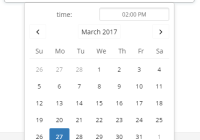
1. open(options: Object) - Opens the standard date picker dialog
The available keys for the options object are:
date(Dateobject or timestamp in milliseconds) - date to show by defaultminDate(Dateor timestamp in milliseconds) - minimum date that can be selectedmaxDate(Dateobject or timestamp in milliseconds) - minimum date that can be selected
2. getSelectedDate - It will return the selected date (@return date object)
Props
1. onDatePicked: PropTypes.func - Date picked handler. This method will be called when the user selected the date from picker.The first and only argument is a Date object representing the picked date and time.
2. onCancel: PropTypes.func - Date cancelled handler. This method will be called when the user dismissed the picker.
3. okLabel: PropTypes.string - **Ios Only** (Ok button label) . Default value is 'Ok'
4. cancelLabel: PropTypes.string - **Ios Only** (Cancel button label) . Default value is 'Cancel'
References
- https://facebook.github.io/react-native/docs/datepickerandroid.html
- http://facebook.github.io/react-native/releases/0.38/docs/datepickerios.html#datepickerios
- https://github.com/facebook/react-native/commit/eaccd7e82e228d744e6aef34b332d99c1ff616a5
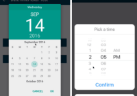
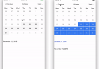
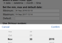
Demo
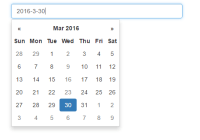
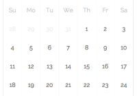
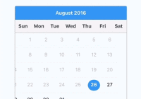
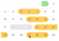
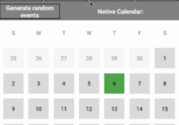
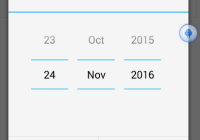
Android

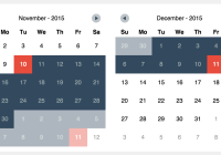
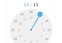
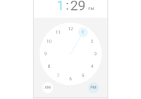
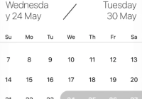
Ios