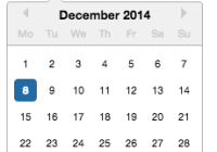
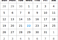
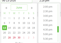
React Input Calendar
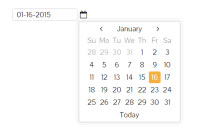
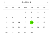
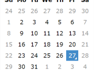
React component for calendar widget.
Installation
React Input Calendar is available as an npm package.
npm install react-input-calendarUse browserify and reactify for dependency management and JSX transformation.
All styles written in CSS and are in style/index.css
Demo
http://rudeg.github.io/react-input-calendar
Usage
import Calendar from 'react-input-calendar' <Calendar format='DD/MM/YYYY' date='4-12-2014' />Dependencies
API
props.format
String- default: 'MM-DD-YYYY'
- Allowed Keys: All formats supported by moment.js
- Format of date, which display in input and set in date property
props.parsingFormat
StringorArray- default: 'props.format'
- Allowed Keys: All formats supported by moment.js
- This property allows the parsing format to be different to the display format.
- Format or Formats could be used to parse manually entered dates. The parsing does only happen if the date was entered manually and on blur of the input field gets called.
props.date
StringorDate- default:
Current date - set initial date value
props.minDate
StringorDate- default:
null - set the selectable minimum date
props.maxDate
StringorDate- default:
null - set the selectable maximum date
props.defaultView
Int(from 0 to 2)- default:
0(DaysView) - Set default view displayed. Values:
- 0 - days
- 1 - months
- 2 - years
props.minView
Int(from 0 to 2)- default:
0(DaysView) - Set minimal view. Values:
- 0 - days
- 1 - months
- 2 - years
props.displayYrWithMonth
Boolean- default:
false - If set
true, the day view's header will show an abbreviated month and full year. Example: Instead of the header displaying 'December', it will display 'Dec 2016'
props.computableFormat
String- default: 'MM-DD-YYYY'
- Allowed Keys: All formats supported by moment.js
- Format of date for the onChange event. Default on the date format (ISO 8601) to ease the save of data
props.strictDateParsing
Boolean- default:
false - If set
true, the parsing process will catch bad dates and does not try to parse the date with the native js date function and does not set the date to now either. Therefore the computed date will be reported as 'Invalid date'.
props.onChange
Function- default:
null - Set a function that will be triggered whenever there is a change in the selected date. It will return the date in the
props.computableFormatformat.
props.onInputChange
Function- default:
null - Set a function that will be triggered within the input box's onChange handler, before the new value is set. It will take the event object and return a modified value.
props.onBlur
Function- default:
null - Set a function that will be triggered when the input field is blurred. It will return the event and the date in the props.computableFormat format.
props.hideOnBlur
Boolean- default:
false - Setting this value to true will hide the calendar, this works best in conjunction with onBlur prop.
props.onFocus
Function- default:
null - Set a function that will be triggered when the input field is focused.
props.onInputKeyDown
Function- default:
null - Set a function that will be triggered when a key is pressed down with the input field focused.
props.onInputKeyUp
Function- default:
null - Set a function that will be triggered when a key is released with the input field focused.
props.closeOnSelect
Boolean- Default:
undefined - Define state when date picker would close once the user has clicked on a date.
props.openOnInputFocus
Boolean- Default:
undefined - Setting this value to true makes the calendar widget open when the input field is focused.
props.hideIcon
Boolean- Default:
false - If true, the icon next to the input field will not be shown. Make sure you set openOnInputFocus to true if using this.
props.hideTouchKeyboard
Boolean- default:
false - If true, the keyboard won't be shown on touch devices.
props.placeholder
String- default:
undefined - Value to show in the input text box if no date is set.
props.todayText
String- default:
'today' - 'Today' button text.
props.inputName
String- default:
null - Define the name of the input field where the date picker represents its value.
props.inputFieldId
String- default: null
- Define the ID of the input field where the date picker represents it's value. This can be useful when the date picker is used with a label element. The label element can be bound to the input field using the
label forattribute.
props.inputFieldClass
String- default:
'input-calendar-value' - Define the class name of the input field where the date picker represents its value.
props.disabled
Boolean- default:
false - If true, the input field gets disabled and the icon next to it disappears.
props.customIcon
String- default:
null - Define the className of the calendar icon. If you need to customize the calendar icon, I would recommend using FontAwesome's
fa fa-calendaricon. Then, update the css style for the icon.
.fa-calendar { color: white; } - If null, then the default calendar icon is used
props.focused
Boolean- default:
false - If
true, the date picker's input field will be focused.
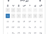
props.locale
String- default:
en - Change locale of the moment in the date picker.
props.hideTodayButton
Boolean- default:
false - If
true, the date picker's today button will be hidden.
props.keyboardDisabled
Boolean- default:
false - If
true, the keyboard handler will be disabled
License
MIT
