


README:中文版
A time picker react-component, no jquery-rely, writing in es6 standard style.
Check here to see changed props in new version.

Online demo
Check here to play online demo.
Play in local
$ git clone https://github.com/ecmadao/react-times.git $ npm install $ npm run storybookInstall
dependencies:
No jQuery rely
😤 😤 😤
So generally speaking, you should already have react & react-dom dependencies in your project. If not:
$ npm install react react-dom moment moment-timezone --save-dev # and $ npm install react-times --save-devConfig
Cause I'm using moment-timezone, you need to be able to parse json file.
Use webpack (version < 2) config as example:
$ npm i json-loader --save// webpack.config.js // ATTENTION: // webpack >= v2.0.0 has native JSON support. // check here: https://github.com/webpack-contrib/json-loader/issues/65 for more information { module: { loaders: [ {include: /\.json$/, loaders: ["json-loader"]} ] }, resolve: { extensions: ['', '.json', '.jsx', '.js'] } }Usage
This component has two themes now: Material Theme by default, or Classic Theme.
Always remember import css file when you use react-times
// basic usage // in some react component import React from 'react'; import TimePicker from 'react-times'; // use material theme import 'react-times/css/material/default.css'; // or you can use classic theme import 'react-times/css/classic/default.css'; export default class SomeComponent extends React.Component { onTimeChange(options) { // do something } onFocusChange(focusStatue) { // do something } render() { <TimePicker onFocusChange={this.onFocusChange.bind(this)} onTimeChange={this.onTimeChange.bind(this)} /> } }See more examples here:
// some config example render() { <TimePicker showTimezone // show the timezone, default false focused // whether to show timepicker modal after rendered. default false withoutIcon // whether to has time icon on button, default false colorPalette="dark" // main color, default "light" time="13:05" // initial time, default current time theme="material" // or // theme="classic" timeMode="12" // use 24 or 12 hours mode, default 24 timezone="America/New_York" // what timezone to use, detects the user's local timezone by default /> }For more detail usage, you can visit example or see the source code.
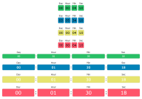
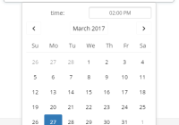
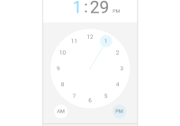
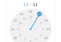
Show time
- 24 hours mode with Material Theme, light color by default
<TimePicker />
- 12 hours mode with Material Theme, light color by default
<TimePicker timeMode="12"/>
- 24 hours mode with Material Theme, dark color
<TimePicker colorPalette="dark"/>
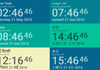
- 24 hours mode, showing user current timezone. (Besides, your can use
timezoneprops to custom timezone)
<TimePicker showTimezone={true}/>
- 24 hours mode with Classic Theme, light color by default
<TimePicker theme="classic"/>
- 24 hours mode with Classic Theme, dark color
<TimePicker colorPalette="dark" theme="classic"/>
APIs
Props
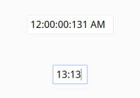
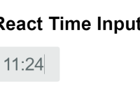
time
Initial time, must be a string, with
${hour}:${minute}format, default now (by usingmoment()):
// PropTypes.string time='11:11' time='11:01' time='1:01' time='1:1'timeFormat
To show the time using custom style
// PropTypes.string // HH, MM means 24 hours mode // hh, mm means 12 hours mode timeFormat='HH:MM' timeFormat='hh:mm' timeFormat='H:M' timeFormat='h:m' // Warning: // If you are using 12 hours mode but with hh or mm format, // or using 24 hours mode with HH or MM format, // you will receive a warning on console, and force to use the timeMode props // So, if you wanna use hh:mm or h:m, you need to set timeMode props to 12 // (cause timeMode default is 24)timeFormatter
To show the time using custom style
// PropTypes.func timeFormatter={({ hour, minute, meridiem }) => `${hour} - ${minute}`} // Note: // If you both set timeFormat and timeFormatter props (and they all validate), component will use timeFormatter functionfocused
Whether the timepicker pannel is focused or not when it did mount. Default
false
// PropTypes.bool focused={false} focused={true}withoutIcon
Whether the timepicker has a svg icon. Default
false.
// PropTypes.bool withoutIcon={true}colorPalette
The main color palette of picker pannel. Default
light.
// PropTypes.string colorPalette="dark" colorPalette="light"timeMode
Support "12" or "24" hours mode.
// PropTypes.string or PropTypes.number timeMode="24" timeMode=24 timeMode="12" timeMode=12meridiem
PropTypes.string, support "PM" or "AM" for 12 hours mode, defaultAM
showTimezone
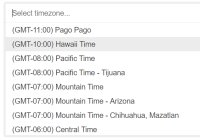
PropTypes.bool, whether show user timezone or not, defaultfalse
timezone
PropTypes.string, change user timezone, default user current local timezone.
trigger
React.component, means a DOM which can control TimePicker Modal "open" or "close" status.
<TimePicker focused={focused} trigger={( <div onClick={this.handleFocusedChange.bind(this)} > click to open modal </div> )} />closeOnOutsideClick
If you don't wanna close panel when outside click, you can use closeOnOutsideClick={false}. Default true
<TimePicker closeOnOutsideClick={false} /> disabled
Disable component. Default false
<TimePicker disabled={true} /> draggable
If you don't want to drag the pointer, then you can set draggable props to false, then users can only use click to change time. Default true
<TimePicker draggable={false} /> language
React.string, use different language. Default english.
/* * support * en: english * zh-cn: 中文简体 * zh-tw: 中文繁体 * fr: Français * ja: 日本語 */ <TimePicker language="zh-cn" // 中文简体 />phrases
React.object, specify text values to use for specific messages. By default, phrases will be set from defaults based on language. Specify any of the available phrases you wish to override or all of them if your desired language is not yet supported. See language.js for default phrases.
<TimePicker phrases={{ confirm: 'Are you sure?', cancel: 'Do you want to cancel?', close: 'DONE', am: 'Ante Meridiem', pm: 'Post Meridiem' }} />minuteStep
React.number, default5. It means the minium minute can change. You can set it to 1, 2, 3...
<TimePicker minuteStep={1} />timeConfig
React.object, to config from, to, step limit for classic theme panel.
<TimePicker theme="classic" timeMode="12" timeConfig={{ from: '08:00 PM', to: '08:00 AM', step: 1, unit: 'hour' }} /> <TimePickerWrapper theme="classic" timeMode="24" timeConfig={{ from: 9, to: 19, step: 30, unit: 'minutes' }} />limitDrag
React.bool, defaultfalse. Iftrue, it will limite the drag rotation byminuteStep
<TimePicker limitDrag />Callback
onFocusChange
PropTypes.func
The callback func when component
focusedstate is changed.
onTimeChange
PropTypes.func
The callback func when component
hourorminuteorAM/PMstate is changed.
onTimeChange(options) { // you can get hour, minute and meridiem here const { hour, minute, meridiem } = options; }onTimezoneChange
PropTypes.func
The callback func when timezone changed. Receives timezone object as argument with the following properties:
- city
- zoneAbbr
- zoneName
Article
Todos
-
Test
-
TimePicker Component
-
PickerDragHandler Component
-
PickerPointGenerator Component
-
MaterialTheme Component
-
TwelveHoursTheme Component
-
PickerPoint Component
-
OutsideClickHandler Component
-
utils test
-
-
Color Palette (Now It has light and dark color)
- light
- dark
- colorful
-
Themes
- Material Theme
- Classical Theme
-
Mode
- 12h mode
- 24h mode
-
Animations
Thx
Thanks to the Airbnb's open source project: react-dates, I have learn a lot from that. Thanks.