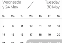
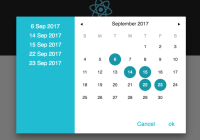
react-native-calendar-android
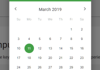
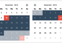
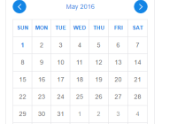
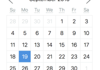
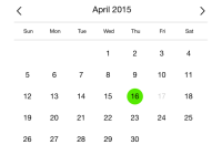
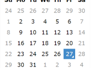
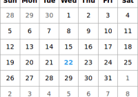
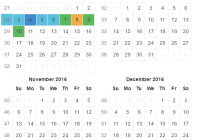
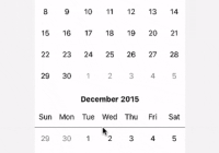
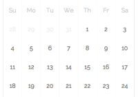
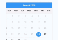
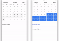
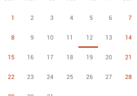
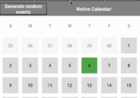
A simple material-themed calendar for react native android
Installation Android
npm install --save react-native-calendar-android
Note: Since [email protected], you should use [email protected] and above
-
In
android/settings.gradle... include ':ReactNativeCalendarAndroid', ':app' project(':ReactNativeCalendarAndroid').projectDir = new File(rootProject.projectDir, '../node_modules/react-native-calendar-android/android')
-
In
android/app/build.gradle... dependencies { ... compile project(':ReactNativeCalendarAndroid') }
-
Register module (in MainActivity.java)
4.1. With RN < 0.19.0
```java import com.chymtt.reactnativecalendar.CalendarPackage; // <----- import public class MainActivity extends Activity implements DefaultHardwareBackBtnHandler { ...... @Override protected void onCreate(Bundle savedInstanceState) { super.onCreate(savedInstanceState); mReactRootView = new ReactRootView(this); mReactInstanceManager = ReactInstanceManager.builder() .setApplication(getApplication()) .setBundleAssetName("index.android.bundle") .setJSMainModuleName("index.android") .addPackage(new MainReactPackage()) .addPackage(new CalendarPackage()) // <------ add here .setUseDeveloperSupport(BuildConfig.DEBUG) .setInitialLifecycleState(LifecycleState.RESUMED) .build(); mReactRootView.startReactApplication(mReactInstanceManager, "ExampleRN", null); setContentView(mReactRootView); } ...... } ```4.2. With RN >= 0.19.0
```java import com.chymtt.reactnativecalendar.CalendarPackage; // <----- import public class MainActivity extends ReactActivity { ... @Override protected List<ReactPackage> getPackages() { return Arrays.<ReactPackage>asList( new MainReactPackage(), new CalendarPackage() // <------ add here ); } } ```
Usage
var Calendar = require('react-native-calendar-android'); ... render() { return ( <Calendar width={300} topbarVisible={true} arrowColor="#dafacd" firstDayOfWeek="monday" showDate="all" currentDate={[ "2016/12/01" ]} selectionMode="multiple" selectionColor="#dadafc" selectedDates={[ "2015/11/20", "2015/11/30", 1448745712382 ]} onDateChange={(data) => { console.log(data); }} /> ); }Notes
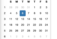
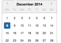
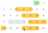
The view is a grid with 7 tiles wide and 8 tiles high (with topbarVisible=true), or 7 tiles high (with topbarVisible=false)
The size of each tile is automatically calculated based on the provided width.
Props
int width (required)
Provide the width of the calendar. The height will be calculated based on width and topbarVisible.
boolean topbarVisible (default = true)
Show/hide the top bar which contains the month's title and arrows to go to previous or next months.
string arrowColor
A string color in the format #RRGGBB or #AARRGGBB. It changes color of the top bar's arrows accordingly.
enum firstDayOfWeek (default = 'sunday')
enum [ 'monday', 'tuesday', 'wednesday', 'thursday', 'friday', 'saturday', 'sunday' ]
Set the first day of the week.
enum showDate (default = 'current')
enum [ 'all', 'current' ]
If set to current, only show dates within current month. If set to all, show dates from previous and current months too.
array currentDate
Set the focus of the calendar. Due to some limitations, you must provide an array with only one element, which is the currentDate. currentDate can be a string in the format yyyy/mm/dd or a timestamp.
enum selectionMode (default = 'single')
enum [ 'none', 'single', 'multiple' ]
Set the selection mode.
- none: you cannot select date
- single: you can only select one date at a time
- multiple: you can select multiple dates
string selectionColor
Set the color of the selection circle. Should be a color in the format #RRGGBB or #AARRGGBB.
array selectedDates
An array of dates in the format yyyy/mm/dd or timestamp. Set the selected dates on the calendar.
Event
onDateChange(data)
Called when user select/deselect a date. The returned data is { date: 'yyyy/mm/dd', selected: boolean }
Questions or suggestions?
Feel free to open an issue Pull requests are also welcome
Credit
Big thanks to @prolificinteractive for their awesome Material Calendar View
