Migarted to KeyUI DatePicker. This repo is not longer maintained.
React Ultra Date Picker
Read Chinese documentation here 中文文档点此
Introduction
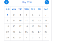
React Ultra Date Picker is an iOS like, comprehensive date picker component for React.
If you are looking for a React Date Picker working on mobile platforms, this one would be a good choice. After browsing a lot of React Date Picker projects on GitHub, I found that most of them are PC-oriented, so I decided to write one for mobile platforms. This is how React Ultra Select and React Ultra Date Picker come.
This component depends on React Ultra Select, so scrolling also relies on its version. You can change UltraSelect's version to use different scrolling features. 1.0.x for iscroll-scrolling and 1.1.x for div-scrolling. Default uses iscroll-scrolling.
Features
-
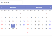
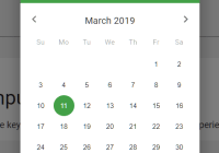
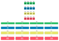
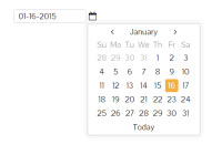
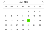
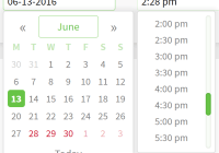
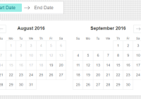
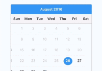
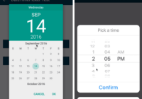
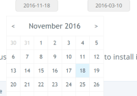
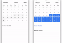
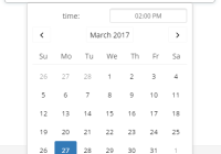
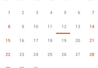
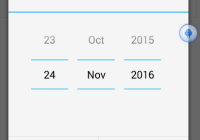
Supporting 4 Types of Date Picker
-
dateDefault type, you can select year, month and date with this type.
-
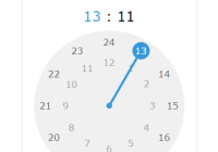
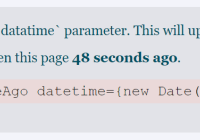
datetimeYou can select year, month, date, hour and minute with this type.
-
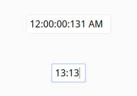
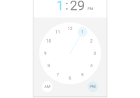
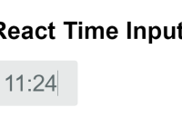
timeYou can select hour and minute with this type.
-
monthYou can select year and month with this type.
-
-
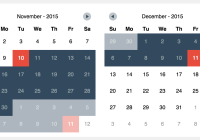
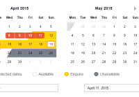
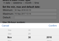
Precise Date Range(aka min date and max date)
Comprehensive and precise support of date range for all Date Picker types. Also supports out-of-range detection.
-
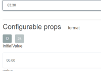
24-hour System and 12-hour System
Both two time system are supported.
-
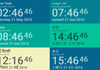
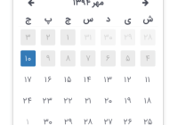
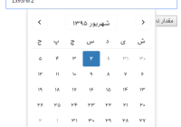
Flexible Locale Configurations
Provides a very convenient API
addLocaleConfigfor custom locale config. Using this API, you can not only arrange order, but also decide how each year/month/date/ampm/hour/minute element is displayed. -
Selection Events
Supports 6 events, same as React Ultra Select.
How to use
npm i react-ultra-date-picker --save Using it in your project:
import React, { Component } from 'react' import ReactDOM from 'react-dom' import DatePicker from 'react-ultra-date-picker' class SomeComponent extends Component { render() { return <DatePicker></DatePicker> } } Props
dateStringProp
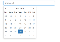
dateStringProp is used as a constructor parameter of JavaScript Date Object. It can either be a number, or a string with RFC2822 Section 3.3, ISO-8601 format or simply dd:dd format.
-
Number
A positive or negative number representing the number of milliseconds passed from 1970-01-01.
-
String of RFC2822 Section 3.3
A string like
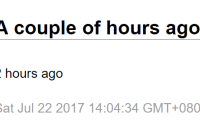
Sat Jul 30 2016 18:17:37 GMT+0800 (CST), which can be generated byDate.toString()orDate.toDateString() -
String of ISO-8601
A string like
2016-07-30T10:18:43.422Z, which can be generated byDate.toJSON(). Note thatDate.toJSON()will return a UTC time. -
String of
dd:ddformatYou should only use this format with prop
type=time, anddd:ddis in 24-hour time system.
Optional Props
| Prop Name | Default Value | Type | Description |
| min | '01 Jan 1970 00:00' | dateStringProp | Minimum date you can select. |
| max | '19 Jan 2038 03:14' | dateStringProp | Maximum date you can select. |
| defaultDate | null | dateStringProp | Default selected date. |
| type | 'date' | One of 'date', 'datetime', 'month' and 'time' | Decide which type of date to select. |
| locale | 'en' | One of 'en' or 'zh-cn', or locale name added by addLocaleConfig | Tells which date locale configuration to use. |
| use24hours | false | Boolean | Whether to use 24-hour system or not. |
| title | null | String/ReactNode | Title for the selection panel. |
| outOfRangeLabel | null | String/ReactNode | Label indicating given defaultDate out of range. Use it if you don't want the default value in locale configuration. |
| noneSelectedLabel | null | String/ReactNode | Label indicating not given defaultDate prop and user haven't made a selection. Use it if you don't want the default value in locale configuration. |
Props for React Ultra Select
Since this component relies on React Ultra Select, you can also pass these props to it:
rowsVisiblerowHeightrowHeightUnitbackdropdisableduseTouchTapisOpen
Events/Callbacks
React Ultra Date Picker shares same events/callbacks with React Ultra Select:
-
onOpen(date)Will be called when the selection panel shows up.
-
onClose(date)Will be called when the selection panel hides.
-
onConfirm(date)Will be called when the confirm button or backdrop is clicked.
-
onCancel(date)Will be called when the cancel button is clicked.
-
onDidSelect(date)Will be called when scrolling stops, useful for real-time selection.
dateis the current selected date. -
onSelect(date)Will be called when scrolling and selected value is changed, useful for playing sound effects or so.
dateis the current selected date. -
getTitle(fullDate)Same as React Ultra Select1, but it will be called with a
fullDateobject, which contains selected date and out-of-range and none-selected status.The priorities of
getTitleprop is higher thantitleprop. -
getStaticText(fullDate)Same as React Ultra Select1, but it will be called with a
fullDateobject.
Functions
-
addLocaleConfig(name, config)Adding a locale configuration to the Date Picker, so you can specify
localeother thanenandzh-cn. The config keys includes:Key Type Description Example Value order Array The order of year, month, date, ampm, hour and minute in selection ['month', 'date', 'year', 'hour', 'minute', 'ampm'] year Function A function generates year string. year => year month Function A function generates month string. month => month + 1 date Function A function generates date string. date => date am String A string for am, probably in different languages. 'AM' pm String A string for pm, probably in different languages. 'PM' hour Function A function generates hour string. (hour, use24hours) => hour minute Function A function generates minute string. minute => minute confirmButton String A string for the confirm button label, probably in different languages. cancelButton String A string for the cancel button label, probably in different languages. dateLabel Function A function accepts current selected date and generates display string. (fullDate, type, use24) => date.toJSON() For example, adding a Japanese(
ja) locale config would be like below:import DatePicker,{addLocaleConfig, padStartWith0, translateHour} from 'react-ultra-date-picker' const jaConfig = { order: ['year', 'month', 'date', 'ampm', 'hour', 'minute'], year: year => `$year年`, month: month => `$month+1月`, date: date => `$date日`, am: '朝', pm: '午後', hour: translateHour, minute: minute => padStartWith0(minute), confirmButton: '決定します', cancelButton: 'キャンセル', dateLabel: (fullDate, type, use24) => { const { date, noneSelected, outOfRange } = fullDate if (noneSelected) { return '日付を選択してください' } if (outOfRange) { return '日付を範囲で選択されていません' } let ampmStr = '' if (!use24) { ampmStr = date.getHours() < 12 ? jaConfig.am : jaConfig.pm } switch (type) { case 'time': return `$ampmStr$jaConfig.hour(date.getHours(), use24):$jaConfig.minute(date.getMinutes())` case 'month': return `$jaConfig.year(date.getFullYear())$jaConfig.month(date.getMonth())` case 'datetime': return `$jaConfig.year(date.getFullYear())$jaConfig.month(date.getMonth())$jaConfig.date(date.getDate()) $ampmStr$jaConfig.hour(date.getHours(), use24):$jaConfig.minute(date.getMinutes())` case 'date': return `$jaConfig.year(date.getFullYear())$jaConfig.month(date.getMonth())$jaConfig.date(date.getDate())` default: return '' } }, } addLocaleConfig('ja', jaConfig) -
padStartWith0(num)Pad a number smaller than 10 with a
0at the start. -
daysInMonth(year, month)Calculates how many days in given year and month. Referenced from StackOverflow. Returns a number.
-
isPm(date)Whether a given date is in p.m. or not. Returns a Boolean.
-
translateHour(hour, use24hours)Translate an hour number to correct number according to the
use24hourparameter with padding zero if needed. -
DatePicker.dateGet the current selected date, a javascript
DateObject will be returned. You can callgetFullYear(),getMonth(),getDate(),getHour()orgetMinute()depending on your needs. Remember to attachrefto<DatePicker>.If given
defaultDateis out of range, or user haven't select a date,nullwill be returned.this.refs.datePicker.date -
DatePicker.fullDateGet the current selected date and out-of-range, none-selected status. It will return an object like:
{ date: Date, outOfRange: false, noneSelected: true, }
Examples
-
Online
Open https://swenyang.github.io/react-date-picker to see online demo.
-
Local
Clone this repo, and run
npm run examples. Then navigate to http://localhost:8080 to see examples.
TODO
-
Add more language configurations and export them to chunks
-
Implementing more features in the web APIs of the INPUT DATE element