react-event-timeline
React component to generate a responsive vertical event timeline
Storybook demos here: https://rcdexta.github.io/react-event-timeline
CodeSandbox version to play with examples (in typescript):
Note: CodeSandbox version has predefined styles and icons loaded in index.html for better presentation!
Features
- Is lightweight
- Responsive and extensible
- Has multiple configurations
Getting started
To install as npm dependency
npm install --save react-event-timeline or if you use yarn
yarn add react-event-timeline Usage
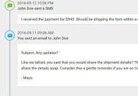
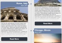
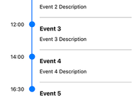
The following snippet generates the timeline you see in the screenshot:
import {Timeline, TimelineEvent} from 'react-event-timeline' ReactDOM.render( <Timeline> <TimelineEvent title="John Doe sent a SMS" createdAt="2016-09-12 10:06 PM" icon={<i className="material-icons md-18">textsms</i>} > I received the payment for $543. Should be shipping the item within a couple of hours. </TimelineEvent> <TimelineEvent title="You sent an email to John Doe" createdAt="2016-09-11 09:06 AM" icon={<i className="material-icons md-18">email</i>} > Like we talked, you said that you would share the shipment details? This is an urgent order and so I am losing patience. Can you expedite the process and pls do share the details asap. Consider this a gentle reminder if you are on track already! </TimelineEvent> </Timeline>, document.getElementById('container') );Please refer storybook to check code for all the examples in the storybook demo.
API Documentation
Timeline
This is the wrapper component that creates the infinite vertical timeline
| Name | Type | Description |
|---|---|---|
| className | string | The css class name of timeline container |
| style | object | Override inline styles of timeline container |
| orientation | string | Display the timeline on right or left. Default: left |
| lineColor | string | CSS color code to override the line color |
| lineStyle | string | Override the appearance of line with custom css styling |
TimelineEvent
Each event in the timeline will be represented by the TimelineEvent component. There can be multiple repeating instances of this component inside Timeline wrapper
| Name | Type | Description |
|---|---|---|
| title | node | The title of the event. Can be string or any DOM element node(s) |
| createdAt | node | The time at which the event occurred. Can be datetime string or any DOM element node(s) |
| subtitle | node | If you prefer having the title at the top and some caption below, omit createdAt and specify title and subtitle |
| icon | node | The icon to show as event lable. Can be a SVG or font icon |
| iconStyle | object | Custom CSS styling for the icon |
| bubbleStyle | object | Custom CSS styling for the bubble containing the icon |
| buttons | node | Action buttons to display to the right of the event content |
| contentStyle | node | Override content style |
| container | string | Optional value card will render event as a Card |
| style | object | Override style for the entire event container. Can be used to modify card appearance if container is selected as card |
| titleStyle | object | Override style for the title content |
| subtitleStyle | object | Override style for the subtitle content |
| cardHeaderStyle | object | Override style for the card header if container is card |
| collapsible | boolean | Make the timeline event collapse body content |
| showContent | boolean | if collapsible is true, should content be shown by default. false is default value |
TimelineBlip
Use this component if your event footprint is too small and can be described in a single line
| Name | Type | Description |
|---|---|---|
| title | node | The title of the event. Can be string or any DOM element node(s) |
| icon | node | The icon to show as event label. Can be a SVG or font icon |
| iconColor | string | CSS color code for icon |
| iconStyle | object | Custom CSS styling for the icon |
| style | object | Override style for the entire event container |
Refer to Condensed Timeline in Storybook for examples of using this component.
Development
This project recommends using react-storybook as a UI component development environment. Use the following scripts for your development workflow:
npm run storybook: Start developing by using storybooknpm run lint: Lint all js filesnpm run lintfix: fix linting errors of all js filesnpm run build: transpile all ES6 component files into ES5(commonjs) and put it indistdirectorynpm run docs: create static build of storybook indocsdirectory that can be used for github pages
The storybook artefacts can be found in stories folder. Run npm run storybook and you should see your code changes hot reloaded on the browser
Also use semantic-release to automate release to npm. Use npm run commit to commit your changes and raise a PR.
Acknowledgements
This project is graciously supported by IDE tools offered by JetBrains for development.
License
MIT
