react-calendar


Calendars for React v15.
Not just calendar component, but a modular toolkit for building everything related to calendars in React, such as Datepickers.
In early alpha stage, documentation and features will arrive.
Example
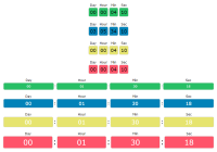
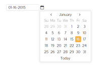
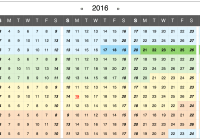
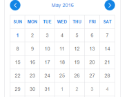
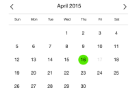
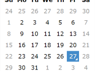
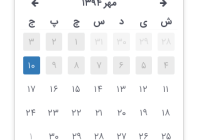
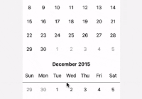
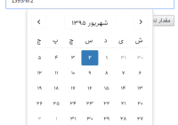
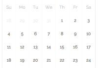
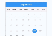
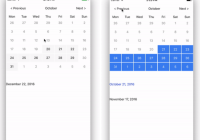
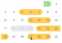
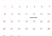
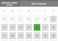
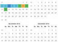
npm install npm run One year calendar (Demo):
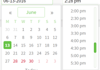
<Calendar startDate={ moment() } endDate={ moment().endOf('year') } <!-- Base calendar component --> weekNumbers={true} size={12} mods={ [ <!-- Pass modifier objects to change rendering --> { date: moment(), classNames: [ 'current' ], component: [ 'day', 'month', 'week' ] <!-- This shows the current day, week, and month. --> } ] } />Each component can be used separately AND passed to other components to modify rendering. We have deprecated this in favor of passing a more flexible modifier object.
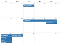
<Month date={moment()} />If a modifier is passed without date it modifies all components of this type in the tree. Useful, for example, for passing callbacks.
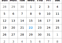
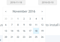
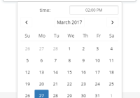
<Calendar firstMonth={1} date={moment("2014-01-01")} weekNumbers={true} size={12} startDate={ moment() } endDate={ moment().endOf('year') } <!-- Base calendar compoment --> weekNumbers={true} size={12} mods={ [ { component: [ 'day' ], events: { onClick: (date) => alert(date) } } ] } />Events
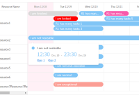
All mouse and touch events are supported on all components with react style onCamelCase props (eg. onClick). Event handlers receives two arguments - date in moment.js format and the original react event.
Styling
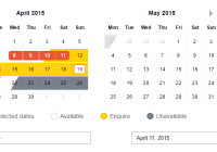
There is no style by default, but an example theme using bootstrap is included in less/bootstrap-theme.less.
react-calendar uses SuitCSS style (a variant of BEM) to make default class hierarchy, if you want to add a class that is separate from that hierarchy just pass classes prop to any component. classes is an object with keys as class names and values as boolean-like values (this will be probably changed to just passing array of classes in future API). If you want to add SuitCSS modifier classes (eg rc-Day--current), pass similar object via modifiers prop (again this will probably become an array in next version of API).
For example:
<Day date={moment()} mods={[{bar: true}]} />will yield the following classes: "rc-Day rc-Day--bar".
TODO
- Merging of modifiers and classe
- Docs
- Calendar should be able to page
- A component for Year - Calendar is supposed to be a 'controller' component for pageable stuff
- A component that is on lower level that Day - for events.
-
Utils to create range of components for modifying multiple components easier - An example datepicker component using react-calendar
-
Basic unit tests - More Tests!