React-Month-Picker
Month-Picker Component offers a popup month selection panel with responsive layouts.
Changelogs
v1.3.10
- update deps for security vulnerability
v1.3.9
- removed webpack-dev-server dependency
v1.3.8
- merged the update with highlight the selected range and slight code improvement
v1.3.7
- any positive integer is valid year
v1.3.5
- using private css naming
v1.3.4
- upgrade react-tapper version
v1.3.3
- fixed carelessness in peerDependencies setting
v1.3.2
- Support show prop in componentWillReceiveProps
v1.3.1
- Support show prop
v1.3.0
- Support keyboard event with escape for cancel and enter for confirm
v1.2.2
- Fixed error in readme
v1.2.1
- Upgrade babel-loader & update readme
v1.2.0
- Update for react v15.5.x
Installation
yarn add react-month-picker or
npm install react-month-picker --save Snapshots
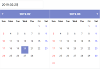
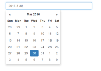
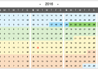
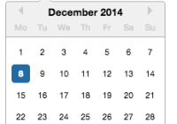
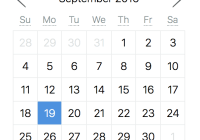
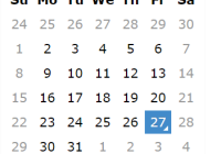
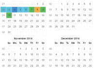
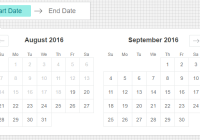
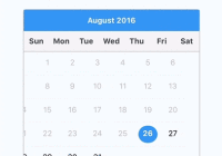
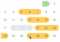
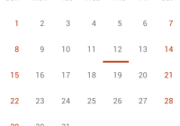
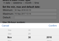
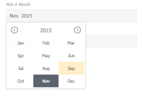
Desktop View (Picking A Months)

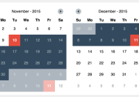
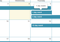
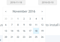
Desktop View (Picking Span of Months)

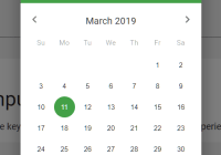
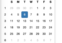
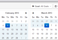
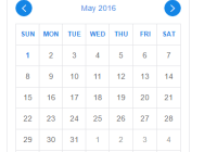
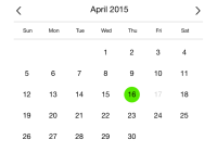
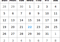
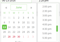
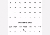
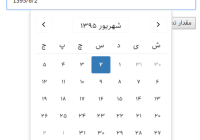
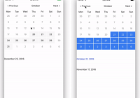
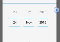
Mobile View (Picking A Months)

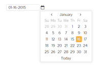
Mobile View (Picking Span of Months)

Demo
Demo file in repository: ./examples/demo.html
Example
./examples/demo.jsx
Import component into your react project
import Picker from 'react-month-picker' render() { let pickerLang = { months: ['Jan', 'Feb', 'Mar', 'Spr', 'May', 'Jun', 'Jul', 'Aug', 'Sep', 'Oct', 'Nov', 'Dec'] , from: 'From', to: 'To' } , mvalue = {year: 2015, month: 11} , mrange = {from: {year: 2014, month: 8}, to: {year: 2015, month: 5}} let makeText = m => { if (m && m.year && m.month) return (pickerLang.months[m.month-1] + '. ' + m.year) return '?' } return ( <ul> <li> <label>Pick A Month</label> <div className="edit"> <Picker ref="pickAMonth" years={[2008, 2010, 2011, 2012, 2014, 2015, 2016, 2017]} value={mvalue} lang={pickerLang.months} onChange={this.handleAMonthChange} onDismiss={this.handleAMonthDissmis} > <MonthBox value={makeText(mvalue)} onClick={this.handleClickMonthBox} /> </Picker> </div> </li> <li> <label>Pick A Span of Months</label> <div className="edit"> <Picker ref="pickRange" years={{min: 2010, max: 2018}} range={mrange} lang={pickerLang} theme="dark" onChange={this.handleRangeChange} onDismiss={this.handleRangeDismiss} > <MonthBox value={makeText(mrange.from) + ' ~ ' + makeText(mrange.to)} onClick={this._handleClickRangeBox} /> </Picker> </div> </li> </ul> ) } MonthBox is a customized component defined for the demo.
Using CSS/SCSS
CSS: import css/month-picker.css
SCSS: 1) import bourbon library (http://bourbon.io/), 2) import scss/month-picker.scss
Properties
@years:
- array: [2013, 2015, 2016]
- number: 5 (last 4 years and this year)
- object: {min: 2013, max: 2016} (from 2013 to 2016); {min: 2013} (from 2013 to this year); {max: 2015} (5 years to 2015)
- object: {min: {year: 2013, month: 4}, max: {year: 2016, month: 9}} (from Apri.2013 to Sept.2016)
@value: default value for picking a single month, e.g. {year: 2015: month: 11}
@range: default value for picking a span of months, e.g. {from: {year: 2014: month: 7}, to: {year: 2015: month: 11}}
@lang: language texts
- array: array of months' texts, e.g. ['Jan', 'Feb', 'Mar', 'Spr', 'May', 'Jun', 'Jul', 'Aug', 'Sep', 'Oct', 'Nov', 'Dec']
- object: including array of months' texts and other display texts, e.g. {from: "From:", to: "To:", months: [...]}
@theme: theme setting of month-picker; 2 options (light/dark); default theme is light
Developing
npm install npm run _build