React Kronos 1.7.2
A fast, intuitive, and elegant date and time picker for React.
Philosophy
- Works straight out of the box with minimal props
- Provide a few props and options that give lots of control
- Allow for granular control when needed
- Style is done in JS and can be easily modified
- Beautiful code and appearance
Rationale
Even though there are many React Date and/or Time components, I'm developing my own because none of them do everything that I need.
Key requirements:
- Separate date and/or time components (many only have date)
- Easily style-able from JS (not have to muck around in the css)
- Return multiple time formats (Date, Moment, ISO, string)
- Lightweight, use no jquery
- Active on focus, disappear on blur
- Efficient keyboard navigation
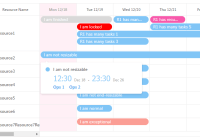
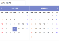
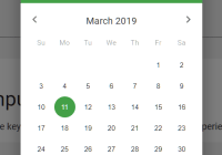
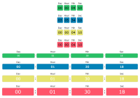
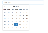
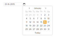
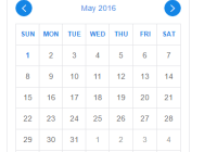
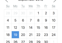
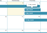
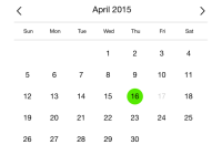
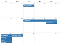
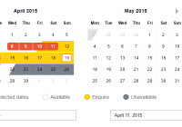
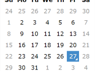
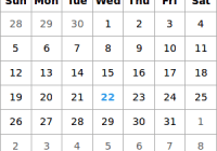
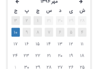
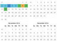
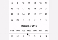
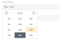
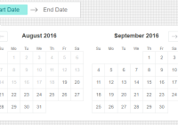
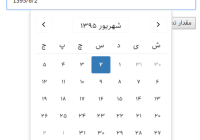
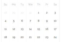
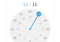
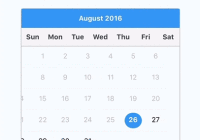
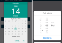
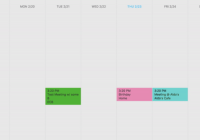
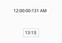
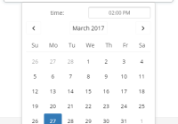
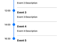
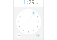
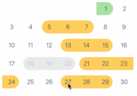
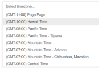
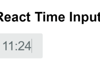
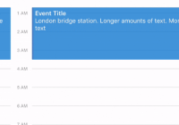
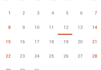
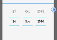
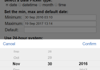
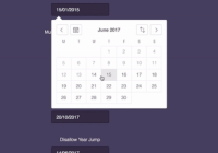
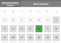
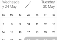
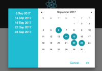
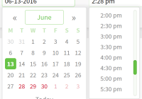
Demo
Usage
- NPM install
npm install react-kronos - Require Kronos
import Kronos from 'react-kronos' - Use
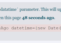
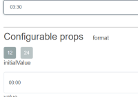
<Kronos date={this.state.datetime} onChange={this.onChange} />Props:
date- Date(), Moment(), ISO, or string (if string, must matchformat)time- Date(), Moment(), ISO, or string (if string, must matchformat)timeStep- number : minutes for time step (if not specified: 30 minutes)format- string : Moment formatting of date / timeonChange- function : native onChange methodonChangeDateTime- function : change method called when there is a new valuereturnAs- string : onChange formatJS_DATE,MOMENT,ISO,STRING(default: same as input)min- Date(), Moment(), ISO to set as the minimum datetimemax- Date(), Moment(), ISO to set as the maximum datetimeminTime- Date(), Moment(), ISO to set as the minimum time (only the time will be used)maxTime- Date(), Moment(), ISO to set as the maximum time (only the time will be used)closeOnSelect- boolean : closes the dropdown when a value is selected (default:true)closeOnBlur- boolean : closes the dropdown when the field is blurred (default:true)shouldTriggerOnChangeForDateTimeOutsideRange- boolean: optionally allow dates outside min/max range to trigger onChanges (default:false)preventClickOnDateTimeOutsideRange- boolean: optionally prevent users from clicking on dates outside min/max range (default:false)hideOutsideDateTimes- boolean: optionally hide times that do not pass validationplaceholder- string : placeholder text when there is no valuename- string : name used for the input formdisabled- boolean : prevent interaction with input fieldinputStyle- object : inline styles for input fieldinputClassName- string :.classfor input fieldinputId- string :#idfor input fieldcalendarStyle- object : inline styles for calendarcalendarClassName- string :.classfor calendaroptions:color- string : the highlight color in the UI as a hexcorners- number : the pixel size of rounded corners (default:4)font- string : the font family (default:Source Sans Pro)locale- object : Moment locale customizationlang- string : language (default:enfor english)settings- object : properties to override as an object (default:{ week: { dow: 1 }, weekdaysMin: ['M', 'T', 'W', 'T', 'F', 'S', 'S'] })
format: - object : Moment formatting for cell titlestoday: - string : default:Todayyear: - string : default:YYYYmonth: - string : default:MMMday: - string : default:Dhour: - string : default:h:mm a
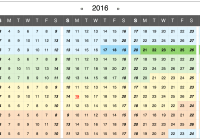
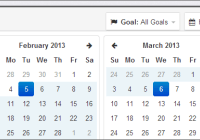
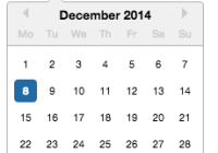
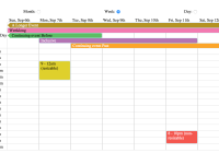
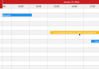
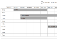
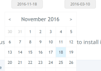
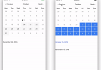
Construction progress
Roadmap
Needed
- Provide docs on website
- options:
- date (restrict calendar to show only days, or with months, or with years)
- time (set increments, set ranges of time)
- support for connected start & end date+time
- date (show range on calendar)
- time (show "0 hours", "0.5 hours", "1 hour", &c)
Ideas
- input field masking
- ⇧+arrow uses the higher order unit
- specify required props & non-required (what happens if none are included)
- add warning messages to help use component properly
- mobile support
- wide browser compatibility
- prop:
styles- granular styling (overwrite any style, or provide entire theme) - add crazy awesome date/time interpretation/parsing similar to that in The Hit List
- set up solid unit tests
- prop to allow or disallow outside range selection?
Kronos 2.0
- remove moment dependency to decrease size
- mobile support
- single input with date & time, or double
- simplify formatting
Thanks
- !!! gaearon big thanks to Dan Abramov who has built some incredible react components (hot-loader, dnd), written excellent articles, and answered many questions
- ! vjeux leading the CSS in JS movement