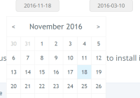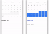
react-native-day-picker
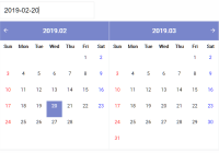
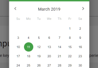
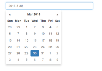
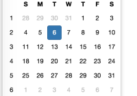
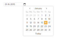
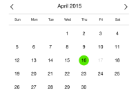
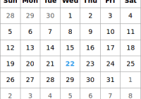
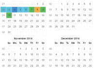
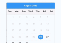
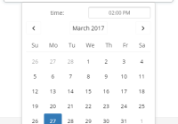
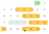
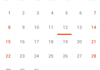
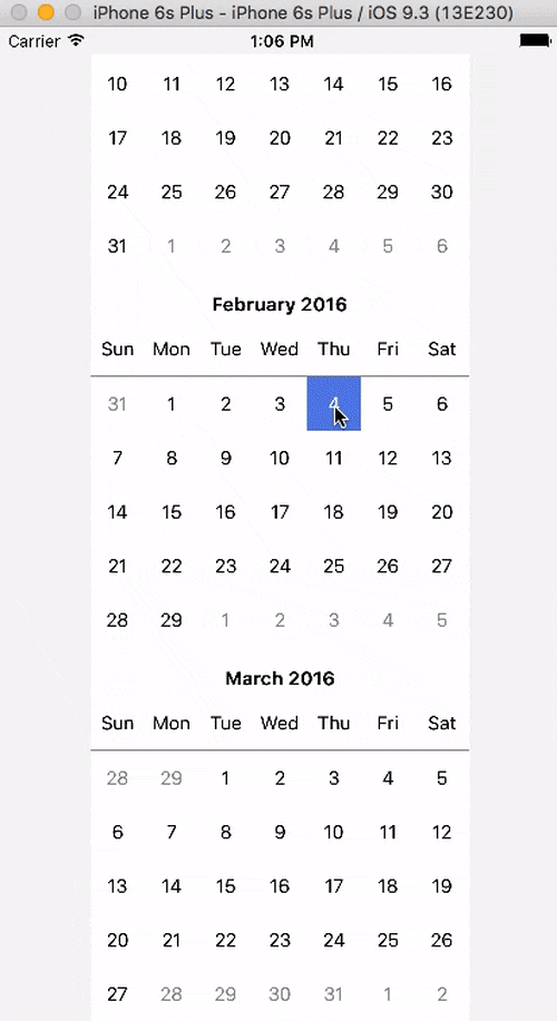
react-native-day-picker is a simple calendar which allows you select date range. Suites for android and ios.
Getting Started
$ npm install react-native-day-picker --saveImportant: When you build app in release mode, calendar works smooth without any lags.
Note: If you use react-native v0.24 or lower install version 1.0.0
Usage
'use strict'; import React from 'react'; import { View, StyleSheet, AppRegistry } from 'react-native'; import Calendar from './src/Calendar'; class DayPicker extends React.Component { render() { var from = new Date(); from.setDate(from.getDate() - 16); var to = new Date(); var startDate = new Date(); startDate.setMonth(startDate.getMonth() + 1); return ( <View style={styles.container}> <Calendar monthsCount={24} startFormMonday={true} startDate={startDate} selectFrom={from} selectTo={to} width={350} onSelectionChange={(current, previous) => { console.log(current, previous); }} /> </View> ); } } const styles = StyleSheet.create({ container: { flex: 1, paddingTop: 20, justifyContent: 'center', alignItems: 'center', backgroundColor: '#F5F5F5' } });Properties
All properties are optional
-
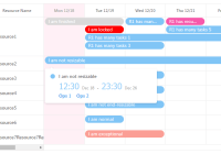
onSelectionChange(func) — Function which will be executed on day click. First param is clicked day date, second one previous clicked day. -
startDate(Date) — Date from which you can select dates. By default is new Date(). -
width(number) Calendars width, should be divided on 7 without remainder or may cause unpredictable behaviour. -
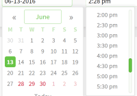
selectFrom(Date) — First day in range that will be selected from start. -
selectTo(Date) — Last day in range that will be selected from start. -
monthsCount(number) — Count of dates from current months to the last. -
startFromMonday(bool) — If true than months will started from monday. -
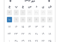
monthsLocale(arrayOf(string)) — Strings for localization, which will be displayed in month header started from January. -
weekDaysLocale(arrayOf(string)) — Strings for localization, which will be displayed in week day header, started from sunday. -
isFutureDate(boolean) — True if you want to select a future date. By default is false.======= -
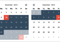
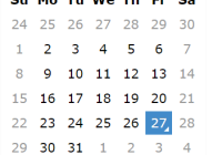
rangeSelect(bool) — True if you want to select a range of dates. By default is true.
Colors
-
bodyBackColor(string) — Calendar background color. -
bodyTextColor(string) — Calendar headers text color. -
headerSepColor(string) — Calendar header separator color. -
dayCommonBackColor(string) — Not selected day background color. -
dayCommonTextColor(string) — Not Selected day text color. -
dayDisabledBackColor(string) — Disabled day background color. -
dayDisabledTextColor(string) — Disabled day text color. -
daySelectedBackColor(string) — First and last day in range background color. -
daySelectedTextColor(string) — First and last day in range text color. -
dayInRangeBackColor(string) — In range day background color. -
dayInRangeTextColor(string) — In range day text color. -
monthTextColor(string) — Calendar month header text color.
Support
Email [email protected] for support.