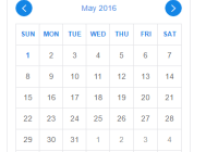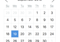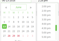
React Daterange Picker
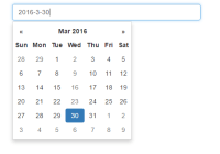
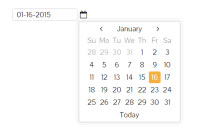
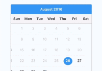
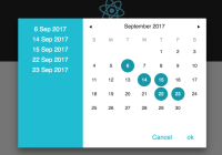
A React based date range picker. Demo
Getting started
Installation
Add React Daterange Picker to your project by executing
npm install react-daterange-pickeror
yarn add react-daterange-pickerUsage
Here's an example of basic usage:
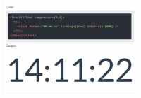
import React, {Component} from 'react' import DateRangePicker from 'react-daterange-picker' import 'react-daterange-picker/dist/css/react-calendar.css' // For some basic styling. (OPTIONAL) class MyApp extends Component { state = { dates: null } onSelect = dates => this.setState({dates}) render() { return ( <div> <DateRangePicker onSelect={this.onSelect} value={this.state.dates} /> </div> ) } }Here is a working example:

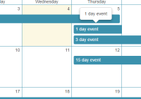
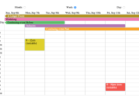
Features
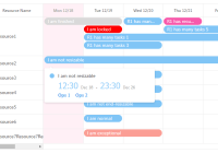
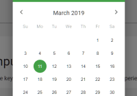
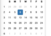
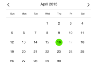
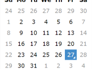
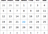
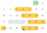
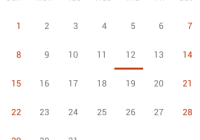
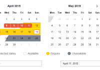
- Select a date range in an intuitive way.
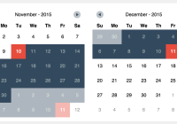
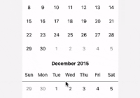
- Define date ranges that are not available for selection.
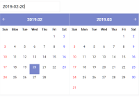
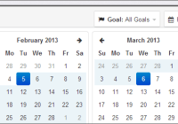
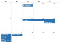
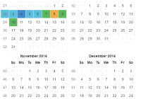
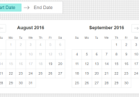
- Show any number of months at the same time.
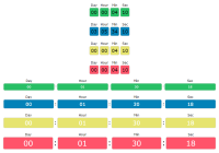
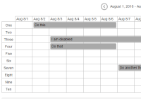
- Visually represent half day states.
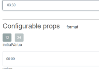
Available props
| prop | description | default | type |
|---|---|---|---|
| bemBlock | String | ||
| bemNamespace | 'DateRangePicker' | String | |
| className | String | ||
| dateStates | An array of date ranges and their states | Array | |
| defaultState | String | ||
| disableNavigation | false | Boolean | |
| firstOfWeek | The first day of the week, as a number between 0-6, where 0 is Sunday | 0 | Integer |
| helpMessage | String | ||
| initialDate | Date | ||
| initialFromValue | true | Boolean | |
| initialMonth | Overrides values derived from initialDate/initialRange | Integer | |
| initialRange | Object | ||
| initialYear | Overrides values derived from initialDate/initialRange | Integer | |
| locale | moment().locale() | String | |
| maximumDate | The last date that is possible to choose. Every date after will be unselectable | null | Moment or Date |
| minimumDate | The earliest date that is possible to choose. Every date before will be unselectable | null | Moment or Date |
| numberOfCalendars | The number of months showing next to each other | 1 | Integer |
| onHighlightDate | Triggered when a date is highlighted (hovered) | Function | |
| onHighlightRange | Triggered when a range is highlighted (hovered) | Function | |
| onSelect | Triggered when a date or range is selected. returns value | ({start, end}) => this.setState({start, end}) | |
| onSelectStart | Triggered when the first date in a range is selected | Function | |
| paginationArrowComponent | PaginationArrow | Component | |
| selectedLabel | 'Your selected dates' | String | |
| selectionType | String (single or range) | ||
| singleDateRange | false | Boolean | |
| showLegend | false | Boolean | |
| stateDefinitions | Object | ||
| value | Contains the start and end value of the selected date range. Format: value={start: null, end: null} (moment range) | null | Moment |
React version
React 0.14, 15, and 16 are all supported in the latest version of react-daterange-picker.
If you wish to user an older version of React, please use react-daterange-picker v0.12.x or below.
Changelog
All change log information is available within the project's releases.
Contribute
Please feel to contribute to this project by making pull requests. You can see a list of tasks that can be worked on in the issues list.
Before a pull request can be merged, ensure that you have linted your files and all tests are passing -
npm run lint npm run testPublishing
If you have been added as a project contributor and wish to publish a new release -
- Ensure that you have added yourself to the
package.jsoncontributors list - Bump the npm version as appropriate, following SemVer conventions
- Update the Demo by running
npm run deploy-example
Building example page
Once you have the repository cloned run the following commands to get started:
npm install npm run developThis will start a local server at http://localhost:9989 where you can see the example page. It will also watch for any files changes and rebuild. To update the compiled files in dist run npm run build-dist-js, and you can lint the code with npm run lint.