React Native General Calendars ✨ 🗓️ 📆


This module includes various customizable react native calendar components.
The package is both Android and iOS compatible.
Installation
$ yarn add react-native-general-calendars
or
$ npm install react-native-general-calendars --save
The solution is implemented in JavaScript so no native module linking is required.
Usage
import { Calendar, CalendarList, Agenda } from 'react-native-general-calendars';
All parameters for components are optional. By default the month of current local date will be displayed.
Event handler callbacks are called with calendar objects like this:
{ day: 1, // day of month (1-31) month: 1, // month of year (1-12) year: 2017, // year timestamp, // UTC timestamp representing 00:00 AM of this date dateString: '2016-05-13' // date formatted as 'YYYY-MM-DD' string } Parameters that require date types accept YYYY-MM-DD formated datestrings (in gregorian), JavaScript date objects, calendar objects and UTC timestamps.
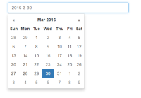
Calendar Types
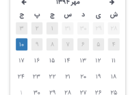
The package implements different type of calendars through type parameter. By setting the type="jalaali", you can use the calendar as Jalaali.
RTL support
The package has independent RTL implementations. But if you want to use the react's I18Manager, you should set the rtl parameter to false rtl={false}.
Moment
Calendars can be localized by adding custom locales using Moment's i18n functions:
import Moment from 'moment'; Moment.locales('fr', { months : 'janvier_février_mars_avril_mai_juin_juillet_août_septembre_octobre_novembre_décembre'.split('_'), monthsShort : 'janv._févr._mars_avr._mai_juin_juil._août_sept._oct._nov._déc.'.split('_'), monthsParseExact : true, weekdays : 'dimanche_lundi_mardi_mercredi_jeudi_vendredi_samedi'.split('_'), weekdaysShort : 'dim._lun._mar._mer._jeu._ven._sam.'.split('_'), weekdaysMin : 'Di_Lu_Ma_Me_Je_Ve_Sa'.split('_'), weekdaysParseExact : true, });Calendar

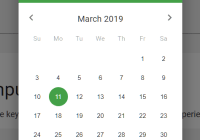
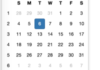
Basic parameters
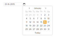
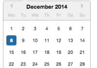
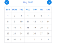
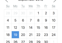
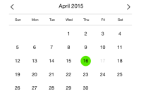
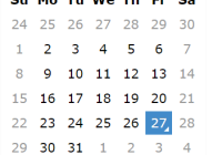
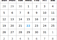
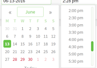
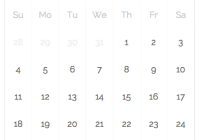
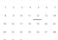
<Calendar // Calendar type (gregorian, jalaali). Default = gregorian type="gregorian" // Initially visible month. Default = Date() current="2012-03-01" // Minimum date that can be selected, dates before minDate will be grayed out. Default = undefined minDate="2012-05-10" // Maximum date that can be selected, dates after maxDate will be grayed out. Default = undefined maxDate="2012-05-30" // Handler which gets executed on day press. Default = undefined onDayPress={(day, localDay) => {console.log('selected day', day, localDay)}} // Handler which gets executed on day long press. Default = undefined onDayLongPress={(day) => {console.log('selected day', day)}} // Month format in calendar title. Formatting values: http://arshaw.com/xdate/#Formatting monthFormat="YYYY MM" // Handler which gets executed when visible month changes in calendar. Default = undefined onMonthChange={(month) => {console.log('month changed', month)}} // Hide month navigation arrows. Default = false hideArrows={true} // Replace default arrows with custom ones (direction can be 'left' or 'right') renderArrow={(direction) => (<Arrow />)} // Do not show days of other months in month page. Default = false hideExtraDays={true} // If hideArrows=false and hideExtraDays=false do not switch month when tapping on greyed out // day from another month that is visible in calendar page. Default = false disableMonthChange={true} // If firstDay=1 week starts from Monday. Note that dayNames and dayNamesShort should still start from Sunday. firstDay={1} // Hide day names. Default = false hideDayNames={true} // Show week numbers to the left. Default = false showWeekNumbers={true} // Handler which gets executed when press arrow icon left. It receive a callback can go back month onPressArrowLeft={substractMonth => substractMonth()} // Handler which gets executed when press arrow icon left. It receive a callback can go next month onPressArrowRight={addMonth => addMonth()} />Date marking
!Disclaimer! Make sure that markedDates param is immutable. If you change markedDates object content but the reference to it does not change calendar update will not be triggered.
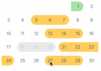
Dot marking

<Calendar // Collection of dates that have to be marked. Default = {} markedDates={{ '2012-05-16': {selected: true, marked: true, selectedColor: 'blue'}, '2012-05-17': {marked: true}, '2012-05-18': {marked: true, dotColor: 'red', activeOpacity: 0}, '2012-05-19': {disabled: true, disableTouchEvent: true} }} />You can customise a dot color for each day independently.
Multi-Dot marking

Use markingType = 'multi-dot' if you want to display more than one dot. Both the Calendar and CalendarList control support multiple dots by using 'dots' array in markedDates. The property 'color' is mandatory while 'key' and 'selectedColor' are optional. If key is omitted then the array index is used as key. If selectedColor is omitted then 'color' will be used for selected dates.
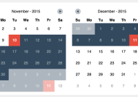
const vacation = {key:'vacation', color: 'red', selectedDotColor: 'blue'}; const massage = {key:'massage', color: 'blue', selectedDotColor: 'blue'}; const workout = {key:'workout', color: 'green'}; <Calendar markedDates={{ '2017-10-25': {dots: [vacation, massage, workout], selected: true, selectedColor: 'red'}, '2017-10-26': {dots: [massage, workout], disabled: true}, }}, markingType="multi-dot" />Period marking


<Calendar // Collection of dates that have to be colored in a special way. Default = {} markedDates={ {'2012-05-20': {textColor: 'green'}, '2012-05-22': {startingDay: true, color: 'green'}, '2012-05-23': {selected: true, endingDay: true, color: 'green', textColor: 'gray'}, '2012-05-04': {disabled: true, startingDay: true, color: 'green', endingDay: true} }} // Date marking style [simple/period/multi-dot/custom]. Default = 'simple' markingType="period" />Multi-period marking

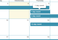
CAUTION: This marking is only fully supported by the <Calendar /> component because it expands its height. Usage with <CalendarList /> might lead to overflow issues.
<Calendar markedDates={{ '2017-12-14': { periods: [ { startingDay: false, endingDay: true, color: '#5f9ea0' }, { startingDay: false, endingDay: true, color: '#ffa500' }, { startingDay: true, endingDay: false, color: '#f0e68c' }, ] }, '2017-12-15': { periods: [ { startingDay: true, endingDay: false, color: '#ffa500' }, { color: 'transparent' }, { startingDay: false, endingDay: false, color: '#f0e68c' }, ] }, }} // Date marking style [simple/period/multi-dot/custom]. Default = 'simple' markingType="multi-period" />Custom marking allows you to customize each marker with custom styles.

<Calendar // Date marking style [simple/period/multi-dot/single]. Default = 'simple' markingType="custom" markedDates={{ '2018-03-28': { customStyles: { container: { backgroundColor: 'green', }, text: { color: 'black', fontWeight: 'bold' }, }, }, '2018-03-29': { customStyles: { container: { backgroundColor: 'white', elevation: 2 }, text: { color: 'blue', }, } }}} />Keep in mind that different marking types are not compatible. You can use just one marking style for calendar.
Displaying data loading indicator

The loading indicator next to month name will be displayed if <Calendar /> has displayLoadingIndicator property and markedDays collection does not have a value for every day of the month in question. When you load data for days, just set [] or special marking value to all days in markedDates collection.
Customizing look & feel
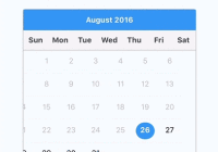
<Calendar // Specify style for calendar container element. Default = {} style={{ borderWidth: 1, borderColor: 'gray', height: 350 }} // Specify theme properties to override specific styles for calendar parts. Default = {} theme={{ backgroundColor: '#ffffff', calendarBackground: '#ffffff', textSectionTitleColor: '#b6c1cd', selectedDayBackgroundColor: '#00adf5', selectedDayTextColor: '#ffffff', todayTextColor: '#00adf5', dayTextColor: '#2d4150', textDisabledColor: '#d9e1e8', dotColor: '#00adf5', selectedDotColor: '#ffffff', arrowColor: 'orange', monthTextColor: 'blue', textDayFontFamily: 'monospace', textMonthFontFamily: 'monospace', textDayHeaderFontFamily: 'monospace', textMonthFontWeight: 'bold', textDayFontSize: 16, textMonthFontSize: 16, textDayHeaderFontSize: 16 }} />Advanced styling
If you want to have complete control over calendar styles you can do it by overriding default style.js files. For example, if you want to override calendar header style first you have to find stylesheet id for this file:
In this case it is 'stylesheet.calendar.header'. Next you can add overriding stylesheet to your theme with this id.
theme={{ arrowColor: 'white', 'stylesheet.calendar.header': { week: { marginTop: 5, flexDirection: 'row', justifyContent: 'space-between' } } }}Disclaimer: issues that arise because something breaks after using stylesheet override will not be supported. Use this option at your own risk.
Overriding day component
If you need custom functionality not supported by current day component implementations you can pass your own custom day component to the calendar.
<Calendar style={[styles.calendar, {height: 300}]} dayComponent={({date, state}) => { return (<View style={{flex: 1}}><Text style={{textAlign: 'center', color: state === 'disabled' ? 'gray' : 'black'}}>{date.day}</Text></View>); }} />The dayComponent prop has to receive a RN component or function that receive props. The day component will receive such props:
- state - disabled if the day should be disabled (this is decided by base calendar component)
- marking - markedDates value for this day
- date - the date object representing this day
Tip: Don't forget to implement shouldComponentUpdate for your custom day component to make calendar perform better
If you implement an awesome day component please make a PR so that other people could use it :)
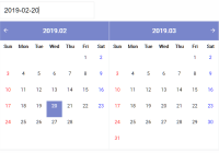
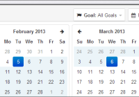
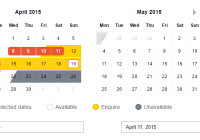
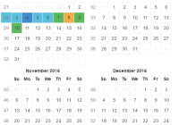
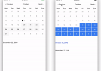
CalendarList

<CalendarList /> is scrollable semi-infinite calendar composed of <Calendar /> components. Currently it is possible to scroll 4 years back and 4 years to the future. All paramters that are available for <Calendar /> are also available for this component. There are also some additional params that can be used:
<CalendarList // Callback which gets executed when visible months change in scroll view. Default = undefined onVisibleMonthsChange={(months) => {console.log('now these months are visible', months);}} // Max amount of months allowed to scroll to the past. Default = 50 pastScrollRange={50} // Max amount of months allowed to scroll to the future. Default = 50 futureScrollRange={50} // Enable or disable scrolling of calendar list scrollEnabled={true} // Enable or disable vertical scroll indicator. Default = false showScrollIndicator={true} ...calendarParams />Horizontal CalendarList

You can also make the CalendarList scroll horizontally. To do that you need to pass specific props to the CalendarList:
<CalendarList // Enable horizontal scrolling, default = false horizontal={true} // Enable paging on horizontal, default = false pagingEnabled={true} // Set custom calendarWidth. calendarWidth={320} ...calendarListParams ...calendarParams />Agenda

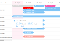
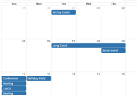
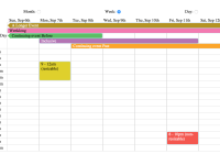
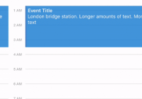
An advanced agenda component that can display interactive listings for calendar day items.
<Agenda // the list of items that have to be displayed in agenda. If you want to render item as empty date // the value of date key kas to be an empty array []. If there exists no value for date key it is // considered that the date in question is not yet loaded items={ {'2012-05-22': [{text: 'item 1 - any js object'}], '2012-05-23': [{text: 'item 2 - any js object'}], '2012-05-24': [], '2012-05-25': [{text: 'item 3 - any js object'},{text: 'any js object'}], }} // callback that gets called when items for a certain month should be loaded (month became visible) loadItemsForMonth={(month) => {console.log('trigger items loading')}} // callback that fires when the calendar is opened or closed onCalendarToggled={(calendarOpened) => {console.log(calendarOpened)}} // callback that gets called on day press onDayPress={(day)=>{console.log('day pressed')}} // callback that gets called when day changes while scrolling agenda list onDayChange={(day)=>{console.log('day changed')}} // initially selected day selected={'2012-05-16'} // Minimum date that can be selected, dates before minDate will be grayed out. Default = undefined minDate={'2012-05-10'} // Maximum date that can be selected, dates after maxDate will be grayed out. Default = undefined maxDate={'2012-05-30'} // Max amount of months allowed to scroll to the past. Default = 50 pastScrollRange={50} // Max amount of months allowed to scroll to the future. Default = 50 futureScrollRange={50} // specify how each item should be rendered in agenda renderItem={(item, firstItemInDay) => {return (<View />);}} // specify how each date should be rendered. day can be undefined if the item is not first in that day. renderDay={(day, item) => {return (<View />);}} // specify how empty date content with no items should be rendered renderEmptyDate={() => {return (<View />);}} // specify how agenda knob should look like renderKnob={() => {return (<View />);}} // specify what should be rendered instead of ActivityIndicator renderEmptyData = {() => {return (<View />);}} // specify your item comparison function for increased performance rowHasChanged={(r1, r2) => {return r1.text !== r2.text}} // Hide knob button. Default = false hideKnob={true} // By default, agenda dates are marked if they have at least one item, but you can override this if needed markedDates={{ '2012-05-16': {selected: true, marked: true}, '2012-05-17': {marked: true}, '2012-05-18': {disabled: true} }} // If provided, a standard RefreshControl will be added for "Pull to Refresh" functionality. Make sure to also set the refreshing prop correctly. onRefresh={() => console.log('refreshing...')} // Set this true while waiting for new data from a refresh refreshing={false} // Add a custom RefreshControl component, used to provide pull-to-refresh functionality for the ScrollView. refreshControl={null} // agenda theme theme={{ ...calendarTheme, agendaDayTextColor: 'yellow', agendaDayNumColor: 'green', agendaTodayColor: 'red', agendaKnobColor: 'blue' }} // agenda container style style={{}} />Authors
- Reza Ghorbani - Re-implementation - @rghorbanif
- Tautvilas Mecinskas - Initial code - @tautvilas
- Katrin Zotchev - Initial design - @katrin_zot
See also the list of contributors who participated in this project.
Contributing
Pull requests are welcome. npm run test and npm run lint before push.