React Native Flexi Radio Button
Simple and flexible Radio button for React Native App
Installation
npm i react-native-flexi-radio-button --save Usage
###Basic Example see full basic example
 |  |
|---|
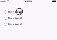
import {RadioGroup, RadioButton} from 'react-native-flexi-radio-button' onSelect(index, value){ this.setState({ text: `Selected index: ${index} , value: ${value}` }) } render(){ return( <View style={styles.container}> <RadioGroup onSelect = {(index, value) => this.onSelect(index, value)} > <RadioButton value={'item1'} > <Text>This is item #1</Text> </RadioButton> <RadioButton value={'item2'}> <Text>This is item #2</Text> </RadioButton> <RadioButton value={'item3'}> <Text>This is item #3</Text> </RadioButton> </RadioGroup> <Text style={styles.text}>{this.state.text}</Text> </View> ) }###Custom Example see full custom example
 |  |
|---|
modify in render()
<RadioGroup size={24} thickness={2} color='#9575b2' highlightColor='#ccc8b9' selectedIndex={1} onSelect = {(index, value) => this.onSelect(index, value)} > <RadioButton style={{alignItems:'center'}} value='Yo!! I am a cat.' > <Image style={{width:100, height: 100}} source={{uri:'https://cloud.githubusercontent.com/assets/21040043/18446298/fa576974-794b-11e6-8430-b31b30846084.jpg'}} /> </RadioButton> <RadioButton value='index1' > <Text>Start from item index #1</Text> </RadioButton> <RadioButton value='red color' color='red' > <Text>Red Dot</Text> </RadioButton> <RadioButton value='green color' color='green' > <Text>Green Dot</Text> </RadioButton> <RadioButton value='blue color' color='blue' > <Text>Blue Dot</Text> </RadioButton> </RadioGroup>Configuration
Radio Group:
| Property | Type | Default | Description |
|---|---|---|---|
| size | number | 20 | Size of the radio button |
| thickness | number | 1 | width of radio button border |
| color | string | '#007AFF' | color of radio button |
| activeColor | string | null | color of radio button when selected |
| highlightColor | string | null | background of radio button after selected |
| selectedIndex | number | null | default selected index of radio group, can be changed to new value or to null for clear selection |
| style | object | null | Custom styles to be applied if supplied |
| onSelect | function(index, value) | null | function to be invoked when radio button is selected |
Radio Button:
| Property | Type | Default | Description |
|---|---|---|---|
| value | any | null | value will be passed on callback onSelect as second argument |
| style | object | null | Styles to be applied on 'RadioButton' component |
| color | string | same as 'RadioGroup' component | color of radio dot |
| disabled | bool | false | If true, disable all interactions for this component. |