Tiny, simple, fast react forms using the new context API (Provider/Consumer pair).
React-minimal-form is:
- A small package (only 5kb!)
- Really easy to use, while also supporting complex forms
- Generic! You can build your own form components with our provided HOC (or use our preconfigured, unstyled form elements)
- Fast. Yes, even with hundreds of form elements on one page.
- Almost dependency free! Well, let's not count react
😇 . Right now the only dependency is a package to make the new context API backwards compatible for older versions of react. We plan to remove it in the future. - Compatible with your version of React. While we use the new context API, older versions of react are supported.
install
npm i --save react-minimal-form
Usage
Building a form
Building a form in React shouldn't be hard. With react-minimal-form, you could even call it fun again.
Here's how it works...
Change handling & input values for form components are provided by the <Form> component by leveraging the new React context API. It works, however deeply nested these components are.
This means it is possible to render a form spread out over different routes with react-router, allowing you to build very complex flows while still maintaining your form state in one place.
Internally, Form is a context Provider. A higher order component, makeFormElement is the context Consumer.
Called with any react component, the HOC will make sure values & change events are handled accordingly. makeFormElement is wrapped around all our exposed form elements.
By implementing a context-aware shouldComponentUpdate lifecycle in makeFormComponent that does not break other functionality such as prop updates, react-minimal-form works blazingly fast, even with hundreds of form elements on one page.
Here's the code for a very basic form:
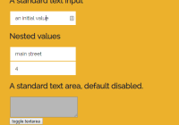
import React, { Component } from "react"; import { Form, TextInput, TextArea, RadioGroup, Checkbox } from "react-minimal-form"; // generate a bunch of textinputs to gauge performance const AllTextinputs = [...Array(300)].map((_, i) => <TextInput key={i} id={`myTextInput${i}`}/>); class App extends Component { constructor() { super(); this.state = { enabled: false, // formData can be provided initially, but this is not necessary. formData: { myTextInput: "an initial value", // initially, value "three" is checked in this radiogroup firstRadioGroup: "three", mycheckbox: true, address: { street: 'mainstreet' } }, }; } handleChange = formData => { this.setState({ formData, }); } render() { return ( <Form formData={this.state.formData} onChange={this.handleChange} onSubmit={data => /* do things with data */} > <TextInput id="myTextInput" /> <TextInput id="address.street" /> {AllTextinputs} <TextArea disabled={!this.state.enabled} id="myOtherInput" /> <button onClick={() => this.setState({ enabled: !this.state.enabled })}>enable</button> <RadioGroup id={"firstRadioGroup"} data={[ // all other domprops work in these objects { value: "one", label: "first choice" }, { value: "two", label: "second choice" }, { value: "three", label: "third choice" }, ]} /> <Checkbox id="mycheckbox" /> <label htmlFor="mycheckbox">checkbox label</label> </Form> ); } } export default App;Custom form elements
This library exposes a couple of generic, minimalistic form components such as a textinput, textarea,... that automatically work with <Form>.
However, with our exposed HOC makeFormElement, you can build your own form inputs as well. As explained, it handles the onChange & value prop for you, but obviously you must pass it through to your own custom input elements as well.
This allows you to build your own styled form inputs, where you can implement your own custom behavior.
import React from "react"; import { makeFormElement } from "react-minimal-form"; const TextInput = (props) => { return ( <input type={"text"} {...props} /> ); }; export default makeFormElement(TextInput);Nested paths
As of react-minimal-form v1, it's possible to identify nested values for your formData with a dot-separated string: (pseudocode)
state = { formData: { address: { street: 'some street' } } } <Form formData={state.formData}> <TextInput id="address.street"> Validation
Right now, we leave form validation up to you. It is trivial to implement for example a joi (or any other validator) scheme in the onChange or the onSubmit callbacks.
To get an overview of touched fields, simply look at all the keys that are currently available in formData.
Documentation
<Form>
Form is a controlled component. Supply an onChange & formData prop to make it work.
| Property | Type | Required | Description |
|---|---|---|---|
| children | any | no | Any form element |
| onChange | function | yes | Callback executed on change of every form element |
| onSubmit | function | yes | Callback executed on form submit |
| formData | object | yes | Object with all the form data |
Form elements
All html properties are passed to a form element. In addition, these props are available:
| Property | Type | Required | Description |
|---|---|---|---|
| id | string | yes | A unique ID used by Form to handle changes and set values. This can be a dot-separated path to your nested form value |
| onChange | function | no | Add your own custom onChange handler as well. Will execute after the form change. Params: id, value |