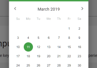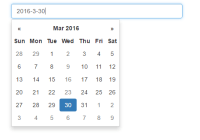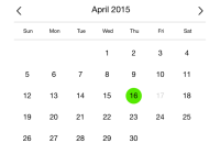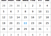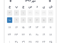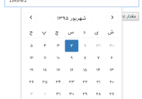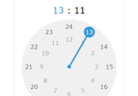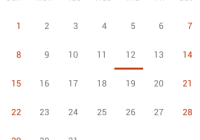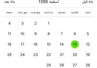
React Native Jalaali (Persian) Calendar


This is a Jalaali (Persian) Calendar Picker Component for React Native

The package is both Android and iOS compatible.
Installation
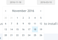
$ yarn add react-native-persian-calendar-picker
or
$ npm install react-native-persian-calendar-picker --save
Prerequisites
CalendarPicker requires Moment JS. Date props may be anything parseable by Moment: Javascript Date, Moment date, or ISO8601 datetime string.
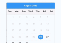
Usage
How to use it:
const React = require('react'); const { StyleSheet, Text, View, } = require('react-native'); const PersianCalendarPicker = require('react-native-persian-calendar-picker'); class PersianCalendarPickerExample extends React.Component { constructor(props) { super(props); this.state = { selectedStartDate: null, }; this.onDateChange = this.onDateChange.bind(this); } onDateChange(date) { this.setState({ selectedStartDate: date }); } render() { const { selectedStartDate } = this.state; const startDate = selectedStartDate ? selectedStartDate.toString() : ''; return ( <View style={styles.container}> <PersianCalendarPicker onDateChange={this.onDateChange} /> <View> <Text>SELECTED DATE:{ startDate }</Text> </View> </View> ); } } const styles = StyleSheet.create({ container: { flex: 1, backgroundColor: '#FFFFFF', marginTop: 100, }, });PersianCalendarPicker props
| Prop | Type | Description |
|---|---|---|
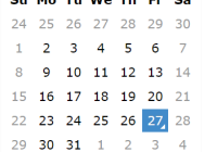
isRTL | Boolean | Optional. Force layout to be RTL. Default is false |
weekdays | Array | Optional. List of week days. Eg. ['Sat', 'Sun', ...] Must be 7 days |
months | Array | Optional. List of months names. Eg. ['Farvardin', 'Ordibehesht', ...] Must be 12 months |
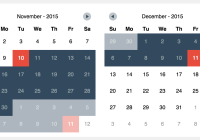
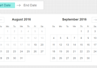
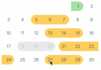
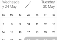
allowRangeSelection | Boolean | Optional. Allow to select date ranges. Default is false |
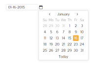
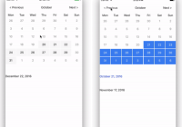
previousTitle | String | Optional. Title of button for previous month. Default is Previous |
nextTitle | String | Optional. Title of button for next month. Default is Next |
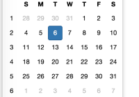
selectedDayColor | String | Optional. Color for selected day |
selectedDayStyle | ViewStyle | Optional. Style for selected day. May override selectedDayColor. |
selectedDayTextColor | String | Optional. Text color for selected day |
selectedRangeStartStyle | ViewStyle | Optional. Style for range selected start day. |
selectedRangeEndStyle | ViewStyle | Optional. Style for range selected end day. |
selectedRangeStyle | ViewStyle | Optional. Style for all days in range selection. |
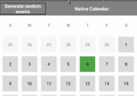
disabledDates | Array | Optional. Specifies dates that cannot be selected. Array of Dates. |
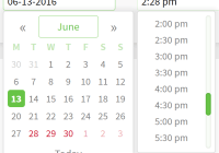
selectedStartDate | Date | Optional. Specifies a selected Start Date. |
selectedEndDate | Date | Optional. Specifies a selected End Date. |
minRangeDuration | Number or Array | Optional. Specifies a minimum range duration when using allowRangeSelection. Can either pass a number to be used for all dates or an Array of objects if the minimum range duration depends on the date {date: Moment-parsable date, minDuration: Number |
maxRangeDuration | Number or Array | Optional. Specifies a maximum range duration when using allowRangeSelection. Can either pass a number to be used for all dates or an Array of objects if the maximum range duration depends on the date {date: Moment-parsable date, maxDuration: Number |
todayBackgroundColor | String | Optional. Background color for today. Default is #cccccc |
todayTextStyle | TextStyle | Optional. Text styling for today. |
textStyle | Object | Optional. Style overall text. Change fontFamily, color, etc. |
customDatesStyles | Array | Optional. Style individual date(s). Array of objects {date: Moment-parseable date, containerStyle: ViewStyle, style: ViewStyle, textStyle: TextStyle} |
scaleFactor | Number | Optional. Default (375) scales to window width |
minDate | Date | Optional. Specifies minimum date to be selected |
maxDate | Date | Optional. Specifies maximum date to be selected |
initialDate | Date | Optional. Date that calendar opens to. Defaults to today. |
width | Number | Optional. Width of CalendarPicker's container. Defaults to Dimensions width. |
height | Number | Optional. Height of CalendarPicker's container. Defaults to Dimensions height. |
swipeConfig | Object | Optional. Config passed to Swiper. |
enableSwipe | Boolean | Optional. Whether to enable swiping. Default is true |
enableDateChange | Boolean | Optional. Whether to enable pressing on day. Default is true |
onDateChange | Function | Optional. Callback when a date is selected. Returns Moment date as first parameter. |
onMonthChange | Function | Optional. Callback when Previous / Next month is pressed. Returns Moment date as first parameter. |
onSwipe | Function | Optional. Callback when swipe event is triggered. Returns swipe direction as first parameter. |
Styles
Some styles will overwrite some won't. For instance:
- If you provide textStyle with fontFamily and color, out of ranges dates will not apply your color, just fontFamily.
Order of precedence:
- defaultColor => textStyle => selectedDayColor
- defaultTodayBackgroundColor => todayBackgroundColor
- defaultBackgroundColor => selectedDayColor
- defaultTextStyles => textStyle => selectedDayTextColor
Suggestions?
Open Issues. Submit PRs.