


React-Time-Picker
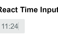
A time picker for your React app.
- Supports virtually any language
- No moment.js needed
tl;dr
- Install by executing
npm install react-time-pickeroryarn add react-time-picker. - Import by adding
import TimePicker from 'react-time-picker'. - Use by adding
<TimePicker />. UseonChangeprop for getting new values.
Demo
Minimal demo page is included in sample directory.
Online demo is also available!
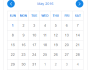
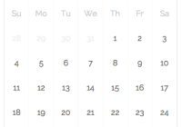
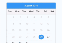
Looking for a date picker or a datetime picker?
React-Time-Picker will play nicely with React-Date-Picker and React-DateTime-Picker. Check them out!
Getting started
Compatibility
Your project needs to use React 16 or later. If you use older version of React, please refer to the table below to find suitable React-Time-Picker version.
| React version | Newest supported React-Time-Picker |
|---|---|
| >16.0 | latest |
| >15.0 | 2.1.1 |
Legacy browsers
If you need to support legacy browsers like Internet Explorer 10, you will need to use Intl.js or another Intl polyfill along with React-Date-Picker.
Installation
Add React-Time-Picker to your project by executing npm install react-time-picker or yarn add react-time-picker.
Usage
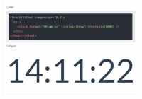
Here's an example of basic usage:
import React, { Component } from 'react'; import TimePicker from 'react-time-picker'; class MyApp extends Component { state = { time: '10:00', } onChange = time => this.setState({ time }) render() { return ( <div> <TimePicker onChange={this.onChange} value={this.state.time} /> </div> ); } }Custom styling
If you don't want to use default React-Time-Picker styling to build upon it, you can import React-Time-Picker by using import TimePicker from 'react-time-picker/dist/entry.nostyle'; instead.
User guide
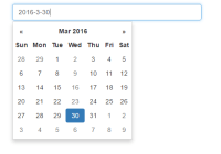
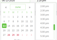
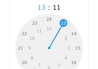
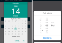
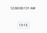
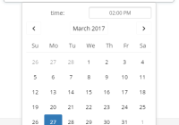
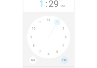
TimePicker
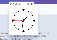
Displays an input field complete with custom inputs, native input and a clock.
Props
| Prop name | Description | Default value | Example values |
|---|---|---|---|
| amPmAriaLabel | aria-label for the AM/PM select input. | n/a | "Select AM/PM" |
| className | Class name(s) that will be added along with "react-time-picker" to the main React-Time-Picker <div> element. | n/a |
|
| clearAriaLabel | aria-label for the clear button. | n/a | "Clear value" |
| clearIcon | Content of the clear button. Setting the value explicitly to null will hide the icon. | (default icon) |
|
| clockAriaLabel | aria-label for the clock button. | n/a | "Toggle clock" |
| clockClassName | Class name(s) that will be added along with "react-clock" to the main React-Clock <time> element. | n/a |
|
| clockIcon | Content of the clock button. Setting the value explicitly to null will hide the icon. | (default icon) |
|
| disabled | Whether the time picker should be disabled. | false | true |
| disableClock | When set to true, will remove the clock and the button toggling its visibility. | false | true |
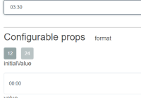
| format | Input format based on Unicode Technical Standard #35. Supported values are: H, HH, h, hh, m, mm, s, ss, a. | n/a | "h:m:s a" |
| hourAriaLabel | aria-label for the hour input. | n/a | "Hour" |
| isOpen | Whether the clock should be opened. | false | true |
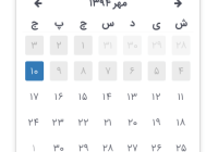
| locale | Locale that should be used by the time picker and the clock. Can be any IETF language tag. | User's browser settings | "hu-HU" |
| maxDetail | How detailed time picking shall be. Can be "hour", "minute" or "second". | "minute" | "second" |
| maxTime | Maximum time that the user can select. | n/a |
|
| minTime | Minimum date that the user can select. | n/a |
|
| minuteAriaLabel | aria-label for the minute input. | n/a | "Minute" |
| name | Input name. | "time" | "myCustomName" |
| nativeInputAriaLabel | aria-label for the native time input. | n/a | "Time" |
| onChange | Function called when the user picks a valid time. | n/a | (value) => alert('New time is: ', value) |
| onClockClose | Function called when the clock closes. | n/a | () => alert('Clock closed') |
| onClockOpen | Function called when the clock opens. | n/a | () => alert('Clock opened') |
| required | Whether date input should be required. | false | true |
| secondAriaLabel | aria-label for the second input. | n/a | "Second" |
| value | Input value. | n/a |
|
Clock
TimePicker component passes all props to React-Clock, with the exception of className (you can use clockClassName for that instead). There are tons of customizations you can do! For more information, see Clock component props.
License
The MIT License.
Author
 | Wojciech Maj [email protected] http://wojtekmaj.pl |