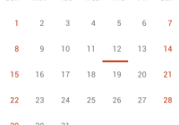
Things-calendar


Installation
npm install things-calendar Usage
import ThingsCalendar from 'things-calendar'; <ThingsCalendar ref={calendar => this.calendar = calendar} show={true} onSelect={(date) => console.log(date)} />Note: This library requires react
Configuration
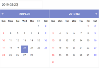
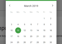
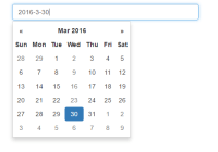
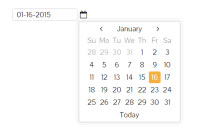
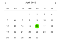
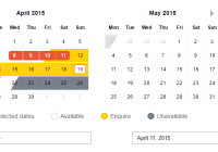
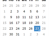
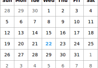
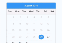
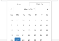
Things-calendar leaves the heavy lifting up to pikaday and supports every feature pikaday has to offer:
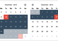
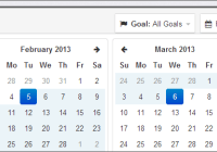
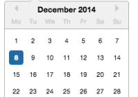
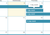
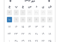
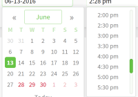
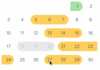
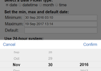
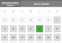
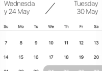
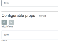
fieldbind the datepicker to a form fieldtriggeruse a different element to trigger opening the datepicker, see [trigger example][] (default tofield)boundautomatically show/hide the datepicker onfieldfocus (defaulttrueiffieldis set)ariaLabeldata-attribute on the input field with an aria assistance tekst (only applied whenboundis set)positionpreferred position of the datepicker relative to the form field, e.g.:top right,bottom rightNote: automatic adjustment may occur to avoid datepicker from being displayed outside the viewport, see [positions example][] (default to 'bottom left')repositioncan be set to false to not reposition datepicker within the viewport, forcing it to take the configuredposition(default: true)containerDOM node to render calendar into, see [container example][] (default: undefined)formatthe default output format for.toString()andfieldvalue (requires [Moment.js][moment] for custom formatting)formatStrictthe default flag for moment's strict date parsing (requires [Moment.js][moment] for custom formatting)toString(date, format)function which will be used for custom formatting. This function will take precedence overmoment.parse(dateString, format)function which will be used for parsing input string and getting a date object from it. This function will take precedence overmoment.defaultDatethe initial date to view when first openedsetDefaultDatemake thedefaultDatethe initial selected valuefirstDayfirst day of the week (0: Sunday, 1: Monday, etc)minDatethe minimum/earliest date that can be selected (this should be a native Date object - e.g.new Date()ormoment().toDate())maxDatethe maximum/latest date that can be selected (this should be a native Date object - e.g.new Date()ormoment().toDate())disableWeekendsdisallow selection of Saturdays or SundaysdisableDayFncallback function that gets passed a Date object for each day in view. Should return true to disable selection of that day.yearRangenumber of years either side (e.g.10) or array of upper/lower range (e.g.[1900,2015])showWeekNumbershow the ISO week number at the head of the row (defaultfalse)pickWholeWeekselect a whole week instead of a day (defaultfalse)isRTLreverse the calendar for right-to-left languagesi18nlanguage defaults for month and weekday names (see internationalization below)yearSuffixadditional text to append to the year in the titleshowMonthAfterYearrender the month after year in the title (defaultfalse)showDaysInNextAndPreviousMonthsrender days of the calendar grid that fall in the next or previous months (default: false)enableSelectionDaysInNextAndPreviousMonthsallows user to select date that is in the next or previous months (default: false)numberOfMonthsnumber of visible calendarsmainCalendarwhennumberOfMonthsis used, this will help you to choose where the main calendar will be (defaultleft, can be set toright). Only used for the first display or when a selected date is not already visibleeventsarray of dates that you would like to differentiate from regular days (e.g.['Sat Jun 28 2017', 'Sun Jun 29 2017', 'Tue Jul 01 2017',])themedefine a classname that can be used as a hook for styling different themes, see [theme example][] (defaultnull)blurFieldOnSelectdefines if the field is blurred when a date is selected (defaulttrue)onSelectcallback function for when a date is selectedonOpencallback function for when the picker becomes visibleonClosecallback function for when the picker is hiddenonDrawcallback function for when the picker draws a new monthkeyboardInputenable keyboard input support (defaulttrue)
Configurations at runtime
import ThingsCalendar from 'things-calendar'; <ThingsCalendar ref={calendar => this.calendar = calendar} show={true} onSelect={this.onSelect} /> // Reset datepicker onSelect onSelect(date) { this.calendar.calendarPicker.goToToday(); this.calendar.calendarPicker.setDate(null); }For a full list of methods for the calendarPicker check out pikaday's official documentation
Special thanks to
Ionicons for an awesome icon set Ionicons
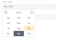
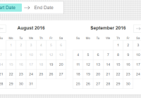
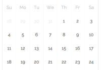
Calendar picker Pikaday
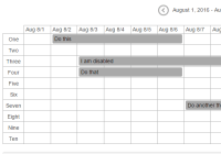
The best to-do app for mac on the market Things