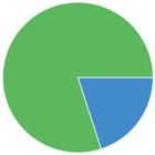
Angular Progress Pie
A simple pie progress indicator for AngularJS. Written in pure Angular, using SVG to render the progress indicator. Tiny, simple and no external dependencies.
Plunker Example
Contributing
If you have a feature or fix please submit a pull request! This repo follows JavaScript standard style, please make sure all pull requests comply to this before submitting them.

Installation
bower install angular-progress-pie --save
Usage
Make sure you inject the dependency into your project
angular.module('myApp', ['angular-progress-pie'])
Then you can use the directive by adding the progress-pie element to your HTML.
<progress-pie radius="{integer}" value="{integer}" min="{integer: optional, defaults to 0}" max="{integer: optional, defaults to 100}" invert-fill="{boolean: optional, defaults to false}" hide-background="{boolean: optional, defaults to false}"> </progress-pie> Options
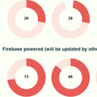
radius- Integer specifying the radius of the pie. Defaults to 50px.value- Integer percentage between 0 and 100 of how complete the pie is. (note the limits can be changed by settingmaxandmin)min- Integer lower bound ofvaluemax- Integer upper bound ofvalueinvert-fill- Boolean which determines if the pie builds up to a full pie, or shrinks from a full pie to nothing. Defaults tofalsewhich means the pie starts as nothing whenvalueis zero and becomes full whenvalueis 100.hide-background- Boolean which toggles the background on and off
Styling
You can style the pie using CSS
.progress-pie { fill: #EFEEDE } .progress-pie-background { fill: #FFCC03 }