Angular Trend


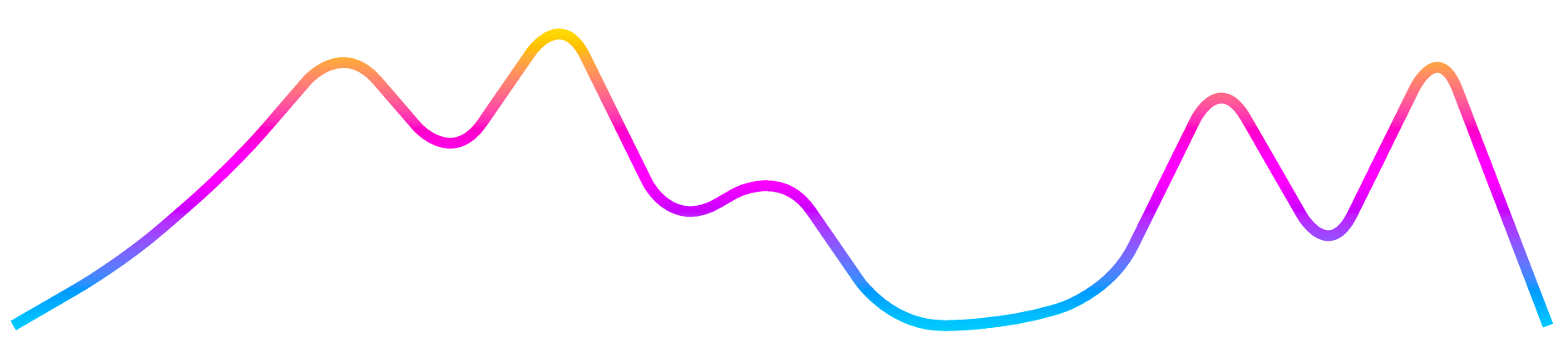
This is a port of the react-trend library by unsplash.
Demo
Check out the Angular Trend playground.
Features
- Simple. Integrate in seconds.
- Scalable. Uses SVG for sharp, scalable graphs. Will fill the parent container, or you can provide a fixed size.
- Beautiful. Built-in gradient support, and customizable smoothing.
- Animatable. Support for on-mount animations where the trend graph draws from left to right using Angular's native Animations library
- Tiny. gzips to <4kb.
Installation
$ npm install ngx-trendQuickstart
// app.module.ts import { NgModule } from '@angular/core'; import { TrendModule } from 'ngx-trend'; import { BrowserAnimationsModule } from '@angular/platform-browser/animations'; @NgModule({ imports: [ BrowserAnimationsModule, TrendModule, ], }) export class AppModule { } // your.component.ts import { Component } from '@angular/core'; @Component({ selector: 'your-component', template: ` <ngx-trend [data]="[0, 10, 5, 22, 3.6, 11]"></ngx-trend> `, }) export class YourComponent {} // That's it! // You can, of course, customize it. Check out the API Reference below. // Be sure to check out `autoDraw`, `gradient`, and `smoothing`.API Reference
SVG Props
By default, all properties not recognized by React Trend will be delegated to the SVG. The line inherits these properties if none of its own override them.
This means that, among other properties, you can use:
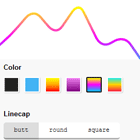
stroketo set a solid color,strokeWidthto change the default line thickness,strokeOpacityto create a transparent line,strokeLinecap/strokeLinejointo control the edges of your line,strokeDasharrayto create a dashed line, andstrokeDashoffsetto control where the dashes start.
autoDraw
| Type | Required | Default |
|---|---|---|
| boolean | ✕ | false |
Allow the line to draw itself on mount. Set to true to enable, and customize using autoDrawDuration and autoDrawEasing.
NOTE: This property uses strokeDasharray and strokeDashoffset under the hood to perform the animation. Because of this, any values you provide for those properties will be ignored.
Example
<ngx-trend [data]="data" autoDraw="true" autoDrawDuration="3000" autoDrawEasing="ease-in" ></ngx-trend>autoDrawDuration
| Type | Required | Default |
|---|---|---|
| number | ✕ | 2000 |
The amount of time, in milliseconds, that the autoDraw animation should span.
This prop has no effect if autoDraw isn't set to true.
Example
<ngx-trend [data]="data" autoDraw="true" autoDrawDuration="3000" autoDrawEasing="ease-in" ></ngx-trend>autoDrawEasing
| Type | Required | Default |
|---|---|---|
| string | ✕ | ease |
The easing function to use for the autoDraw animation. Accepts any transition timing function within the CSS spec (eg. linear, ease, ease-in, cubic-bezier...).
This prop has no effect if autoDraw isn't set to true.
Example
<ngx-trend [data]="data" autoDraw="true" autoDrawDuration="3000" autoDrawEasing="ease-in" ></ngx-trend>data
| Type | Required | Default | |
|---|---|---|---|
| number[] | object[] | ✓ | undefined |
The data accepted by React Trend is incredibly simple: An array of y-axis values to graph.
React Trend takes care of normalization, so don't worry about ensuring the data is in a specific range.
This does mean that all data points will be evenly-spaced. If you have irregularly-spaced data, it will not be properly represented.
As of v1.2.0, you may supply an array of data objects with a value property.
Example
<ngx-trend [data]="[120, 149, 193.4, 200, 92]"></ngx-trend> <ngx-trend [data]="[{ value: 4 }, { value: 6 }, { value: 8 }]"></ngx-trend>gradient
| Type | Required | Default |
|---|---|---|
| string[] | ✕ | undefined |
React Trend supports vertical gradients. It accepts an array of 2+ color values, and will fade evenly between them from the bottom up.
color can be specified as any SVG-supported format (named, rgb, hex, etc).
Example
<ngx-trend [gradient]="['#0FF', '#F0F', '#FF0']"></ngx-trend>height
| Type | Required | Default |
|---|---|---|
| number | ✕ | undefined |
Set an explicit height for your SVG. By default it ensures a 1:4 aspect ratio with the width, and the width expands to fill the container.
Note that in most cases it is sufficient to leave this blank, and just control the size of the parent container.
Example
<ngx-trend width="200" height="200"></ngx-trend>padding
| Type | Required | Default |
|---|---|---|
| number | ✕ | 8 |
If you set a very large strokeWidth on your line, you may notice that it gets "cropped" towards the edges. This is because SVGs don't support overflow.
By increasing this number, you expand the space around the line, so that very thick lines aren't cropped.
In most cases you don't need to touch this value.
Example
<ngx-trend strokeWidth="20" [padding]="18"></ngx-trend>radius
| Type | Required | Default |
|---|---|---|
| number | ✕ | 10 |
When using smoothing, you may wish to control the amount of curve around each point. For example, a 0 radius is equivalent to not having any smoothing at all, where an impossibly-large number like 10000 will ensure that each peak is as curved as it can possibly be.
This prop has no effect if smooth isn't set to true.
Example
<ngx-trend smooth="true" radius="20" strokeWidth="4"></ngx-trend>smooth
| Type | Required | Default |
|---|---|---|
| boolean | ✕ | false |
Smooth allows the peaks to be 'rounded' out so that the line has no jagged edges.
By tweaking the radius prop, you can use this as a subtle prop to tone down the sharpness, or you can set a very high radius to create a snake-like line.
Example
<ngx-trend smooth="true" radius="20" strokeWidth="4"></ngx-trend>width
| Type | Required | Default |
|---|---|---|
| number | ✕ | undefined |
Set an explicit width for your SVG. By default it ensures a 1:4 aspect ratio with the height, expanding to fill the width of the container.
Note that in most cases it is sufficient to leave this blank, and just control the width of the parent container.
Example
<ngx-trend width="200" height="200"></ngx-trend>


