🌙 ng-animate
ng-animate is a collection of cool, reusable and flexible animations for Angular. It implements all the animations in animate.css, but with the power and flexibility of Angular animations instead of CSS.
Note: the library requires Angular 4.2+, which introduced different new animation APIs needed by
ng-animate.
Demo
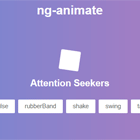
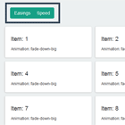
The demo of the animations is available at https://jiayihu.github.io/ng-animate/.
Usage
npm install ng-animate --save Example
Import the animation from the package and pass it to your Angular component using useAnimation:
// my-component.component.ts import { trigger, transition, useAnimation } from '@angular/animations'; import { bounce } from 'ng-animate'; @Component({ selector: 'my-component', templateUrl: 'my-component.component.html', animations: [ trigger('bounce', [transition('* => *', useAnimation(bounce))]) ], }) export class MyComponent { bounce: any; }<!-- my-component.component.html --> <div [@bounce]="bounce"></div>Note: Make sure to have included BrowserAnimationsModule in your AppModule and the web-animation.js polyfill.
It's also possible to import only a subset of the animations:
import { bounce } from 'ng-animate/lib/bouncing';Animation params
All the animations provided by ng-animate support at least two optional params timing and delay to specify the animation duration and delay. Default value for timing is usually 1s and 0s for delay.
You can pass the params object using the Javascript API or within the component template:
@Component({ selector: 'my-component', templateUrl: 'my-component.component.html', animations: [ trigger('bounce', [transition('* => *', useAnimation(bounce, { // Set the duration to 5seconds and delay to 2seconds params: { timing: 5, delay: 2 } }))]) ], }) export class MyComponent {}Using a template can achieve the same result, but you'll have access to the component context:
<div [@bounce]="{ value: bounce, params: { timing: myTiming || 5, delay: myDelay || 2 } }"></div>Animations
All the animations are organized by their group. Many of them have additional params other than timing/delay: refer to Advanced Usage for more details. Nevertheless you can probably ignore them if you're happy with how they are by default.
Attention seekers
bounceflashpulserubberBandshakeswingtadawobblejello
Bouncing
bounceInbouceOut. Additional param:scale
The following bouncing animations have additional params a, b, c, d for translate
bounceInDownbounceInLeftbounceInRightbounceInUpbounceOutDownbounceOutLeftbounceOutRightbounceOutUp
Fading
All fading animations have additional params fromOpacity, toOpacity for opacity transition and a, b for translate.
fadeInfadeInDownfadeInLeftfadeInRightfadeInUpfadeOutfadeOutDownfadeOutLeftfadeOutRightfadeOutUp
Sliding
Sliding animations are basically fading animations without a change of opacity. They can also receive the same params.
slideInDownslideInLeftslideInRightslideInUpslideOutDownslideOutLeftslideOutRightslideOutUp
Flippers
flipflipInXflipInYflipOutXflipOutY
LightSpeed
lightSpeedInlightSpeedOut
Rotating
All rotating animations have additional params fromOpacity, toOpacity for opacity transition, origin for transform-origin and degrees for rotate3d.
rotateInrotateInDownLeftrotateInDownRightrotateInUpLeftrotateInUpRightrotateOutrotateOutDownLeftrotateOutDownRightrotateOutUpLeftrotateOutUpRight
Specials
jackInTheBoxhingerollInrollOut
Zooming
zoomInzoomOut
The following zooming animations have additional params a, b for translate
zoomInDownzoomInLeftzoomInRightzoomInUpzoomOutDownzoomOutLeftzoomOutRightzoomOutUp
Advanced params
Many of the animations support also other params like scale, fromOpacity, toOpacity and much more, allowing extremely flexible usage and customisation if you're not happy with default values.
Single letters like a, b, c, d are used for the steps of some animations: a is the starting value, d is the ending.
The animated property they refer to depends on the animation and the direction: usually translate on axis Y from -Down/-Up, axis X for -Left/-Right.
useAnimation(bounceInDown, { params: { timing: 5, // Specify granular values for `translate` on axis Y during 'bounceInDown' a: '-3000px', b: '25px', c: '-10px', d: '5px', } })