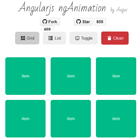
angular-notification-icons
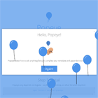
Add notification popups to any element http://jemonjam.com/angular-notification-icons

<notification-icon count='scopeVariable'> <i class="fa fa-envelope-o fa-3x"></i> </notification-icon>Getting Started
1. Install components
Bower:
bower install angular-notification-icons --savenpm:
npm install angular-notification-icons --save2. Add css and scripts
Bower:
<link rel="stylesheet" href="bower_components/angular-notification-icons/dist/angular-notification-icons.min.css"> <script src="bower_components/angular/angular.js"></script> <script src="bower_components/angular-animate/angular-animate.js"></script> <!-- Not required, but recommended --> <script src="bower_components/angular-notification-icons/dist/angular-notification-icons.min.js"></script>npm:
<link rel="stylesheet" href="node_modules/angular-notification-icons/dist/angular-notification-icons.min.css"> <script src="bower_components/angular/angular.js"></script> <script src="bower_components/angular-animate/angular-animate.js"></script> <!-- Not required, but recommended --> <script src="bower_components/angular-notification-icons/dist/angular-notification-icons.min.js"></script>3. Add a dependency to your app
angular.module('MyApp', ['angular-notification-icons', 'ngAnimate']); // ngAnimate is only required if you want animations 4. Add a notification-icon element around any other element
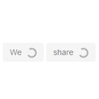
<notification-icon count='scopeVariable'> ... </notification-icon>angular-notification-icons is an angular directive that adds a notification popup on top of any element. The counter is tied to a scope variable and updating the count is as easy as updating the scope variable. angular-notification-icons comes with a number of canned animations and a default style, but it is easy to add your own styles or custom animations. angular-notification-icons can also optionally listen for DOM events and clear the count on a DOM event.
angular-notification-icons has been tested with angular 1.3.x, 1.4.x, and 1.5.x. It will probably work with most recent versions of angular and angular-animate.
Demo App
To run the demo app, run npm install, bower install and then gulp serve.
Webpack and ES6
angular-notification-icons can be used in a webpack Angular application. To the top of your main application, add:
import angular from 'angular' import 'angular-animate' import 'angular-notification-icons' import 'angular-notification-icons/dist/angular-notification-icons.css' // Can also use less with a less-loader: // import 'angular-notification-icons/src/less/angular-notification-icons.less' Basic Usage
Counter
The only required attribute for angular-notification-icons is 'count'. This uses two-way binding to bind a scope variable to the isolate scope. This makes updating the count very simple, since your controller has full control over how it's set.
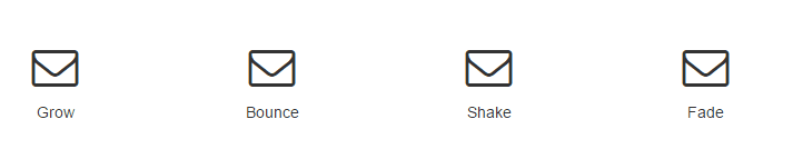
<notification-icon count="myScopeVariable"> ... </notification-icon>When myScopeVariable is <= 0, the notification icon will not be visible. Once myScopeVariable > 0, the notification will show up.
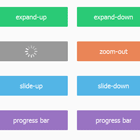
Built-in Animations
angular-notification-icons comes with a few prebuilt animations for your use. Note that these are only available if you are using the ngAnimate module
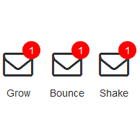
- bounce
- fade
- grow
- shake
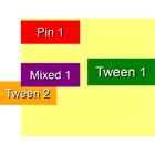
There are three separate animation events: appear, update, and disappear. Appear is triggered when the counter goes from 0 to non-zero. Update is trigger when the counter increments or decrements but does not go to or from zero. Disappear is triggered when the counter goes from non-zero to zero. The default animation for appear and update is grow, and there is no default set for disappear. A common case is to use the same animation for appear and update, and you can use the 'animation' attribute for this case.
<notification-icon count="myCount" animation='bounce'> ... </notification-icon>This will create a notification that bounces when appearing and when the counter is updated. All three animation events can also be set explicitly:
<notification-icon count="myCount" appear-animation='bounce' update-animation='shake' disappear-animation='fade'> ... </notification-icon>This will create a notification that bounces when appearing, shakes when updates, and fades away when disappearing. Because all of these attributes do not use two-way binding, if you're using a variable for the animation, you'll want to use {{myVariable}} when binding.
DOM Events
angular-notification-icons can respond to DOM events to clear the counter. This clears the scope variable and runs an $apply. Your controller can $watch the variable if you want to react to clearing the counter.
<notification-icon count="myCount" clear-trigger='click'> ... </notification-icon>Will cause the count to be cleared upon click. Any DOM event name is valid as a clear-trigger. Because clear-trigger does not use two-way binding, if you're using a variable as the trigger, you'll want to use {{myVariable}} when binding.
Customizing
angular-notification-icons was designed to be very simple to customize so that it fits the feel of your app.
Adding Custom Style
Adding custom style is done via CSS. When the directive is created, it adds a few elements to the DOM
<notification-icon> <div class="angular-notification-icons-container"> <div class="angular-notification-icons-icon overlay"> <div class="notification-inner"> <!-- Your transcluded element here --> </div> </div> </div> </notification-icon>You can add styling at any level. For instance, if you just want to change the look of the notifaction icon, you can add to your app's css:
.angular-notification-icons-icon { left: -10px; background: yellow; color: black; width: 30px; height: 30px; font-weight: bolder; font-size: 1.2em; }Which will make the notification icon appear on the left with a yellow background and bold, larger text. Live Demo
Adding Custom Animations
Adding a custom animation is as simple as adding custom styles. angular-notification-icons uses the standard angular-animate module for providing animations. This means that you can use either CSS keyframes or CSS transitions to build animations.
.angular-notification-icons-icon.my-custom-animation { transition:0.5s linear all; } .angular-notification-icons-icon.my-custom-animation-add { background: black; color: white; } .angular-notification-icons-icon.my-custom-animation-add-active { background: yellow; color: black; } .angular-notification-icons-icon.my-custom-keyframe-animation { animation: custom_keyframe_animation 0.5s; } @keyframes custom_keyframe_animation { from { opacity: 0; } to { opacity: 1; } }Adding your animation is as simple as specifying it by name on the directive
<notification-icon count='myCount' animation='my-custom-animation' disappear-animation='my-custom-keyframe-animation'> ... </notification-icon>Advanced Usage
hideCount
If you don't want the count number appear, you can hide the count using the 'hide-count' attribute
<notification-icon count='myCount' hide-count='true'> ... </notification-icon>When myCount > 0, the notification icon will be visible, but the number will be hidden. When myCount <= 0, the icon will be hidden as normal.
alwaysShow
If you always want the count number to appear, even when 0 or negative, you can add the 'always-show' attribute
<notification-icon count='myCount' always-show='true'> ... </notification-icon>Pill shape
When the number of notifications grows large enough, the icon changes to a pill shape. This is achieved by adding the css class wide-icon to the icon's div. By default, the shape transitions to a pill once the count is greater than or equal to 100, but is configurable via the attribute 'wide-threshold'.
<notification-icon count='myCount' wide-threshold='10'> ... </notification-icon>This will change the shape to a pill once myCount >= 10.
Helping Out
Pull requests are gladly accepted! Be sure to run npm run build to ensure that your PR is lint-free and all the tests pass.