nw-react-slider
A React Slider
Authors: Drew Schuster & Greg Mathews


⚠️ THIS PROJECT IS NO LONGER MAINTAINED ⚠️
This project is no longer being actively maintained. There are some great alternatives to this project out there; we are using rc-slider.
Demo
To run the demo locally with live reload functionality:
npm install PORT=3000 npm start Then open localhost:3000 in a browser.
To run the demo locally without live reload:
npm install PORT=3000 npm run start-static Installation
The easiest way to use nw-react-slider is to install it from NPM and include it in your own build process (Webpack, Browserify, etc)
$ npm install --save nw-react-slider You can also use the standalone UMD build by including dist/nw-react-slider.js or dist/nw-react-slider.min.js, as well as the styles from dist/nw-react-slider.css or dist/nw-react-slider.min.css.
Example usage
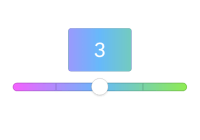
/** @jsx React.DOM */ var React = require('react') var ReactDOM = require('react-dom') var Slider = require('nw-react-slider') var App = React.createClass({ handleChange: function () { console.log('Change'); }, render: function () { return ( <Slider value={0} min={0} max={10} ticks markers={[{value: 3, label: 'Three'}, {value: 8, label: 'Eight'}]} onChange={this.handleChange}/> ) } }) ReactDOM.render(<App/>, document.body)Details
A <NWReactSlider/> element is an improved upon version of an HTML5 range type input. You are able to smoothly drag the handle no matter how large or small the number of your steps are, and you are able to style it more effectively. You can also add tick marks to your steps if you wish. <NWReactSlider/> is also compatible with IE9.
Styles
Styles are generated from src/slider.less. That can be pulled directly into your build process if you use less already, or you can pull the generated CSS from either dist/nw-react-slider.css or dist/nw-react-slider.min.css.
API
Props:
value: (React.PropTypes.number) Determines the start position of your slider. Must be a number between min and max. Default value is min.
min: (React.PropTypes.number) The smallest number you want in the range. Default min is 0.
max: (React.PropTypes.number) The largest number you want in the range. Default max is 10.
ticks: (React.PropTypes.bool) A boolean to show tick marks on the slider. Default true.
markerLabel: (React.PropTypes.array) An array filled with values and labels for which position on the slider track you want to mark
onChange: (React.PropTypes.func) A function that will be fired when the position of the handle changes. Default none
displayFollowerPopover: (React.PropTypes.bool) A boolean to show a floating label below the handle. Default false
Contributing
See CONTRIBUTING.md
License
MIT


