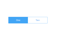
.
<SegmentedControl> – a good-lookin' segmented control React component
<SegmentedControlWithoutStyles> - a version that doesn't import the stylesheet (if <SegmentedControl> doesn't work in your build system—eg Next.js)
<FormsySegmentedControl> – a version for Formsy
UX background
In iOS, a segmented control is usually used to display different views (the equivalent of tabs in material design). However, segmented controls are increasingly being used in lieu of plain radio buttons or select inputs (dropdowns, or material menus). See for instance the designer lukew's recommendations:
Other good choices are radio groups, like this Ionic component, or a button list, as used in the Yo or Thumbtack apps, that looks the same, except on click, instead of seeing a checkmark, you're taken to the next screen.
A similar component in material design is the toggle button.
Component
Demo: lorensr.me/segmented-control
Usage
npm install --save segmented-controlPlain
<SegmentedControl> props:
className: PropTypes.string: optional customclassNamefor the container in addition to the defaultsegmented-controlclass.name: PropTypes.string.isRequired: name of the radio<input>s. Also the attribute included in the first argument of Formsy'sonSubmit.options: PropTypes.array.isRequired: Maximum length 10, each element an object of the form:label: display textvalue: value passed tosetValueand Formsy'sonSubmitdefault: true: one object must have thisdisabled: true: optional
style: PropTypes.object: common styles are width and colorsetValue: PropTypes.func: callback on input change, passed the value string. Called once initially with the default value on mount.
import { SegmentedControl } from 'segmented-control' <SegmentedControl name="oneDisabled" options={[ { label: "One", value: "one", disabled: true }, { label: "Two", value: "two" }, { label: "Three", value: "three", default: true }, { label: "Four", value: "four" } ]} setValue={newValue => this.doSomething(newValue)} style={{ width: 400, color: '#ab47bc' }} // purple400 />Formsy
<FormsySegmentedControl> has the same props, but includes Formsy.Mixin and calls Formsy's setValue, so that the value is included in onSubmit (see the event triggered by submitting the demo form). In the example below, the first arg of onSubmit would be {exampleInput: 'two'}:
import Formsy from 'formsy-react' import RaisedButton from 'material-ui/RaisedButton' import MuiThemeProvider from 'material-ui/styles/MuiThemeProvider' import { FormsySegmentedControl } from 'segmented-control' <MuiThemeProvider> <Formsy.Form onValidSubmit={this.onSubmit} > <FormsySegmentedControl name="exampleInput" options={[ { label: "One", value: "one" }, { label: "Two", value: "two", default: true }, { label: "Three", value: "three" } ]} style={{ width: 300, color: 'rgb(0, 188, 212)' }} // match default material-ui primary teal /> <RaisedButton type="submit" label="submit formsy form" style={{ display: 'block', width: 200, margin: "20px auto" }} primary /> </Formsy.Form> </MuiThemeProvider>Development
git clone [email protected]:lorensr/segmented-control.git npm install npm startCredits
- Contributions by these fine folks
- CSS from @fstgerm: http://code.fstgerm.com/pure-css-segmented-controls/


