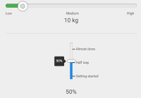
A fast & lightweight react component as a drop in replacement for HTML5 input range slider element.
Installation
Using npm (use --save to include it in your package.json)
$ npm install react-rangeslider --saveUsing yarn (this command also adds react-rangeslider to your package.json dependencies)
$ yarn add react-rangesliderGetting Started
React-Rangeslider is bundled with a slider component & default styles which can be overridden depending on your design requirements.
With a module bundler like webpack that supports either CommonJS or ES2015 modules, use as you would anything else:
// Using an ES6 transpiler like Babel import Slider from 'react-rangeslider' // To include the default styles import 'react-rangeslider/lib/index.css' // Not using an ES6 transpiler var Slider = require('react-rangeslider')The UMD build is also available on unpkg:
<script src="https://unpkg.com/react-rangeslider/umd/rangeslider.min.js"></script>You can find the library on window.ReactRangeslider. Optionally you can drop in the default styles by adding the stylesheet.
<link rel="stylesheet" href="https://unpkg.com/react-rangeslider/umd/rangeslider.min.css" />Check out docs & examples.
Basic Example
import React, { Component } from 'react' import Slider from 'react-rangeslider' class VolumeSlider extends Component { constructor(props, context) { super(props, context) this.state = { volume: 0 } } handleOnChange = (value) => { this.setState({ volume: value }) } render() { let { volume } = this.state return ( <Slider value={volume} orientation="vertical" onChange={this.handleOnChange} /> ) } }API
Rangeslider is bundled as a single component, that accepts data and callbacks only as props.
Component
import Slider from 'react-rangeslider' // inside render <Slider min={Number} max={Number} step={Number} value={Number} orientation={String} reverse={Boolean} tooltip={Boolean} labels={Object} handleLabel={String} format={Function} onChangeStart={Function} onChange={Function} onChangeComplete={Function} />Props
| Prop | Type | Default | Description |
|---|---|---|---|
min | number | 0 | minimum value the slider can hold |
max | number | 100 | maximum value the slider can hold |
step | number | 1 | step in which increments/decrements have to be made |
value | number | current value of the slider | |
orientation | string | horizontal | orientation of the slider |
tooltip | boolean | true | show or hide tooltip |
reverse | boolean | false | reverse direction of vertical slider (top-bottom) |
labels | object | {} | object containing key-value pairs. { 0: 'Low', 50: 'Medium', 100: 'High'} |
handleLabel | string | '' | string label to appear inside slider handles |
format | function | function to format and display the value in label or tooltip | |
onChangeStart | function | function gets called whenever the user starts dragging the slider handle | |
onChange | function | function gets called whenever the slider handle is being dragged or clicked | |
onChangeComplete | function | function gets called whenever the user stops dragging the slider handle. |
Development
To work on the project locally, you need to pull its dependencies and run npm start.
$ npm install $ npm startIssues
Feel free to contribute. Submit a Pull Request or open an issue for further discussion.
License
MIT


