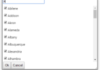
React Virtualized Checkbox
Demo available here: http://emilebres.github.io/react-virtualized-checkbox/

Getting started
Install react-virtualized-checkbox using npm.
npm install react-virtualized-checkbox --save yarn add react-virtualized-checkboxAnd in your code:
import VirtualizedCheckbox from 'react-virtualized-checkbox'Simple Example
You pass react-virtualized-checkbox an array of items. Here's a simple example:
import React, { Component } from 'react' import VirtualizedCheckbox from 'react-virtualized-checkbox' class MyCheckbox extends Component { constructor (props) { super(props) this.state = {} } render () { const items = [ { label: "One", value: 1, checked: true}, { label: "Two", value: 2, checked: true}, { label: "Three", value: 3, checked: true} // And so on... ] return ( <VirtualizedCheckbox items={items} onOk={(checkedItems) => this.setState({ checkedItems })} onCancel={ () => this.setState({ checkedItems: [] })} /> ) } }React Virtualized Checkbox Props
| Property | Type | Description |
|---|---|---|
| items | PropTypes.array | Items to choose from; can be an array of strings or an array of objects. |
| onOk | PropTypes.func | Callback called when the Ok button is clicked; takes an array of the selected items, a boolean if all items are selected and the text filter as arguments. |
| onCancel | PropTypes.func | Callback called when the Cancel button is clicked. |
| onChange | PropTypes.func | Callback called when a checkbox is clicked. If a normal checkbox is clicked, will return the item. If the (Select all) checkbox is clicked, will return an array of all filtered items. |
| hasFilterBox | PropTypes.bool | If the text filter box is displayed; defaults to true |
| hasOkButton | PropTypes.bool | If the Ok button is displayed; defaults to true |
| hasCancelButton | PropTypes.bool | If the Cancel button is displayed; defaults to true |
| labelKey | PropTypes.string | Label key; defaults to 'label'. |
| rowHeight | PropTypes.number | Row height; defaults to 30 pixels. |
| height | PropTypes.number | Component height; If not set, will get from the parent. |
| width | PropTypes.number | Component width; If not set, will get from the parent. |


