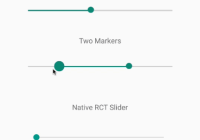
react-native-multi-slider
Pure JS react native slider component with one or two markers. Options to customize track, touch area and provide customer markers and callbacks for touch events and value changes.
Examples
cd example/Basic npm install react-native run-ios react-native run-android 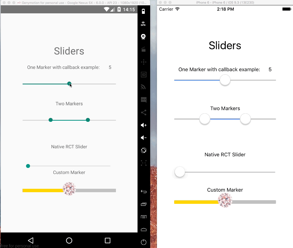
Getting Started
Installation
$ npm install --save @ptomasroos/react-native-multi-sliderUsage in a ScrollView
enableScroll = () => this.setState({ scrollEnabled: true }); disableScroll = () => this.setState({ scrollEnabled: false }); render() { return ( <ScrollView scrollEnabled={this.state.scrollEnabled}> <MultiSlider ... onValuesChangeStart={this.disableScroll} onValuesChangeFinish={this.enableScroll} /> </ScrollView> ); shape up CustomMarker as left and right
In order to make different styles on markers you can set isMarkersSeparated to true, define customMarkerLeft and customMarkerRight in MultiSlider. for example:
<MultiSlider ... isMarkersSeparated={true} customMarkerLeft={(e) => { return (<CustomSliderMarkerLeft currentValue={e.currentValue}/>) }} customMarkerRight={(e) => { return (<CustomSliderMarkerRight currentValue={e.currentValue}/>) }} /> Partial report of the props
Feel free to contribute to this part of the documentation.
| Prop name | Default value | Type | Purpouse |
|---|---|---|---|
| values | [0] | array of numbers | Prefixed values of the slider. |
| onValuesChangeStart | () => {} | function | Callback when the value starts changing |
| onValuesChange | () => {} | function | Callback when the value changes |
| onValuesChangeFinish | (values) => {} | function | Callback when the value stops changing |
| sliderLength | 280 | number | Length of the slider (?) |
| touchDimensions | {height: 50,width: 50,borderRadius: 15,slipDisplacement: 200} | object | (?) |
| customMarker | function | Component used for the cursor. | |
| customMarkerLeft | function | Component used for the left cursor. | |
| customMarkerRight | function | Component used for the right cursor. | |
| isMarkersSeparated | boolean | (?) | |
| min | 0 | number | Minimum value available in the slider. |
| max | 10 | number | Maximum value available in the slider. |
| step | 1 | number | Step value of the slider. |
| optionsArray | array of numbers | Possible values of the slider. Ignores min and max. | |
| {container/track/selected/unselected/ markerContainer/marker/pressedMarker} Style | style object | Styles for the slider | |
| valuePrefix | string | Prefix added to the value. | |
| valueSuffix | string | Suffix added to the value. | |
| enabledOne | true | boolean | Enables the first cursor |
| enabledTwo | true | boolean | Enables the second cursor |
| onToggleOne | undefined | function callback | Listener when first cursor toggles. |
| onToggleTwo | undefined | function callback | Listener when second cursor toggles. |
| allowOverlap | false | boolean | Allow the overlap within the cursors. |
| snapped | false | boolean | Use this when you want a fixed position for your markers, this will split the slider in N specific positions |
| markerOffsetX | 0 | number | Offset first cursor. |
| markerOffsetY | 0 | number | Offset second cursor. |
| minMarkerOverlapDistance | 0 | number | if this is > 0 and allowOverlap is false, this value will determine the closest two markers can come to each other. This can be used for cases where you have two markers large cursors and you don't want them to overlap. Note that markers will still overlap at the start if starting values are too near. |
| imageBackgroundSource | undefined | string | Specifies the source as required by ImageBackground |


