react-native-material-design-searchbar
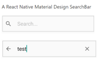
A React Native Material Design SearchBar

Setup
Install the SearchBar from npm with npm i -S react-native-material-design-searchbar. Then, require it from your app's JavaScript files with import SearchBar from 'react-native-material-design-searchbar'. This library depends on react-native-vector-icons. Please link it by following their installation guide.
Usage
All props are optional except height.
import React, { Component } from 'react'; import SearchBar from 'react-native-material-design-searchbar'; export default class ExampleComponent extends Component { render() { return ( <SearchBar onSearchChange={() => console.log('On Search Change')} height={50} onFocus={() => console.log('On Focus')} onBlur={() => console.log('On Blur')} placeholder={'Search...'} autoCorrect={false} padding={5} returnKeyType={'search'} /> ); } }; Available Props
onSearchChange: Callback on search changeonBackPress: Optional function, Callback on back icon pressedalwaysShowBackButton: Optional bool, use if you want to always show the back button instead of search, default isfalseiconCloseName: Optional string, use it to customize the close iconiconSearchName: Optional string, use it to customize the search iconiconBackName: Optional string, use it to customize the back iconiconCloseComponent: Optional object, custom component for the close icon (overrides iconCloseName)iconSearchComponent: Optional object, custom component for the search icon (overrides iconSearchName)iconBackComponent: Optional object, custom component for the back icon (overrides iconBackName)iconColor: Optional string, use it to define a different padding size, default is#737373placeholder: Optional string, use it to customize the placeholder text, default iseSearch...placeholderColor: Optional string, use it to define a different placeholder color, default is#bdbdbdreturnKeyType: Optional string, use it to customize the return key typepadding: Optional string, use it to define a different padding size, default is5inputStyle: Optional string, use it to pass your style to the containingViewinputProps: Optional object, use it to pass additional props to theTextInput, for example{autoFocus: true}textStyle: Optional string, use it to pass your style to theTextInput
The React packager will include the SearchBar component in your app's JS package and make it available for your app to use.
Contributing
Contributions are welcome.
LICENSE
MIT


