React Native Checkbox Field

React Native Checkbox Field is a configurable React Native component which works on both iOS and Android with minimal dependencies.
Installation
npm install --save react-native-checkbox-field
Usage
import CheckboxField from 'react-native-checkbox-field'; // Field with label import { Checkbox } from 'react-native-checkbox-field'; // Checkbox onlyimport React, { Component } from 'react'; import { View, Text } from 'react-native'; import CheckboxField from 'react-native-checkbox-field'; import Icon from 'react-native-vector-icons/FontAwesome'; export default class Form extends Component { state = { selected: false, }; selectCheckbox = () => { this.setState({ selected: !this.state.selected, }); }; render() { const { selected } = this.state; // Only onSelect prop is required return ( <CheckboxField onSelect={this.selectCheckbox} selected={selected} label="Accept terms and conditions" labelSide="right" > <Icon name="check" color="#fff" /> </CheckboxField> ) } }Props
CheckboxField
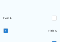
label(String)null- The label positioned next to the checkboxlabelStyle(Object) - The style of the text label
{ flex: 1 } containerStyle(Object) - The style of the container surrounding the label and checkbox
{ flex: 1, flexDirection: 'row', padding: 20, alignItems: 'center' } labelSide(enum('left', 'right'))left- The side the label will be positioned with the checkbox.
Checkbox
onSelect(Function)null- The function that is run when the checkbox is selectedselected(Boolean)false- The value representing the selected statedisabled(Boolean)false- Whether the checkbox can receive user interactionsdisabledColor(String)null- The background color when the checkbox is disabledchildren(React.Component)null- The component within the checkboxdefaultColor(String)#fff- The default color of the checkbox backgroundselectedColor(String)#247fd2- The selected color of the checkbox backgroundcheckboxStyle(Object)
{ borderWidth: 2, borderColor: '#ddd', borderRadius: 5 } 


