React Validation Library
Client-side validation library that aims for the excellent user experience. Do not expect cheap magic here; we will force you to write some amount of code. In return, you get a lot of flexibility and customizability (if you want it); and of course, really great user experience with your validated forms.
Try it out
You can view the demo examples here.
To run the examples locally:
- Clone the repository:
git clone [email protected]:vacuumlabs/react-custom-validation.git - Enter the
examplesdirectory:cd react-custom-validation/examples npm installnpm run example- Navigate to
localhost:3000
Code of the examples is located in examples/example/ directory.
Examples 1 and 2 illustrate the usage of this library in very simple cases. It is highly recommended to review and understand the code of these examples, as it can help to understand this documentation and basic features of this library.
Example 3 is more complicated and is used to show that this library can be used even when the requirements are more complex (e.g. when one wants to dynamically add and remove fields). The user is encouraged to review the code of example 3 if they want to create more complex validated forms.
Example
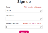
Let us start with a simple registration form that contains three validated fields: email, password and repeated password. The corresponding code without validations can look as follows:
class RegistrationForm extends React.Component { render() { let { fields: {email, password, rePassword} changeEmail, ... } = this.props return ( <form> <input type="text" id="email" onChange={(e) => changeEmail(e.target.value)} value={email} /> { /* similar code for password and re-password inputs */ } </form> ) } }To add some validations for this React component, we need to define a function that calculates validation config from component's props:
function validationConfig(props) { let {fields: {email, password, rePassword}} = props return { fields: ['email', 'password', 'rePassword'], validations: { email: [ [isEmail, email], // [function, ...args] [isUnique, email] ], password: [[minLength, password, 6]], rePassword: { rules: [[areSame, password, rePassword]], fields: [ // hide validation result if user is typing in one of these fields ['password', 'rePassword'], // hide validation result until user touched all of these fields ['rePassword'] ] } }, } } @validated(validationConfig) class Registration extends React.Component { ...To make the show/hide validity recommendations work properly, one also needs to notify the validation library about some user actions (changes, blurs, submits). This can be easily done by using a provided helper function $field:
@validated(validationConfig) class RegistrationForm extends React.Component { render() { let { fields: {email, password, rePassword} $field, changeEmail, ... } = this.props return ( <form> <input type="text" id="email" {...$field('email', (e) => changeEmail(e.target.value))} value={email} /> { /* similar code for password and re-password inputs */ } </form> ) } }In return, the validation library provides data on validity and show/hide behavior as the prop $validation. (If needed, one can also specify onValidation handler that will be called whenever new validation data is available. This takes some more coding, but provides full flexibility regarding validation data handling.)
render() { let { ... // validation data provided as props by the validated decorator $validation: { email: { isValid: emailValid, error: {rule: emailRule, reason: emailReason}, show: emailShow }, ... } } = this.props return ( <div> ... {emailShow ? `Invalid email (${emailReason})` : 'Valid email!'} ... </div> ) }Note that multiple-field validations (such as passwordsMatch) are very easy to specify. Apart from absolutely straighforward definition of rules, one just needs to provide the list of all fields involved in the validation, so that correct show/hide recommendations can be given.
Rationale
With React and proper application state management system (for example, Redux) it is simple to validate things. All the data is available in the application state, hence obtaining the validity is as easy as applying validation functions to the appropriate arguments. Multiple-field validations and asynchronous validations do not complicate the story much.
The real challenge for top-notch validated component is not computing actual validity of individual fields, but computing whether the validation result should be shown to the user. We strongly believe that these two aspects are completely orthogonal and should be treated so. Required field never touched? Invalid, but do not show it. Email field does not look e-mail-ish at all? Invalid, but do not show it if the user is still typing. If the user changes the focus to another field, show it ASAP! You see the picture.
It turns out that whether the validation result should be presented to the user depends on many details: what inputs were already touched, when the last keystroke happened, whether the user already attempted to submit the form, etc. Such details are 100% unimportant for anything else than showing validation result, so you do not capture and store these data in any way. Therefore, the validation library creates a higher order component (HOC) that stores this information in its internal component state.
The contract is simple:
- you configure what validation rules exist and what fields affect what validations
- you inform the validation component about all changes, blurs and submits performed by the user
- validation component informs you what is the status of each individual validation: Whether the validation is OK / not OK and whether you should / should not display validation status
Feature set
- Automatic re-calculation of validity when user changes the input value
- Suggestions on showing/hiding the validation result
- Hide validity while the user is typing
- Hide validity if the field was not touched yet
- Show validity if the user finished typing
- Easy definition and usage of custom validation rules
- Multiple fields validation
- Async validations
- Debouncing / Throttling
- Conditional validations
- Flexibility and extensibility: can be easily combined with other validation approaches
This library is intended to be used with React. It also plays well with Redux, but it can be used without Redux as well. It can be easily integrated with React-Intl or other (custom?) i18n solution.
API Documentation
validationConfig(props)
The validationConfig function that is used to annotate the validated React component takes in one argument, the props of that React component, and returns a config, which is a plain javascript object containing the keys specified below.
validations
Object that maps validation names to validation rules and fields. The keys serve as identifiers for the validations and will be referred to as validationNames in this documentation. For example:
validations: { email: { rules: [ ['isEmail', isEmail, email], ['isUnique', isUnique, email] ], fields: [['email'], ['email']] }, ... }If the optional fields part is not provided, one can specify the rules directly (top-level):
validations: { email: [ ['isEmail', isEmail, email], ['isUnique', isUnique, email] ], ... }validations.rules
List of function-call descriptors in the form
[string, fn, arg1, arg2, ...] // rule name, rule function, argsThe first item (rule name) is optional. It is used to specify the failed rule in the validation result; if ommitted, the rule function name is used.
[fn, arg1, arg2, ...]The next item fn can be any function that complies with the rule function API. All other items are provided to this function as arguments in the specified order (i.e. fn(arg1, arg2, ...) is called internally).
fn leads to infinite loop in validation calculations in some cases. It is best to avoid them completely and use named functions instead.
validations.fields (optional)
Fields validated by this validation in the form
[dependsOn, needTouch]Both dependsOn and needTouch are Arrays of field names (strings). These data are used to calculate show/hide recommendations.
dependsOn should list all user-input fields that influence the validation result. Validation library tracks whether user is typing in any of these fields and if so, it recommends to hide the corresponding validation result.
needTouch should list all user-input fields that need to be touched (changed, blurred, submitted) before the validation result can be shown.
In most cases, both fields look the same, and contain one item, the name of the validated field. Therefore, the following defaults are provided:
nullandundefinedresolve to[[validationName], [validationName]](e.g. ([['email'], ['email']])someStringresolves to[[someString], [someString]]someArrayresolves to[someArray, someArray]
fields
Array of all field names (strings) that require validation, for example:
fields: ['email', 'password', 'rePassword']onValidation (optional)
Handler function that is called by the validation library whenever new validation data (i.e. validation results and recommendations for showing/hiding these validation results) is available. It provides the application developer with full control over handling the calculated validation data.
The implementation of this handler is optional and if not provided, it defaults to empty function. If the validation data is needed only from within the validated React component, one can use the provided prop $validation to access this data. However, if the data is needed elsewhere in the application (e.g. by some other React components), the onValidation handler needs to be implemented.
The onValidation handler takes in two arguments:
validationName: name of the corresponding validation as defined invalidationspart of configdata: newly calculated validation data; javascript object with the following structure
{ // valid or invalid or unknown validity isValid: true | false | null error: { // name of the rule that failed rule: undefined | String // data returned by the rule function providing more specific info on error reason: undefined | any javascipt object }, // whether the validation result should be displayed to the user show: true | false } Note that rule and reason are not undefined only if isValid is false.
The recommended implementation of the onValidation handler should simply save the provided data in the application state so that they can be accessed there when needed. Example:
onValidation: (validationName, data) => dispatch( // Here we dispatch a function that defines how app state should be modified // using update from immutability-helper library (state) => update(state, {validations: {[validationName]: {$set: data}}}) )formValid (optional)
Validity of the whole form. This information is used to provide the $submit prop.
The value can be
true: all fields are validfalse: at least one field is invalidnull: validity is unknown (some validations are pending)
This field is optional; if it is not specified, isFormValid($validation) is used, where $validation is validation data that is also provided as the prop $validation to the validated form component and isFormValid is a helper function for calculating overall form validity.
options (optional)
Object that further configures the validation library.
asyncThrottlesets throttling for async validity computations; number (milliseconds)typingDebouncespecifies the time to wait after last user's type before validation result is shown. Allowed values are:- number (millisecons)
[number1, number2]When user enters the field for the second time (typically to correct the value), you may want to lower the typing debounce so that the feedback is more immediate. Therefore, you can specify two typing debounces:number1will be used on the first visit of the field andnumber2on the second and all subsequent visits of the field
If some of the options is not specified, the following default values are used:
{ asyncThrottle: 500, typingDebounce: [2500, 1000] }typingDebounce to infinite (very long) time will result in the validation results being shown only on blur or submit.
Provided props
The validated React component gets four new props (apart from all other props that were passed to it) from the validation library. Prop names starting with $ were chosen to prevent name collisions. To further ensure that these prop names do not collide with other prop names passed to the validated component, they are checked during render and error is thrown if some collision is detected.
$submit(onValid, onInvalid, fieldEvent = true)
It is recommended to call this function on form submit. It internally waits until the form validity calculation is finished and calls one of the provided handlers: onValid in case the form validity is true or onInvalid in case the form validity is false. If the validity of the form is known already when user clicks on the submit button, the onValid (or onInvalid) handler is called right away. Both, onValid and onInvalid arguments are optional, defaulting to empty functions.
Since it is the desired behavior in most cases, calling $submit also calls $fieldEvent('submit'). This default behavior can be turned off by passing false as the third (fieldEvent) argument.
Example of usage:
class RegistrationForm extends React.Component { render() { ... <form onSubmit={ (e) => { e.preventDefault() this.props.$submit( () => alert('Registration successful!'), () => alert('There are errors in the form!') ) } }> ... } } Since invalid data submission can be easily avoided by using this $submit function, it is recommended to keep the submit button enabled while the user is filling out the form.
If the user submits the form while validity calculation is in progress and the user continues typing (and thus changing the form field values), the onValid/onInvalid handler call will be canceled. It will also be canceled if anything in validations part of the validation config changes. This is to prevent possible mismatch between validated and actually submitted fields.
Note that the validation library does not prevent multiple submits while onValid handler is running; the submit button should be therefore disabled while the onValid handler is running.
For information on form validity calculation see here.
null). In such a case, one can simply use isFormValid($validity) instead of $submit to find out form validity at submit (see code in example 2).
$fieldEvent(event, field, debounce)
Handler used to notify the validation library about user actions which are used in show/hide validation calculations. Takes in the following arguments:
event:'blur'or'change'or'submit'or'reset'field(optional): string, one of field names specified infieldspart of the validation configdebounce(optional):trueorfalseor number ornull; overrides typing debounce set in validation config; only available for'change'events
The event 'reset' causes the validation library to "forget" all past field events. For example, suppose that the field 'email' was changed, blurred and/or submitted and the user is not typing right now. One will thus get {show: true} for this email validation. After $fieldEvent('reset', 'email') is called, the email field will be considered untouched (all changes, blurs, submits being forgotten) and one will get {show: false} for the email validation. The most usual case is perhaps calling $fieldEvent('reset') which is useful for resetting all recorded field data (for example, after successful submit).
If field is not specified, all fields specified in the fields part of the validation config are assumed. This is useful especially for the 'submit' event. Note that $fieldEvent('reset') is an exception; it resets all the recorded field events (even for fields that are not specified in the validation config).
Examples of usage:
<input type="text" id="email" onChange={(e) => { this.handleEmailChange(e.target.value) this.props.$fieldEvent('change', 'email') }} onBlur={() => this.props.$fieldEvent('blur', 'email')} value={this.props.fields.email} /> <form onSubmit={ (e) => { e.preventDefault() this.props.$fieldEvent('submit') ... $field(field, onChange, onBlur, debounce)
Syntactic sugar that saves manual calling of the $fieldEvent function. Takes in the following arguments:
- field name
onChangehandleronBlurhandlerdebounce(optional):trueorfalseor number ornull; overrides typing debounce set in validation config for the'change'fieldEvent; does not affect'blur' field event. Default value is'true'
Provides modified onChange and onBlur that take care of calling the $fieldEvent function. Both handlers can be null, empty functions are then used as a default.
Examples of usage:
<input type="text" id="email" {...this.props.$field('email', (e) => this.handleEmailChange(e.target.value))} value={this.props.fields.email} /><input type="checkbox" id="isOther" {...this.props.$field( 'isOther', (e) => this.handleIsOtherChange(e.target.value), // onChange null, // onBlur false // we do not want typing debounce for a checkbox )} checked={this.props.fields.isOther} />$validation
Object that maps each validationName specified in the validations part of the config to the corresponding validation result and show/hide recommendation.
The data structure is the same as what is provided by the onValidation handler. For example:
let { $validation: { email: {isValid, error: {reason, rule}}, password: {...} } } = this.props Helper Functions
isFormValid($validation)
Returns validity of multiple validation results. The result is false if any single validation contains valid = false, null if any validation contains valid = null (and none is false) and true otherwise. The argument $validation should be a dict of validation results as provided by the validation library.
initValidation()
Returns initial status of validation data as provided by this library. Can be used to initialize the app state. It is recommended (but not necessary) to keep the validation data in the app state structured in the same way.
Defining Custom Rules
It is very easy to create new rule functions. The rule function is any function that:
- returns a valid value or a
Promisethat resolves to a valid value if the arguments satify the rule - returns an error description (not equal to any valid value) or a
Promiseof such error description if the arguments do not satisfy the rule
The valid values are null, undefined, true, [] and {}. This convention enables one to use functions provided by some popular javascript validation libraries without any additional boilerplate code.
Examples:
function areSame({value1, value2}) { return (value1 === value2) ? null : 'Values are different' } function isUnique({value}) { let isValid = value.indexOf('used') === -1 let response = isValid ? null : 'The value is not unique.' return Promise.delay(10).then(() => response) }Custom messages and internationalization
In larger and more serious projects one might need to translate the validation messages to other languages, or one might want to provide very specific validation messages. The recommended way of achieving this is outlined below.
Write rule functions that return object:
function hasLength({value, min, max}) { if (min != null && value.length < min) { return {code: 'too short', args: {min}, msg: `Length should be at least ${min}.`} } if (max != null && value.length > max) { return {code: 'too long', args: {max}, msg: `Length should be at most ${max}.`} } return null } Write a displayMessage function that can handle all types of errors that you are using, for example:
function displayMessage(error, dictionary) { if (typeof error === 'string') { return error } {code, args, msg} = error if (dictionary[code] != null) { return dictionary[code](args) } else { return msg // falling back to provided message } } The dictionary in this case might be something like:
{ 'too short': ({min}) => `The provided value is very short. Please enter at least ${min} characters`, ... } 


