ssuggestor


React component that enables users to quickly find and select from a pre-populated list of values as they type. Current themes provided use Bootstrap and custom styles.
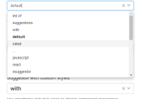
Demo
Live Demo: carloluis.github.io/ssuggestor
Instalation
# using yarn yarn add ssuggestor # using npm npm i ssuggestorUsage
Include react dependencies and ssuggestor script. Also include ssuggestor styles and theme if required.
npm
import React from 'react'; import { render } from 'react-dom'; import 'ssuggestor/dist/styles.css'; import b3Theme from 'ssuggestor/dist/bootstrap-3.json'; import Suggestor from 'ssuggestor'; render( <Suggestor list={['suggestion-a', 'suggestion-b', 'suggestion-c', '...', 'suggestion-z']} theme={b3Theme} onChange={value => {}} onSelect={(value, suggestion) => {}} placeholder="placeholder text..." />, document.querySelector('#app') );browser
<!-- scripts: react, react-dom, ssuggestor --> <script src="https://unpkg.com/[email protected]/umd/react.production.min.js"></script> <script src="https://unpkg.com/[email protected]/umd/react-dom.production.min.js"></script> <script src="https://unpkg.com/[email protected]/dist/ssuggestor.min.js"></script> <!-- styles: bootstrap, custom --> <link href="https://maxcdn.bootstrapcdn.com/bootstrap/3.3.7/css/bootstrap.min.css"> <link href="https://unpkg.com/[email protected]/dist/styles.min.css">Check suggestor example on CodePen.
Description
Simple Suggestor package provides a React component as default export. Clicks outside of DOM component are tracked in order to close the suggestion list. Pattern matches are highlighted in bold.
Example:
- input pattern:
sugge - items on suggestion list: autoSuggest, ssüggèstor and suggests
Then,
- matches are case insensitive: autoSuggest
- pattern test is performed removing accents: ssüggèstor
Suggestion Objects
The usage of suggestion objects requires a selector function to convert each object into string representation which will be displayed on the suggestion list.
Props:
| Prop | Type | Default | Description |
|---|---|---|---|
| accents | Boolean | false | whether to differentiate chars with accents or not |
| arrow | Boolean | true | ▼ icon - open suggestion list |
| theme | Object | {} | JSON theme with css classes for each dom element |
| close | Boolean | true | ✖︎ icon - delete current value |
| list | Array | -- | suggestions (required) |
| selector | Function | s => s | suggestions selector (must return a string) |
| openOnClick | Boolean | true | whether suggestion list opens on click or not |
| onSelect | Function | () => {} | onSelect handler: (value, suggestion) => { } |
| onChange | Function | () => {} | onChange handler: (value) => { } |
| onKey | Function | () => {} | onKey handler: (keyEvent) => { } |
| placeholder | String | -- | input placeholder text |
| required | Boolean | false | if true, set required attribute on <input> element |
| selectOnTab | Boolean | false | if true, enables Tab key to select ssuggestion |
| style | Object | -- | inline styles for component's root element |
| suggestOn | Number | 1 | minimum size of search string to show suggestions |
| tooltip | String | -- | input title text (simple tooltip) |
| value | String | '' | initial value |
| useKeys | Boolean | true | whether to use supported keys or not |
Supported Keys
Up, Down, Enter, Escape & Tab.
Theme
Provide JSON with classes for styling the component:
{ "root": "class(es) used on wrapper element", "input": "<input> element class(es)", "arrow": "open <span> indicator class(es)", "close": "remove <span> indicator class(es)", "list": "<ul> class(es)", "item": "<li> class(es)", "activeItem": "active <li> class(es)" }This package also provides a theme using custom classes from styles.css and others from Bootstrap.
- Custom class names start with the
ss-prefix. Required to importssuggestor/dist/styles.css - Bootstrap classes:
input-group,form-groupanddropdown-menu.
Bootstrap 3 Theme
{ "root": "input-group ss-root", "input": "form-control ss-input", "arrow": "ss-arrow", "close": "ss-remove", "list": "dropdown-menu ss-list", "item": "", "activeItem": "ss-over-item" }Note that you need to import the Bootstrap3 theme from ssuggestor/dist/bootstrap-3.json
Check usage on npm section.
Bootstrap 4 Theme
{ "root": "input-group ss-root", "input": "form-control ss-input", "arrow": "ss-arrow", "close": "ss-remove", "list": "dropdown-menu ss-list", "item": "dropdown-item", "activeItem": "ss-over-item" }Note that you need to import the Bootstrap4 theme from ssuggestor/dist/bootstrap-4.json
Check usage on npm section.
Focus
Use public method focus to set focus in <input> element.
<suggestor-instance>.focus();Development
In order to run locally: first clone the git repo, then restore dependencies and execute the dev task:
git clone https://github.com/carloluis/ssuggestor.git cd ssuggestor yarn yarn devOpen browser on localhost:9000
License
MIT © Carloluis


