React Native SelectMultiple Button
This library is a button (or a grouped buttons) supporting multiple or radio selection by building with React Native. https://github.com/danceyoung/selectmultiplebuttons for Swift.
You can specify any Layout and Style for container view,button view and text through View Style Props, Layout Props and Text Style Props supporting by React Native
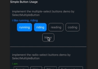
Example running in iOS and Android(captured by GIPHY CAPTURE)
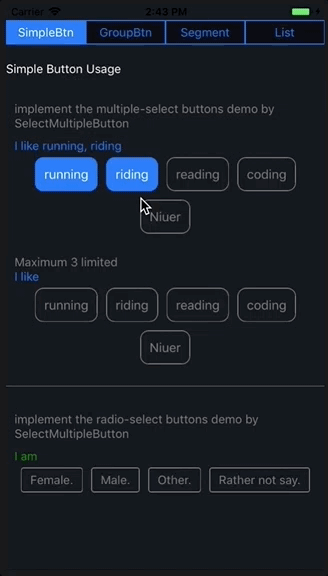
Note:Runing a Android Virtual Device is TMDing too large memory eated.
Instruction
-
SelectMultipleButton
-
SelectMultipleGroupButton
SelectMultipleButton
You need to set the props selected as true to highlight button's selected status and manage the data selected through event props singleTap(valueTap) by hard coding yourself.
SelectMultipleGroupButton
You needn't to set these settings like SelectMultipleButton, because these features are build in the SelectMultipleGroupButton. What you do is set the event props singleTap(valueTap) to hold the value tap and the event props onSelectedValuesChange(selectedValues) to hold the array of values selected.
Installation
cd your project root direction
$ npm install react-native-selectmultiple-button --save
Usage
code example
code snap
import { SelectMultipleButton, SelectMultipleGroupButton } from "react-native-selectmultiple-button"; <SelectMultipleButton buttonViewStyle={{ borderRadius: 10, height: 40 }} textStyle={{ fontSize: 15 }} highLightStyle={{ borderColor: "gray", backgroundColor: "transparent", textColor: "gray", borderTintColor: ios_blue, backgroundTintColor: ios_blue, textTintColor: "white" }} multiple={true} value={interest} selected={this.state.multipleSelectedData.includes(interest)} singleTap={valueTap => this._singleTapMultipleSelectedButtons(interest)} />; <SelectMultipleGroupButton containerViewStyle={{ justifyContent: "flex-start" }} highLightStyle={{ borderColor: "gray", backgroundColor: "transparent", textColor: "gray", borderTintColor: ios_blue, backgroundTintColor: "transparent", textTintColor: ios_blue }} onSelectedValuesChange={selectedValues => this._groupButtonOnSelectedValuesChange(selectedValues) } group={multipleGroupData} />;Props
SelectMultipleButton
| props | type | required | desc |
|---|---|---|---|
selected | bool | no | Default is false. The selected prop determines whether the button is selected and highlighted |
value | one of types(string,number) | yes | Your business key |
displayValue | one of types(string,number) | no | Default is == value prop if not set displayValue prop. Displayed as button's text |
singleTap | function(valueTap) | no | Handler to be called when the user taps the button. The button's props value is passed as an argument to the callback handler |
highLightStyle
Normal or highlighted style, the style object {} contains the following keys.
-
borderColor: PropTypes.string.isRequired---Normal color of button border.
-
backgroundColor: PropTypes.string.isRequired---Normal color of button background.
-
textColor: PropTypes.string.isRequired---Normal color of text.
-
borderTintColor: PropTypes.string.isRequired---Highlighted color of button border.
-
backgroundTintColor: PropTypes.string.isRequired---Highlighted color of button background.
-
textTintColor: PropTypes.string.isRequired--Highlighted color of text.
Default style is
{
borderColor: 'gray',
backgroundColor: 'transparent',
textColor: 'gray',
borderTintColor: ios_blue,
backgroundTintColor: 'transparent',
textTintColor: ios_blue,
}
buttonViewStyle
Style of button view. You can specify any View Style Props.
Default style is
{ margin: 5, borderRadius: 3, alignItems: 'center', justifyContent: 'center', borderWidth: 1 }textStyle
Style of text. You can specify any Text Style Props
Default style is
{ textAlign: 'center', marginTop: 5, marginBottom: 5, marginLeft: 10, marginRight: 10, }SelectMultipleGroupButton
| props | type | required | desc |
|---|---|---|---|
multiple | bool | no | Default is true. The multiple prop determines the grouped buttons are multiple or radio selected |
defaultSelectedIndexes | array | no | The indexes array in group of the grouped buttons to be default selected and highlighted |
maximumNumberSelected | number | no | Specifies maximum number for selecting buttons, and its smallest value is 2. Only enabled for multiple prop is set true |
group | array of {value,displayValue} | yes | Just a plain array, value and displayValue props are akin to value and displayValue props of SelectMultipleButton. |
singleTap | function(valueTap) | no | Handler to be called when the user taps the button. The button's props value is passed as an argument to the callback handler. |
onSelectedValuesChange | function(selectedValues) | no | Handler to be called when the user taps the button.the array of selected values is passed as an argument to the callback handler. |
highLightStyle
Normal or highlighted style, akin to highLightStyle of SelectMultipleButton.
buttonViewStyle
Style of button view, akin to buttonViewStyle of SelectMultipleButton.
textStyle
Style of text, akin to textStyle of SelectMultipleButton.
containerViewStyle
Style of the grouped buttons container view. You can specify any View Style Props and Layout Props.
Default View Style and Layout props is
{ flexWrap: 'wrap', flexDirection: 'row', justifyContent: 'center' }License
react-native-selectmultiple-button is MIT Licensed.


