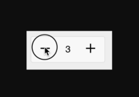
react-stepper-primitive 
React primitives for a "stepper" component.
So you can build this:
ReactDOM.render( <Stepper min={1} max={100} render={({ getFormProps, getInputProps, getIncrementProps, getDecrementProps }) => <form {...getFormProps()}> <button className='my-button' {...getDecrementProps()}> <img src='/assets/svg/minus.svg' /> </button> <input className='my-step-input' {...getInputProps()} /> <button className='my-button' {...getIncrementProps()}> <img src='/assets/svg/plus.svg' /> </button> </form>} />, document.body )Why?
Because a stepper (minus button, input, plus button) is non-trivial. There's a lot to manage: there's a minimum and maximum. There's the input displaying the current value. There's the input allowing free-type while the user focuses the input, then interpreting the user's value once they blur it.
These primitives manage the data manipulation for you so you only have to worry about the styling.
Install
$ npm install --save react-stepper-primitive API
<Stepper>
Props
defaultValue
number| default 0 | optional
The initial value.
onChange
function| optional
Called when the value changes, with the new value as the only argument.
value
number| optional
The value. If no value is passed in, the stepper will manage its value via its own internal state.
If value is passed in, the stepper becomes a "controlled component".
The onChange function passed in will be called whenever value changes, whether you pass it in or not.
Note: This is very similar to how normal controlled components work elsewhere in react (like
<input />).
min
number| optional, no default
The value cannot go below this minimum.
max
number| optional, no default
The value cannot go above this maximum.
step
number| default 1 | optional
Every click on the increment or decrement button increases the value by step.
render
function()| required
<Stepper render={() => <div />} />
The render prop function is called with the following object:
| property | category | type | description |
|---|---|---|---|
| value | state | number | The current value of the stepper |
| focused | state | boolean | Whether the input is currently focused. |
| getFormProps | prop getter | function | Returns the props you should apply to a form element (for submit handling) |
| getInputProps | prop getter | function | Returns the props you should apply to an input element (for displaying and free-form modification of the current value) |
| getDecrementProps | prop getter | function | Returns the props you should apply to a decrement button |
| getIncrementProps | prop getter | function | Returns the props you should apply to an increment button |
| increment | setter | function | Increment the value by one. Value cannot go under props.min. |
| decrement | setter | function | Decrement the value by one. Value cannot go over props.max. |
| setValue | setter | function | Set a new value. Value is coerced to stay between props.min and props.max. |
enableReinitialize
boolean| default false | optional
Control whether the current value (if unchanged) will update to the new default if defaultValue changes.
Related Work
Thanks to Kent C Dodds for formalizing the "prop getters" idea in downshift. And for the readme formatting, which I've stolen.
License
MIT © Andrew Joslin


