react-native-material-selectize 
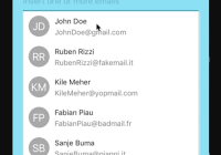
A React Native component inspired to Selectize which follows Material Design guidelines.
Examples
Working examples are provided within the project. After downloading it, navigate to any subfolder of examples and run either "npm install" or "yarn".

Features
- Material design guidelines compliance
- Consistent look and feel on iOS and Android
- State transitions (normal, focused and errored)
- Highly customizable styles and props of inner TextInput component
- Pure javascript implementation
- Minimal setup (no props required)
Installation
The easiest way to install it is via npm. You need to have node.js installed.
npm install react-native-material-selectize --save Alternatively you can use yarn.
yarn add react-native-material-selectize Properties
| name | description | type | default |
|---|---|---|---|
| chipStyle | Style of Chip component | Style | - |
| chipIconStyle | Style of Chip close icon | Style | - |
| containerStyle | Style of the main container component | Style | - |
| inputContainerStyle | Style of the input container component | Style | - |
| listStyle | Style of the dropdown list container | Style | - |
| listRowStyle | Style of each row within the list | Style | - |
| itemId | Unique identifier for each item object | String | id |
| items | Array of objects to populate the list More info | Array | [] |
| selectedItems | Array of objects to render chips More info | Array | [] |
| label | Text field label text | String | - |
| error | Text field error text | String | - |
| errorColor | Text field color for errored state | String | rgb(213, 0, 0) |
| tintColor | Text field accent color (focus) | String | rgb(0, 145, 234) |
| baseColor | Text field base color (blur) | String | rgba(0, 0, 0, .38) |
| showItems | Define when dropdown items should be seen | 'always', 'never', 'onFocus', 'onTyping' | 'onFocus' |
| autoReflow | Define whether the typed text reflows More info | Boolean | true |
| trimOnSubmit | Trim text before creating the Chip | Boolean | true |
| renderRow | Return the rendered row of the list | Function | renderRow default |
| renderChip | Return the rendered Chip component | Function | renderChip default |
| textInputProps | TextInput props More info | Object | - |
| middleComponent | A custom component to render between the text input and the item list | Component | - |
| filterOnKey | The key to filter on. If not set, the provided itemId is used | String | - |
| onChangeSelectedItems | Called when selectedItems changes | Function | (selectedItems) => {} |
items
In general, this array should be consisting of objects having at least one property [itemId] which value is unique for each object. An example of valid input for itemId = 'id' would be:
[ { id: 'john', email: '[email protected]' }, { id: 'doe', email: '[email protected]' } ] An example of invalid input for itemId = 'anotherId' would be:
[ { anotherId: '1' }, { anotherId: '1' }, { id: '2' } ] It is invalid for two reasons: itemId doesn't appear in every object and there are two objects having same itemId.
If you just need to render a single value for each row in the list and for each Chip, 'items' prop can be represented as simple array of strings, but only if each value is unique:
['john', 'doe'] selectedItems
Same format rules of items
renderRow default
(id, onPress, item, style) => ( <TouchableOpacity activeOpacity={0.6} key={id} onPress={onPress} style={[styles.listRow, style]}> <Text style={{ color: 'rgba(0, 0, 0, 0.87)' }}>{id}</Text> </TouchableOpacity> )| param | description |
|---|---|
| id | 'itemId' of the row-indexed object contained in 'items', used as 'key' |
| onPress | onPress handler that turns the selected row into a Chip |
| item | row-indexed object contained in 'items' |
| styles | reference to 'listRowStyle' prop |
renderChip default
(id, onClose, item, style, iconStyle) => ( <Chip key={id} iconStyle={iconStyle} onClose={onClose} text={id} style={style} /> )| param | description |
|---|---|
| id | unique key for the Chip, used as 'key' |
| onClose | onClose handler for removing the Chip |
| item | row-indexed object contained in 'items' if the Chip has been created clicking on a row of the list, OR the value of the TextInput otherwise |
| styles | reference to 'chipStyle' prop |
| iconStyle | reference to 'chipIconStyle' prop |
textInputProps
Object which contains the props of the inner TextInput component used for filtering the results from the list generated by 'items' prop. Some props are set internally and cannot be changed.
| ignored prop | type | default |
|---|---|---|
| disableFullscreenUI | Boolean | true |
| underlineColorAndroid | String | transparent |
| value | String | set internally |
| selectionColor | String | 'tintColor' prop |
Other props have different default to better cope with the component requirements, but they can be overridden.
| different default prop | type | default |
|---|---|---|
| autoCapitalize | String | none |
| autoCorrect | Boolean | false |
| blurOnSubmit | Boolean | false |
The following handler props are wrapped internally and will be invoked if defined. They are called with different parameters than their original counterparts.
| different parameters prop | type | parameters |
|---|---|---|
| onChangeText | Function | (text) => {} |
| onSubmitEditing | Function | (text) => {} |
| onFocus | Function | (text) => {} |
| onBlur | Function | (text) => {} |
The following handler props have a special behavior: returning false they prevent the related event dispatch.
| prevent event prop | type |
|---|---|
| onChangeText | Function |
| onSubmitEditing | Function |
Methods
| name | description | returns |
|---|---|---|
| focus() | Acquire focus | - |
| blur() | Release focus | - |
| submit() | Transform current text into Chip | - |
| getValue() | Get current value of the inner TextInput | String |
| getSelectedItems() | Get items transformed into Chips | Array |
| clearSelectedItems() | Remove all the Chips | - |
Caveats
- When
Selectizeis a child of aScrollView, theScrollView'skeyboardShouldPersistTapsprop must be set to eitherhandledoralwaysfor dropdown completion to work properly.
FAQ
How to make list go over all other elements vs pushing them down?
By default the list of rendered items pushes the other elements down. If you want to have an absolute positioned list, it can be achieved in the following way:
- specify a
zIndexfor the container bigger than its siblings, usually 1 is just ok:
containerStyle: { zIndex: 1 }- specify an absolute positioning for
listStyle:
listStyle: { position: 'absolute' }Related issue: https://github.com/raynor85/react-native-material-selectize/issues/19
Licence
react-native-material-selectize is MIT licensed.


