react-native-otp-inputs


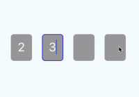
Demo

Description
react-native-otp-inputs is fully customizable, pure JavaScript package, that provides solution for One-time password feature with user friendly events like moving to previous input with backspace or going to next when filled in. It supports pasting and otp code into inputs
Installation
| React-Native version | installation |
|---|---|
| >= 0.53.0 < 0.57.0 | yarn add [email protected] |
| <= 0.57.0 | yarn add react-native-otp-inputs |
It's because of onKeyPress event implementation on android.
Basic usage
import React, { Component } from 'react' import { View } from 'react-native' import OtpInputs from 'react-native-otp-inputs' export default class App extends Component { render() { return ( <View style={styles.container}> <OtpInputs handleChange={code => console.log(code)} numberOfInputs={6} /> </View> ) } }API
| Method | Type | Required | Default | Description |
|---|---|---|---|---|
| autoCapitalize | string | false | 'none' | Defines input auto capitalization (only use with keyboardType) |
| clearTextOnFocus | boolean | false | false | Defines if input text should be cleared on focus |
| containerStyles | style (object) | false | none | Styles applied to whole container |
| errorMessage | string | false | none | Error message that is displayed above inputs |
| errorMessageContainerStyles | style (object) | false | defaultStyles | Styles applied to error message container |
| errorMessageTextStyles | style (object) | false | none | Styles applied to error message text |
| focusedBorderColor | string | false | #0000ff | borderColor of input when focused |
| focusStyles | style (object) | false | none | Styles applied to the input when its focused |
| handleChange | function | true | console.log | Returns otp code which is typed in inputs |
| inputStyles | style(object) | false | defaultStyles | Styles applied to single input |
| inputContainerStyles | style (object) | false | defaultStyles | Styles applied to each input container |
| inputsContainerStyles | style (object) | false | defaultStyles | Styles applied to inputs container |
| inputTextErrorColor | string | false | #ff0000 | Color of text inside input container when error is passed in |
| keyboardType | string | true | 'phone-pad' | Keyboard type for inputs |
| numberOfInputs | number | true (1..6) | 4 | How many inputs should be rendered |
| secureTextEntry | boolean | false | false | Defines if input will hide text inside |
| selectTextOnFocus | boolean | false | true | Defines if input text should be selected on focus |
| unfocusedBorderColor | string | false | transparent | borderColor of input when not focused |
| testIDPrefix | string | false | otpInput-${inputIndex} | Prefix that will be applied as a testID for each input |
Contributions
Great thanks to @kantorm.


