react-filtered-multiselect
A <FilteredMultiSelect/> React component, for making and adding to selections using a filtered multi-select.
Live example with Bootstrap styles applied
Features
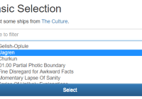
This component manages an <input>, a <select multiple> and a <button>.
You provide a list of objects to be used to populate the select and an onChange callback function.
Typing in the the input will filter the select to items with matching option text.
When some of the select's options are selected, the button will become enabled. Clicking it will select the objects backing the currently selected options.
If only one option is displayed after filtering against the input, pressing Enter in the input will select the object backing it.
When backing objects are selected, the onChange callback is executed, passing a list of all backing objects selected so far.
To hide already-selected items, pass them back to FilteredMultiSelect as its selectedOptions prop. This can be more convenient than manually removing the selected items from the list passed as options.
To deselect items, remove them from the list passed back via the onChange callback and re-render the FilteredMultiSelect with the new list passed as its selectedOptions prop.
Double-clicking will add the selected option to the selection.
Install
Node
npm install react-filtered-multiselect import FilteredMultiSelect from 'react-filtered-multiselect' // or const FilteredMultiSelect = require('react-filtered-multiselect')Browser
Browser bundles export a global FilteredMultiSelect variable and expect to find a global React variable to work with.
- react-filtered-multiselect.js (development version)
- react-filtered-multiselect.min.js (compressed production version)
API
Required props
Minimal usage:
let options = [ {value: 1, text: 'Item One'}, {value: 2, text: 'Item Two'} ] <FilteredMultiSelect onChange={this.handleChange} options={options} />options - list of objects providing <option> data for the multi-select. By default, these should have text and value properties, but this is configurable via props.
The component will update its display if its options list changes length or is replaced with a different list, but it will not be able to detect changes which don't affect length or object equality, such as replacement of one option with another. Consider using immutability-helper or other immutability libraries if you need to do this.
onChange(selectedOptions) - callback which will be called with selected option objects each time the selection is added to.
Optional props
buttonText - text to be displayed in the <button> for adding selected <option>s.
className - class name for the component's <div> container.
classNames - class names for each of the component's child elements. See the default props below for properties. Defaults will be used for any properties not specified via this prop.
defaultFilter - default filter text to be applied to the <select>
disabled - disables each child element if true.
placeholder - placeholder text to be displayed in the filter <input>.
selectedOptions - list of option objects which are selected, so should no longer be displayed in the <select>.
showFilter - pass false to disable showing the filter input if you just use this component for selection.
size - size attribute for the <select>
textProp - name of the property in each object in options which provides the displayed text for its <option>.
valueProp - name of the property in each object in options which provides the value for its <option>.
Default props
{ buttonText: 'Select', className: 'FilteredMultiSelect', classNames: { button: 'FilteredMultiSelect__button', // Used when at least one <option> is selected buttonActive: 'FilteredMultiSelect__button--active', filter: 'FilteredMultiSelect__filter', select: 'FilteredMultiSelect__select' } defaultFilter: '', disabled: false, placeholder: 'type to filter', selectedOptions: [], showFilter: true, size: 6, textProp: 'text', valueProp: 'value' }Example
Example which implements display of selected items and de-selection.
const CULTURE_SHIPS = [ {id: 1, name: '5*Gelish-Oplule'}, {id: 2, name: '7*Uagren'}, // ... {id: 249, name: 'Zero Gravitas'}, {id: 250, name: 'Zoologist'} ] class Example extends React.Component { state = {selectedShips: []} handleDeselect(index) { var selectedShips = this.state.selectedShips.slice() selectedShips.splice(index, 1) this.setState({selectedShips}) } handleSelectionChange = (selectedShips) => { this.setState({selectedShips}) } render() { var {selectedShips} = this.state return <div> <FilteredMultiSelect onChange={this.handleSelectionChange} options={CULTURE_SHIPS} selectedOptions={selectedShips} textProp="name" valueProp="id" /> {selectedShips.length === 0 && <p>(nothing selected yet)</p>} {selectedShips.length > 0 && <ul> {selectedShips.map((ship, i) => <li key={ship.id}> {`${ship.name} `} <button type="button" onClick={() => this.handleDeselect(i)}> × </button> </li>)} </ul>} </div> } }


