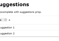
react-autocomplete-tags
A React component that build a Autocomplete with tags.
Demos
https://celebryts.github.io/react-autocomplete-tags
Installation
npm install @celebryts/react-autocomplete-tags --saveor
yarn add @celebryts/react-autocomplete-tagsBasic Usage
import React, { Component } from 'react' import Autocomplete from 'react-autocomplete-tags' class Example extends Component { constructor(props){ super(props) this.state = { suggestions: [ { label: 'Suggestions 1', value: '1' }, { label: 'Suggestions 2', value: '2' }, { label: 'Another suggestions', value: 'X' } ] } } onChange = (value) => { console.log('Value received from onChange: ' + value) } render(){ return ( <Autocomplete suggestions={this.state.suggestions} onChange={this.handleChange} /> ) } }Props
| Prop | Type | Default | Description |
|---|---|---|---|
className | String | '' | Classname to style the root div. |
suggestions | Array | [] | Suggestions to show. |
tags | Array | [] | Visible tags in input. |
limitTags | Number | null | Maximum allowed tags. |
allowCreateTag | Boolean | true | If user can create tags without restritions. |
saveOnBlur | Boolean | false | If component must add current input value on blur. |
delay | Number | null | Delay in onChange event after user changes. |
onKeyUp | Function | ()=>{} | Callback for key up event. |
onKeyDown | Function | ()=>{} | Callback for key down event. |
onFocus | Function | ()=>{} | Callback for focus event. |
onChange | Function | ()=>{} | Callback for changes in input. |
className : String
Css class to stylize the component:
<Autocomplete className="my-css-class" />This will be applied into <div> element that wrap the other Autocomplete elements.
You can style elements like this:
.my-css-class{ background-color: #f0f0f0; } .my-css-class > div{ padding: 20px 0; } .my-css-class input{ margin: 0 10px; } suggestions : Array
Array of suggestions to show. It needs to be an array of objects:
<Autocomplete suggestions={ [ { label: 'Suggestion 1', value: 'IdOfSuggestion1' }, { label: 'Suggestion 2', value: 'IdOfSuggestion2' } ] } />label is the text to be showed on suggestions area of the Autocomplete.
value is the value of the showed label.
It's similar to the label/value funcionality of HTML <option> .
tags : Array
Array of tags that are initially rendered on input. The usage is similar to suggestions.
<Autocomplete tags={ [ { label: 'Tag 1', value: 'IdOfTag1' }, { label: 'Tag 2', value: 'IdOfTag2' } ] } />limitTags : Number
You can set whether the input will have a limit amout.
<Autocomplete limitTags={2} tags={ [ { label: 'Tag 1', value: 'IdOfTag1' } ] } />In the above example, user will be able to add only 2 tags. (Or erase the first and write another 3).
allowCreateTag : Boolean
Its possible block the creation of tags, thus the user will be able to put only tags that were been suggesteds in input.
<Autocomplete allowCreateTag={false} suggestions={ [ { label: 'Choose one option', value: 'IdOfSuggestion1' }, { label: 'You cannot create tags', value: 'IdOfSuggestion1' }, { label: 'Last chance', value: 'IdOfSuggestion2' } ] } />saveOnBlur : Boolean
When the event blur occurs, the typed text (even if not sent) will be transformed into a tag.
<Autocomplete saveOnBlur={true} />delay : Number
Sometimes we don't need the event onChange immediately after user action, so, we can add a delay (milliseconds) to this happen.
<Autocomplete delay={300} onChange={this.handleChange} />Issues
You can report your issues here
Pull Requests
Pull Requests are always welcome! :)
Clone the repository: https://github.com/celebryts/react-autocomplete-tags, and run the command:
npm run devAuthors
Built by Celebryts


