@cat-react / form 


A simple yet powerful library which helps creating validated forms in react. This project is inspired by formsy-react.
Installation
- Install the dependency
@cat-react/form
(e.g. withyarn add @cat-react/formornpm install @cat-react/form --save) - Import the Components with
import {Form, Input} from '@cat-react/form';
Getting Started
| API Documentation | Examples |
|---|
Are you looking for a simple way to create validated forms with React?
Congratulations! Your search is over, because @cat-react/form offers you a simple way to create either frontend- or backend-validated forms. Validations can either be processed synchronous or asynchronous and the state of the form is being refreshed in real time.
Take a look at the examples to find out how to create the form of your desire.
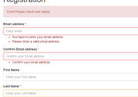
<Form> <MyInput name="email" validations={{ isEmail: true, isRequired: true }}/> <MyInput name="email_confirm" validations={{ isRequired: true, equalsField: 'email' }} messages={{ isRequired: 'Please confirm your email address.', equalsField: 'The email addresses do not match each other.' }}/> </Form>Example Custom TextInput
Here you can see an example of an custom TextInput which shows how you can implement your own Inputs:
import React from 'react'; import {Input} from '@cat-react/form' @Input export default class BasicInput extends React.Component { onChange(event) { this.props.setValue(event.target.value); } getClassName() { let className = 'form-control'; if (!this.props.isPristine()) { if (this.props.isValid()) { const isWarning = this.props.getMessages().length > 0; if (isWarning) { className += ' warning'; } } else { className += ' error'; } } return className; } renderMessages() { let messages = []; if (!this.props.isPristine()) { messages = this.props.getMessages(); } if (!messages || messages.length <= 0) { return null; } let className = 'errorText'; if (this.props.isValid()) { className = 'warningText'; } return <ul className={className}>{messages.map((message, i) => <li key={i}>{message}</li>)}</ul>; } render() { return ( <div className="form-group"> <label htmlFor={this.props.name}>{this.props.label} {this.props.isRequired() ? '*' : null}</label> <input type={this.props.type} className={this.getClassName()} id={this.props.name} aria-describedby={this.props.name} placeholder={this.props.placeholder} value={this.props.getValue()} onChange={this.onChange.bind(this)} onBlur={this.props.touch}/> {this.renderMessages()} </div> ); } }Note: You need the babel-plugin-transform-decorators plugin to use the @Input decorator. If you don't want or cannot add this plugin to you webpack config you need to use the HOC as a function (like the connect() HOC of Redux).
Example: export default Input(BasicInput)
See the Babel Documentation for a detailed guide about how to add decorators to your application.
Contribution
The project requires at least the latest stable version of node and npm. You also need to have yarn installed globally.
Two simple steps to get the things running on your local machine:
- Fork the repo
- Execute
yarn
You can run the examples with yarn run examples and the tests with yarn test.
How to build a release
- update the
CHANGELOG.mdwith all changes regarding the new release - update the release version in the
package.json - push the changes
- build the project locally with
npm run build cdinto thedistfolder and runnpm publish --access public- draft a new release at
Githubwith the contents of theCHANGELOG.mdfile
License
Copyright (c) 2018 Catalysts GmbH


