
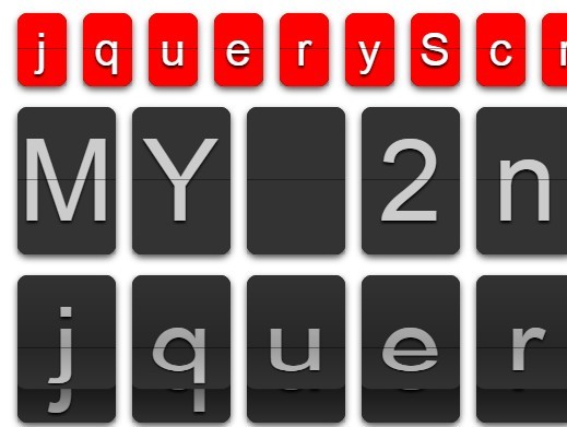
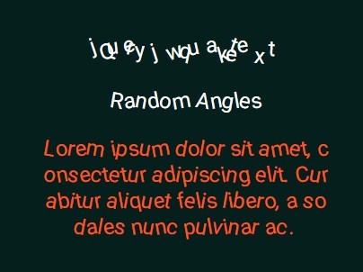
TextyleFLIP.js
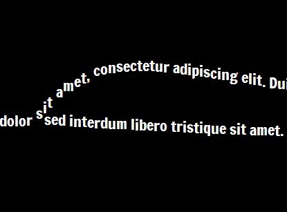
A flip text revealing effect with jQuery and tiny CSS.
How to use
JS
TextyleFLIP.js requires jQuery and textyleF.js ( or textyleF.min.js).
read
<script src="https://ajax.googleapis.com/ajax/libs/jquery/3.3.1/jquery.min.js"></script> <script src="textyleF.min.js"></script> call ( most simply )
$('target').textyleF(); CSS (with vendor prefix, if necessary)
target element
opacity: 0; perspective: xxx; //3d effective dose span (as child element)
flip effect
transform : rotateY(xxxdeg); //you can also use 'rotateX' together. (transform-origin : xxx;) //If you want. fade effect
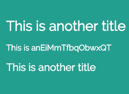
opacity: 0; example 1
target { opacity: 0; perspective : 200px; } target span { /* flip effect */ transform : rotateY(-90deg); /* fade effect */ opacity: 0; } example 2
target { opacity: 0; perspective : 200px; } target span { /* flip effect */ transform : rotateY(-90deg) rotateX(45deg); transform-origin : -50% 75%; /* fade effect */ opacity: 0; } Opitions
You can choose some following options or add callback function.
Values below is default.
$('target').textyleF({ duration : 1000, delay : 150, easing : 'ease', callback : null }); You can use CSS easing property or cubic-bezier as 'easing' property.
example
$('target').textyleF({ duration : 2000, delay : 200, easing : 'cubic-bezier(0.785, 0.135, 0.15, 0.86)', callback : function(){ $(this).css({ color : '#fff', transition : '1s', }); $('.desc').css('opacity',1); } }); 


