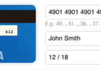
React Credit Cards
A modern credit card component for React.
Install
npm install --save react-credit-cards Usage
import Cards from 'react-credit-cards'; ... <Cards number={input.number.value} name={input.name.value} expiry={input.expiry.value} cvc={input.cvc.value} focused={state.focused} />Don't forget to import the react-credit-cards/lib/styles.scss if you are using SASS in your project.
Or you can import the CSS:
import 'react-credit-cards/es/styles-compiled.css';
Features
- We support all credit card issuers available in Payment plus Hipercard (a brazilian credit card).
Props
name{string}: Name on card. *number{string|number}: Card number. *expiry{string|number}: Card expiry date.10/20or012017*cvc{string|number}: Card CVC/CVV. *focused{string}: Focused card field.name|number|expiry|cvclocale{object}: Localization text (e.g.{ valid: 'valid thru' }).placeholders{object}: Placeholder text (e.g.{ name: 'YOUR NAME HERE' }).preview{bool}: To use the card to show scrambled data (e.g.**** 4567).issuer{string}: Set the issuer for thepreviewmode (e.g.visa|mastercard|...)acceptedCards{array}: If you want to limit the accepted cards. (e.g.['visa', 'mastercard']callback{func}: A callback function that will be called when the card number has changed with 2 paramaters:type ({ issuer: 'visa', maxLength: 19 }), isValid ({boolean})
* Required fields
SCSS options
Credit Card sizing
$rccs-card-ratio: Card ratio. Defaults to1.5858$rccs-size: Card width. Defaults to290px
Credit Card fonts
$rccs-name-font-size: Defaults to17px$rccs-name-font-family: Defaults toConsolas, Courier, monospace$rccs-number-font-size: Defaults to17px$rccs-number-font-family: Defaults toConsolas, Courier, monospace$rccs-valid-font-size: Defaults to10px$rccs-expiry-font-size: Defaults to16px$rccs-expiry-font-family: Defaults toConsolas, Courier, monospace$rccs-cvc-font-size: Defaults to14px$rccs-cvc-font-family: Defaults toConsolas, Courier, monospace$rccs-cvc-color: Defaults to#222
Credit Card styling
$rccs-shadow: Defaults to0 0 20px rgba(#000, 0.2)$rccs-light-text-color: Card text color for dark cards. Defaults to#fff$rccs-dark-text-color: Card text color for light cards. Defaults to#555$rccs-stripe-bg-color: Stripe background color in the back. Defaults to#2a1d16$rccs-signature-background: Signature background in the back. Defaults torepeating-linear-gradient(0.1deg, #fff 20%, #fff 40%, #fea 40%, #fea 44%, #fff 44%)$rccs-default-background: Default card background. Defaults tolinear-gradient(25deg, #939393, #717171)$rccs-unknown-background: Unknown card background. Defaults tolinear-gradient(25deg, #999, #999)$rccs-background-transition: Card background transition. Defaults toall 0.5s ease-out$rccs-animate-background: Card background animation. Defaults totrue
Credit Card brands
$rccs-amex-background: Defaults tolinear-gradient(25deg, #308c67, #a3f2cf)$rccs-dankort-background: Defaults tolinear-gradient(25deg, #ccc, #999)$rccs-dinersclub-background: Defaults tolinear-gradient(25deg, #fff, #eee)$rccs-discover-background: Defaults tolinear-gradient(25deg, #fff, #eee)$rccs-mastercard-background: Defaults tolinear-gradient(25deg, #e8e9e5, #fbfbfb)$rccs-visa-background: Defaults tolinear-gradient(25deg, #0f509e, #1399cd)$rccs-elo-background: Defaults tolinear-gradient(25deg, #211c18, #aaa7a2)$rccs-hipercard-background: Defaults tolinear-gradient(25deg, #8b181b, #de1f27)
Development
Here's how you can get started developing locally:
$ git clone [email protected]:amarofashion/react-credit-cards.git $ cd react-credit-cards $ npm install $ npm start Now, if you go to http://localhost:3000 in your browser, you should see the demo page.
Contributing
Please read CONTRIBUTING.md for details on our code of conduct, and the process of contributing to the project.
Useful links
EBANK's test numbers
Adyen's test numbers
Worldpay's test card numbers
Brazilian cards patterns
LICENSE
This project is licensed under the MIT License.


