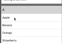
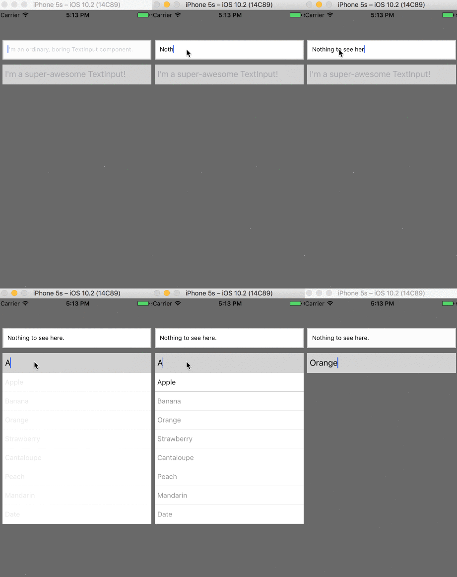
AutoSuggest TextInput Component
Installation
npm install autosuggest --save
Example:
check the index.ios.js in the example repo.
import { TextInput } from 'react-native' import AutoSuggest from 'react-native-autosuggest';
<AutoSuggest onChangeText={(text) => console.log('input changing!')} terms={['Apple', 'Banana', 'Orange', 'Strawberry', 'Lemon', 'Cantaloupe', 'Peach', 'Mandarin', 'Date', 'Kiwi']} ... /> Props
| Prop | Type | Optional | Default | Description |
|---|---|---|---|---|
onChangeText | Function | false | (prop is manadatory) | fired when the input changes. e.g (ev) => console.log(event) |
terms | Array | false | (prop is mandatory) | list of suggestions. e.g ['Chicago', 'New York', 'San Francisco'] |
onChangeTextDebounce | Number | true | 300 | the minimum break in milliseconds that the onChangeText callback needs to take before firing again. |
onItemPress | Function | true | undefined | fired when an item in the menu is pressed with that item's string value as the argument. You probably don't need this, and should just use onChangeText |
placeholder | String | true | '' | e.g 'please enter a name' |
clearBtnStyles | Object | true | ...see src | styles that go around your clear btn |
clearBtnVisibility | Bool | true | false | is the clear input button visible? |
clearBtn | Array | true | undefined | only if you want a custom btn component |
containerStyles | Object | true | ...see src | applies to the entire application |
placeholderTextColor | String | true | 'lightgrey' | placeholder text color |
otherTextInputProps | Object | true | undefined | check the TextInput docs for the full list) |
textInputStyles | Object | true | undefined | applies to the TextInput component e.g {width: 400, backgroundColor: "black"}) |
rowWrapperStyles | Object | true | undefined | applies to the View around the dropdown |
rowTextStyles | Object | true | undefined | applies the dropdown text |
Contributing
- I set up the following repo for development: https://github.com/silesky/AutosuggestExample
- Clone, npm install, and cd
node_modules/react-native-autosuggestto start work.


