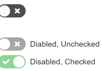
An elegant, accessible toggle component for React. Also a glorified checkbox.
See usage and examples.
Props
The component takes the following props.
| Prop | Type | Description |
|---|---|---|
checked | boolean | If true, the toggle is checked. If false, the toggle is unchecked. Use this if you want to treat the toggle as a controlled component |
defaultChecked | boolean | If true on initial render, the toggle is checked. If false on initial render, the toggle is unchecked. Use this if you want to treat the toggle as an uncontrolled component |
onChange | function | Callback function to invoke when the user clicks on the toggle. The function signature should be the following: function(e) { }. To get the current checked status from the event, use e.target.checked. |
onFocus | function | Callback function to invoke when field has focus. The function signature should be the following: function(e) { } |
onBlur | function | Callback function to invoke when field loses focus. The function signature should be the following: function(e) { } |
name | string | The value of the name attribute of the wrapped <input> element |
value | string | The value of the value attribute of the wrapped <input> element |
id | string | The value of the id attribute of the wrapped <input> element |
icons | object | If false, no icons are displayed. You may also pass custom icon components in icons={{{checked: <CheckedIcon />, unchecked: <UncheckedIcon />}} |
aria-labelledby | string | The value of the aria-labelledby attribute of the wrapped <input> element |
aria-label | string | The value of the aria-label attribute of the wrapped <input> element |
disabled | boolean | If true, the toggle is disabled. If false, the toggle is enabled |
Installation
npm install react-toggleUsage
If you want the default styling, include the component's CSS with
import "react-toggle/style.css" // for ES6 modules // or require("react-toggle/style.css") // for CommonJSDevelopment
npm install npm run devBuild
npm run buildLicense
MIT


