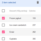
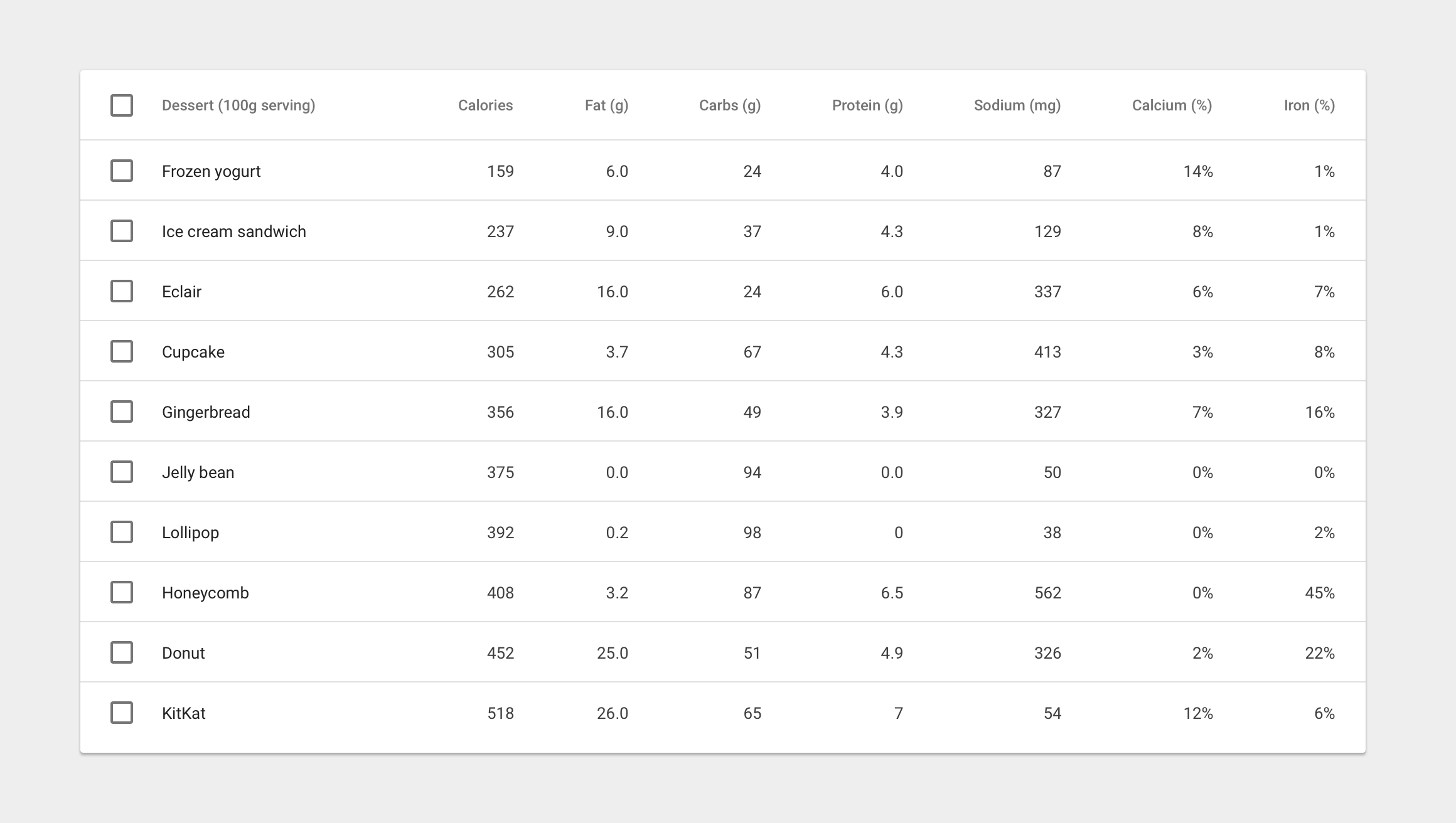
Live demo http://iamisti.github.io/mdDataTable/
Angular material table. Complete implementation of google material design based on angular material components. This component is optimized for speed, and it's faster then other similar implementations, since it generates a native html table, and browsers are optimized for tables.
Angular2 and Angular2 Material version of this plugin is under development. If you want to be notified for the first release, please star the project here:
md-data-table2
Usage statistics
Install
bower install md-data-tableornpm install md-data-tableor download the source.- Make sure the
mdDataTable(notice the camelCase typing) lib is loaded. It's served in three different files:md-data-table-style.css,md-data-table.js,md-data-table-templates.js - Add
mdDataTableas a dependency of your app.
Load it from CDN (with example of version 1.8.0)
https://cdnjs.cloudflare.com/ajax/libs/md-data-table/1.8.0/md-data-table-templates.min.js
https://cdnjs.cloudflare.com/ajax/libs/md-data-table/1.8.0/md-data-table.min.js
https://cdnjs.cloudflare.com/ajax/libs/md-data-table/1.8.0/md-data-table-style.css
UI&UX driven by google data table
http://www.google.com/design/spec/components/data-tables.html
Table of contents
- selectable-rows
- virtual-repeat
- delete-row-callback
- selected-row-callback
- animate-sort-icon
- ripple-effect
- ! title-overflow-handler
- table-card
- paginated-rows
- alternate-headers
- mdt-row
- mdt-row-paginator
- mdt-row-paginator-error-message
- mdt-row-paginator-no-results-message
- mdt-trigger-request
- mdt-translations
- mdt-loading-indicator
Column attributes (mdt-column)
- align-rule
- column-definition
- column-filter
- exclude-from-column-selector
- hide-column-by-default
- table-row-id
- ! inline-menu
- editable-field
- html-content
Custom cell content (mdt-custom-cell)
- column-key
Overview
In its simplest form, a data table contains a top row of column names, and rows for data.
Table attributes
Global attributes for the table
| Available | Params | ChildParams | Type | Details |
|---|---|---|---|---|
| mdt-row | Object | optional, makes possible to provide row data by passing the information through this attribute. Makes it possible to listen on data changes. | ||
| data | Array | required, The input data | ||
| table-row-id-key | String | Integer | ||
| table-row-class-name | Function | optional, callback that defines the classname of a row. | ||
| column-keys | Array | required, property names of the passed data array. Makes it possible to configure which property should go in which column. | ||
| mdt-translations | Object | optional, makes it possible to provide a custom translated texts in the table. | ||
| rowsPerPage | String | When you need to select the amount of rows visible on the page, this label appears next to the dropdown | ||
| largeEditDialog.saveButtonLabel | String | When edit mode is on, in the modal you can click on a button which has the 'Save' label. | ||
| largeEditDialog.cancelButtonLabel | String | When edit mode is on, in the modal you can click on a button which has the : 'Cancel' label. | ||
| mdt-loading-indicator | Object | optional, if set then loading indicator can be customised. | ||
| color | String | Passing a css compatible format as a color will set the color for the loading indicator (e.g.: 'red' or '#008bd2', '#000') | ||
Html support is available for mdt-row, see more: Custom cell content (mdt-custom-cell) |
Example usage for mdt-row attribute:
<mdt-table selectable-rows="true" table-card="{title: Nutrition, actionIcons: true}" mdt-row="{ 'data': filteredItems, 'table-row-id-key': 'id', 'column-keys': ['name', 'calories', 'fat', 'carbs', 'protein', 'sodium', 'calcium', 'iron'] }"> <mdt-header-row> <mdt-column>Dessert (100g serving)</mdt-column> <mdt-column>Type</mdt-column> <mdt-column>Calories</mdt-column> <mdt-column sortable-rows-default>Fat (g)</mdt-column> <mdt-column>Carbs (g)</mdt-column> <mdt-column>Protein (g)</mdt-column> </mdt-header-row> <!-- notice we didn't provide mdt-row here --> </mdt-table>| Available | Params | Type | Details |
|---|---|---|---|
| mdt-row-paginator | Function | optional, makes possible to provide a callback function which returns a promise, providing the data for the table. Has two parameters: page and pageSize (an optional parameter is options as a third parameter, which can have columnFilter property when column-filter is used or columnSort when you turn on column sorting feature | |
| mdt-row-paginator-error-message | String | optional, overrides default error mesasge when promise gets rejected by the paginator function. | |
| mdt-row-paginator-no-results-message | String | optional, overrides default 'no results' message when there are no results in the table. | |
| mdt-trigger-request | function(loadPageCallback) | optional, if mdt-row-paginator set, provides a callback function for manually triggering an ajax request. Can be useful when you want to populate the results in the table manually. (e.g.: having a search field in your page which then can trigger a new request in the table to show the results based on that filter. |
Example usage for mdt-row-paginator attribute:
<mdt-table paginated-rows="{isEnabled: true, rowsPerPageValues: [5,10,20,100]}" mdt-row-paginator="paginatorCallback(page, pageSize, options)" mdt-row-paginator-error-message="Error happened during loading nutritions." mdt-row="{ 'table-row-id-key': 'fields.item_id', 'column-keys': [ 'fields.item_name', 'fields.nf_calories', 'fields.nf_total_fat', 'fields.nf_total_carbohydrate', 'fields.nf_protein', 'fields.nf_sodium', 'fields.nf_calcium_dv', 'fields.nf_iron_dv' ], }"> <mdt-header-row> <mdt-column align-rule="left">Dessert (100g serving)</mdt-column> <mdt-column align-rule="right">Calories</mdt-column> <mdt-column align-rule="right">Fat (g)</mdt-column> <mdt-column align-rule="right">Carbs (g)</mdt-column> <mdt-column align-rule="right">Protein (g)</mdt-column> <mdt-column align-rule="right">Sodium (mg)</mdt-column> <mdt-column align-rule="right">Calcium (%)</mdt-column> <mdt-column align-rule="right">Iron (%)</mdt-column> </mdt-header-row> </mdt-table>Column attributes
mdt-columnattributes
| Available | Params | ChildPArams | Type | Details |
|---|---|---|---|---|
| align-rule | String | if provided, align the text to the needed direction for the entire column (note, that it aligns the data that belongs to the column) | ||
| (default) left | left-align content | |||
| right | right-align content |
| Available | Params | ChildPArams | Type | Details |
|---|---|---|---|---|
| sortable-rows-default | - | When column-sort is applied to the table, it marks the column as the default sorting column | ||
| column-sort | Boolean | Object | ||
| column-sort | true | false | ||
| column-sort | comparator | in case of object, specifying a 'comparator' property which is a function for sorting the column data's. As every compare function, it gets two parameters and return with the compared result (-1,1,0) |
| Available | Params | ChildPArams | Type | Details |
|---|---|---|---|---|
| column-filter | Object | if provided, user can activate column filter feature on the selected column. | ||
| valuesProviderCallback | Function | required, function which provides the values into the column filter. It must return with a promise which resolves an array of strings/objects. | ||
| valuesTransformerCallback | Function | optional, function which transforms the provided objects into strings to be able to show it visually in the column filter. | ||
| placeholderText | Text | optional, placeholder which will show up as a default text (available only for chips and dropdown filter types | ||
| filterType | Text | optional, defines the type of the filter you want to use. Available options are: chips, checkbox, dropdown. If you don't specify it, the default will be chips | ||
| exclude-from-column-selector | Boolean | optional, excludes the column from the column selection feature | ||
| hide-column-by-default | Boolean | optional, make column unselected by default in the column selection panel |
When filters are applied to the columns, a third parameter will be applied to the
mdt-row-paginatorcallback function.
Data-Row attributes
mdt-rowattributes
| Available | Params | Type | Details |
|---|---|---|---|
| table-row-id | String | Integer |
Custom cell content
mdt-custom-cellattributes
If you are using mdt-row attribute to load your data (which is only way of you are dealing with ajax contents), you can now have custom content for each cells you defined. Important information:
You can still access your scope variables/functions with accessing
clientScopewithin themdt-custom-celldirective. The value of the cell can be accessed by accessingvalueinside the directive. AccessingrowIdalso possible if you specified it withtable-row-id-key.
| Available | Params | ChildParams | Type | Details |
|---|---|---|---|---|
| column-key | String | required, specifies the column in the rows. | ||
There is only one scope variable that you can use in your template, and it's called value. Check the example. |
Example usage for mdt-custom-cell:
<mdt-table> <mdt-table mdt-row="{'data': filteredItems, 'table-row-id-key': 'id', 'column-keys': ['name', 'calories', 'fat', 'carbs', 'protein', 'sodium', 'calcium', 'iron']}"> <mdt-header-row> <mdt-column align-rule="left">Dessert (100g serving)</mdt-column> <mdt-column align-rule="right">Calories</mdt-column> <mdt-column align-rule="right">Fat (g)</mdt-column> <mdt-column align-rule="right">Carbs (g)</mdt-column> <mdt-column align-rule="right">Protein (g)</mdt-column> <mdt-column align-rule="right">Sodium (mg)</mdt-column> <mdt-column align-rule="right">Calcium (%)</mdt-column> <mdt-column align-rule="right">Iron (%)</mdt-column> </mdt-header-row> <!-- here you have your own, customised cell for every 'protein' column --> <mdt-custom-cell column-key="protein"> <span ng-class="{'red': value > 5, 'green': value <= 5}">{{value}}</span> <span ng-click="clientScope.myMethodToExecute()">click here</span> <span>This is the row id for this column: {{rowId}}</span> </mdt-custom-cell> </mdt-table> </mdt-table>Data-Cell attributes
mdt-cellattributes
| Available | Params | ChildParams | Type | Details |
|---|---|---|---|---|
| inline-menu | Array | if provided, users can select from a predefined list of options. In this scenario, a menu component directly embedded in the table | ||
 | ||||
 |
| Available | Params | ChildParams | Type | Details |
|---|---|---|---|---|
| html-content | Boolean | When the cell content is not a simple value (html content) |
Example usage:
<mdt-table selectable-rows="true" table-card="{title: Nutrition, actionIcons: true}"> <mdt-header-row> <!-- defining column descriptions, align content to the left --> <mdt-column align-rule="left" column-definition="The total amount of food energy in the given serving size."> Dessert (100g serving) </mdt-column> <!-- in case of inline menu (INLINE-MENU FEATURE DOES NOT EXIST YET) --> <mdt-column inline-menu="[ {iceCream: 'Ice Cream', pastry: 'Pastry', other: 'Other'} ]">Type</mdt-column> <!-- inline text editing (EDITABLE-FIELDS FEATURE DOES NOT EXIST YET) --> <mdt-column editable-field="textInput"> Calories </mdt-column> <!-- in case of sortable columns, we can set the defaultly sortable column --> <mdt-column sortable-rows-default> Fat (g) </mdt-column> <mdt-column>Carbs (g)</mdt-column> <mdt-column>Protein (g)</mdt-column> </mdt-header-row> <mdt-row ng-repeat="nutrition in nutritionList"> <mdt-cell>Frozen Joghurt</mdt-cell> <mdt-cell>159</mdt-cell> <mdt-cell>6</mdt-cell> <mdt-cell>24</mdt-cell> <mdt-cell>4</mdt-cell> <mdt-cell>87</mdt-cell> </mdt-row> </mdt-table>