ng-material-floating-button
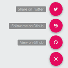
Material design floating action button implemented as an Angularjs directive. Shamelessly inspired by action buttons from Google Inbox, Evernote and Path.
Made to be fast and easy to customise. It works out of the box with no other dependency apart from Angular, but plays nicely with the Angular Material bundle, for which it has dedicated templates.
Demo
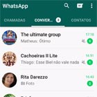
Head over to the project homepage to see it in action as a standalone component, check the Angular Material integration or just take a look at this awesome gif:
Other versions
- Vanilla html (original, upstream version of the component)
- React component
How to use
Download/clone the repo or use your favorite package manager:
npm i ng-material-floating-button --save or:
bower install ng-mfb --save Then (optionally) run npm install to have access to the configured Grunt tasks.
Look in the demo folder for usage examples and head to the original component docs to see how to customise the styles of the menu.
If you are upgrading check the changelog before doing so in order to prevent breaking changes to bite you.
Basic setup
Download the whole repo or clone it, then reference the directive css file (here is mfb/src/mfb.css)in your <head>:
<link href="../path/to/css/mfb.css" rel="stylesheet"/>Place a reference to the directive before the closing <body> tag or anywhere after your angular script tag.
<script src="../mfb/src/mfb-directive.js"></script>Make sure you reference the Mfb module as a dependecy to your app or module like so:
var app = angular.module('your-app', ['ng-mfb']);Finally, place the correct html structure in your template. As a first example, assuming your example is using Ionicons as icon font:
<nav mfb-menu position="br" effect="zoomin" label="hover here" active-icon="ion-edit" resting-icon="ion-plus-round" toggling-method="click"> <button mfb-button icon="paper-airplane" label="menu item"></button> </nav>This example shows the two basic components of the directive, a unique mfb-menu element which serves as a wrapper to a variable number of child buttons, defined by the mfb-button attribute. This above code will output a basic button menu on the bottom right corner of the screen with a single menu item. Hardly amazing, so let's see how to customise it.
NOTE: if you want to change the CSS make you sure you understand how it's supposed to be done. Please read here and here.
Element attributes
A number of attributes can be passed to the elements from the template in order to customise both behavior and appearance.
####<mfb-menu> element This can be defined as an attribute or an element. So this is valid:
<ul mfb-menu></ul>...and this is valid too:
<mfb-menu></mfb-menu>TemplateUrl
Optional attribute definining the template for the main button. If no template is specified it will fallback to the default ng-mfb-menu-default.tpl.html. If you are using Angular Material in your app you can pass the predefined template for the Angular Material bundle which is ng-mfb-menu-md.tpl.html.
Example:
<ul mfb-menu template-url="ng-mfb-menu-md.tpl.html"> <!-- this will display the Angular Material optimised template --> </ul>By no means you are tied to the default templates, though. See customising templates.
Main Action
Defines a main action that will get fired when the main button is clicked. Works best with toggling-method=hover to put a main action on the base button.
Example:
<ul mfb-menu main-action="fireMainAction()"></ul>Position
Defines in which corner of the screen the component should be displayed.
| value | explanation |
|---|---|
tl | top-left corner |
tr | top-right corner |
br | bottom-right corner |
bl | bottom-left corner |
Example:
<ul mfb-menu position="br"> <!-- this will be displayed on the bottom-right corner of the screen --> </ul>Toggling method
Defines how the user will open the menu. Two values are possible:
| value | explanation |
|---|---|
hover | hover to open the menu |
click | click or tap to open the menu |
Example:
<ul mfb-menu toggling-method="click"> <!-- click on the button to open the menu --> </ul>NOTE: Using hover will prevent user browsing on modbile/touch devices to properly interact with the menu. The directive provides a fallback for this case.
If you want the menu to work on hover but need support for touch devices you first need to include Modernizr to detect touch support. If you are alreay using it in your project just make sure that the touch detection is enabled.
If you're not using Modernizr already, just include the tiny (<3KB) provided modernizr.touch.js script (look in the mfb/src/lib/ folder) in your <head> or get the latest version of this very script right from here. Note that this is a custom build and will only detect for touch support, it's not the full library.
Menu state
You can programmatically open/close the menu leveraging this attribute at any time after compilation, without any clicking required by the user, or listen to the current state of the menu.
| value | explanation |
|---|---|
open | menu is... open (surprise, surprise) |
closed | menu is...(hold tight) ... closed |
Example:
<ul mfb-menu menu-state="myVar"> </ul>// in your controller $scope.myVar = 'closed';NB: currently this value is only updated if using click toggling.
Effect
Defines the effect that is performed when the menu opens up to show its child buttons.
| value |
|---|
zoomin |
slidein |
slidein-spring |
fountain |
Test them here.
Example:
<ul mfb-menu effect="zoomin"> </ul>Label
The text that is displayed when hovering the main button. Example:
<ul mfb-menu label="your text here"> </ul>Active-icon
The icon that will be displayed by default on the main button. Example:
<ul mfb-menu active-icon="ion-edit"> </ul>Resting-icon
The icon that will be displayed on the main button when hovering/interacting with the menu. Example:
<ul mfb-menu resting-icon="ion-plus-round"> </ul><mfb-button> element
This element represents the child button(s) of the menu and can only "live" inside a wrapper <mfb-menu> element. Like its parent, it can be defined both as an attribute and as an element. So this is valid:
<a mfb-button></a>...and this is valid too:
<mfb-button></mfb-button>NOTE: If you are adding more than the default number of buttons supported by the provided CSS (currently 4) you will need to compile your own CSS beforehand to support your requirements. It's easy, here's an example.
TemplateUrl
Optional attribute definining the template for the child buttons. If no template is specified it will fallback to the default ng-mfb-button-default.tpl.html. If you are using Angular Material in your app you can pass the predefined template for the Angular Material bundle which is ng-mfb-button-md.tpl.html.
Example:
<button mfb-button template-url="ng-mfb-button-md.tpl.html"> <!-- this will display the Angular Material optimised template --> </button>Here again customising the template is surely possible, see how here.
Icon
Pass the class of the icon font character that is associated to the menu item: Example:
<a mfb-button icon="ion-paperclip"></a>Label
The text that is displayed when hovering the button. Example:
<a mfb-button label="About us"></a>Custom attributes
Due to the nature of the component you'll probably want to associate some actions or use other angular directives such as ng-repeat on the buttons. As these attributes will be copied over to the generated html structure you can simply attach them to the <mfb-element>. A couple of examples, here using ui-router:
<!-- if using ui-router, associate an on-click event to the anchor--> <a mfb-button ui-sref="yourState"></a>And here leveraging a basic ng-repeat with buttons defined via js:
// in your controller... $scope.buttons = [{ label: 'a link text', icon: 'ion-paper-airplane' },{ label: 'another link', icon: 'ion-plus' },{ label: 'a third link', icon: 'ion-paperclip' };<!-- in your template --> <!-- this will output 3 buttons with different icon, label and so on--> <a mfb-button label="{{button.label}}" icon="{{button.icon}}" ng-repeat="button in buttons"></a>mfb-button-close attribute
When using the toggling method click <ul mfb-menu toggling-method="click"> only the main button toggles the menu. If you want your secondary buttons to close the menu as well you can use the mfb-button-close attribute on your mfb-button.
That way if your mfb-button opens a modal or something else that loses focus, your menu will close.
<button mfb-button mfb-button-close>Closes the menu</button>Customising templates
Custom templates can be passed as a attributes to the directive. Just pass either the url of your own template or the ID of the script containing your template. Refer to the default templates provided to have a working base to build upon.
More customisations
The component have plenty more customisations available and they are all handled by the CSS. The CSS and its SCSS source files are found in the mfb/ folder (which is actually a subtree that pulls from this repo).
For a thorough overview of what and how to customise the look of the component through css make sure you read these docs, especially if you plan to keep your copy in sync with this repo by pulling in changes in the future.
Unit tests
To run the tests you need Jasmine and Karma runner. They can be run from the console with either grunt karma or karma start test/karma.conf.js commands.
Contributing and issues
Contributions are very welcome, as well as opening issues if you find any bugs. If an issue or pull request is not specifically related to the Angularjs version (i.e. it's a layout/css bug/feature) please open it on the original component repo rather than here.
Todos
- add "click to open" functionality and option
- add to bower
- add to npm
Credits
Thanks to these contributors. Demo icons are courtesy of Ionicons
