angular-circular-navigation 

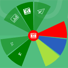
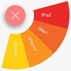
angular-circular-navigation is a AngularJS directive, which is build on top of the Tutorial Building a circular navigation with css transform by Sara Soueidan.
Usage 
You can get it from Bower:
bower install angular-circular-navigationAdd everything to your index.html:
<link rel="stylesheet" href="bower_components/angular-circular-navigation/angular-circular-navigation.css"> <script src="bower_components/angular/angular.js"></script> <script src="bower_components/angular-circular-navigation/angular-circular-navigation.js"></script>And specify the directive in your module dependencies:
angular.module('myApp', ['angularCircularNavigation'])Add the corresponding options in your controller:
$scope.options = { content: 'Menu', isOpen: false, toggleOnClick: true, items: [ { content: 'About', onclick: function () {console.log('About');} } ] };Then you are ready to use the directive in your view:
<div ng-controller="Controller"> <circular options="options"> </circular> </div>Options
The following attributes define the circular navigation menu itself and how to display each item.
isOpen : boolean (default: false)
Shows if the items are currently displayed or not.
toggleOnClick : boolean (default: false)
If true the menu will close when an item is clicked.
background : String
Sets the css attribute background for the whole menu.
color : String
Sets the css attribute color for the whole menu.
size : String (default: normal)
Possible values: small, normal, big
button : Object
Configuration of the central button which toggles the menu.
button.content : String
The text that will be rendered in the button.
button.cssClass : String
Adds css classes to the button.
button.background : String
Sets the css attribute background for the button.
button.color : String
Sets the css attribute color for the button.
button.size : String (default: normal)
Possible values: small, normal, big
items : Array of Objects
items.content : String
The text that will be rendered in this item.
items.isActive : boolean (default: false)
If true the item is rendered more prominent.
items.onclick : function
This function will called when the item is clicked and gets the option and the item itself as attribute.
items.cssClass : String
Adds css classes to this item.
items.background : String
Sets the css attribute background for this item.
items.color : String
Sets the css attribute color for this item.
button.empty : boolean (default: false)
If true the item is not rendered.
Development
We use Karma and jshint to ensure the quality of the code. The easiest way to run these checks is to use grunt:
npm install -g bower grunt-cli npm install gruntContributing
Please submit all pull requests the against develop branch. Make sure it passes the CI and add tests to cover your code

Authors
Max Klenk
Copyright and license
The MIT License Copyright (c) 2014 Max Klenk Permission is hereby granted, free of charge, to any person obtaining a copy of this software and associated documentation files (the "Software"), to deal in the Software without restriction, including without limitation the rights to use, copy, modify, merge, publish, distribute, sublicense, and/or sell copies of the Software, and to permit persons to whom the Software is furnished to do so, subject to the following conditions: The above copyright notice and this permission notice shall be included in all copies or substantial portions of the Software. THE SOFTWARE IS PROVIDED "AS IS", WITHOUT WARRANTY OF ANY KIND, EXPRESS OR IMPLIED, INCLUDING BUT NOT LIMITED TO THE WARRANTIES OF MERCHANTABILITY, FITNESS FOR A PARTICULAR PURPOSE AND NONINFRINGEMENT. IN NO EVENT SHALL THE AUTHORS OR COPYRIGHT HOLDERS BE LIABLE FOR ANY CLAIM, DAMAGES OR OTHER LIABILITY, WHETHER IN AN ACTION OF CONTRACT, TORT OR OTHERWISE, ARISING FROM, OUT OF OR IN CONNECTION WITH THE SOFTWARE OR THE USE OR OTHER DEALINGS IN THE SOFTWARE. 