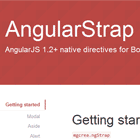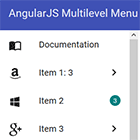
ng-material-multilevel-menu
Material Multi-Level Menu for Angular Projects.
Why ng-material-multilevel-menu?
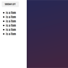
The main goal of this package is to deliver a slim and Skinny Material Multi-Level Menu for Angular Projects. That can fit into any kind of projects with no muss, no fuss. Within few lines, you will get an animation ready multilevel list that just works.
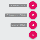
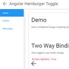
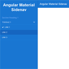
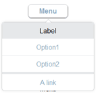
Demo
Check the Material Multi-Level Menu in action, click here.
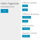
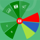
Features
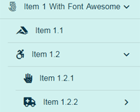
- Material Icons are supported.
- FontAwesome Icons are supported.
- Use images as icons in the list.
- Seamlessly work with Angular routing, if provided.
- RTL supported (thanks to StavM).
Installation
You can use either the npm or yarn command-line tool to install packages. Use whichever is appropriate for your project in the examples below.
NPM
npm install --save ng-material-multilevel-menu YARN
yarn add --save ng-material-multilevel-menu Usage
Follow below steps to add multi level list in your project
1. Import NgMaterialMultilevelMenuModule
You need to import the NgMaterialMultilevelMenuModule in the module of your app where you want to use it.
import { BrowserModule } from '@angular/platform-browser'; import { NgModule } from '@angular/core'; /* Import the module*/ import { NgMaterialMultilevelMenuModule } from 'ng-material-multilevel-menu'; import { AppComponent } from './app.component'; @NgModule({ declarations: [ AppComponent ], imports: [ BrowserModule, NgMaterialMultilevelMenuModule // Import here ], providers: [], bootstrap: [AppComponent] }) export class AppModule { }2. Use in your HTML
In your HTML: Use the <ng-material-multilevel-menu> wherever you like in your project.
<ng-material-multilevel-menu [configuration]='config' [items]='appitems' (selectedItem)="selectedItem($event)" (selectedLabel)="selectedLabel($event)"> </ng-material-multilevel-menu>3. Structure of array to display the list
Make sure you structure of array should look like array shown below,
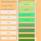
appitems = [ { label: 'NPM', imageIcon: '/assets/batman.jpg', link: 'https://www.npmjs.com/package/ng-material-multilevel-menu', externalRedirect: true }, { label: 'Item 1 (with Font awesome icon)', faIcon: 'fab fa-500px', items: [ { label: 'Item 1.1', link: '/item-1-1', faIcon: 'fab fa-accusoft' }, { label: 'Item 1.2', faIcon: 'fab fa-accessible-icon', items: [ { label: 'Item 1.2.1', link: '/item-1-2-1', faIcon: 'fas fa-allergies' }, { label: 'Item 1.2.2', faIcon: 'fas fa-ambulance', items: [ { label: 'Item 1.2.2.1', faIcon: 'fas fa-anchor', onSelected: function() { console.log('Item 1.2.2.1'); } } ] } ] } ] }, { label: 'Item 2', icon: 'alarm', items: [ { label: 'Item 2.1', link: '/item-2-1', icon: 'favorite' }, { label: 'Item 2.2', link: '/item-2-2', icon: 'favorite_border' } ] }, { label: 'Item 3', icon: 'offline_pin', onSelected: function() { console.log('Item 3'); } }, { label: 'Item 4', link: '/item-4', icon: 'star_rate', hidden: true } ];API
Using configuration, You can customise the appearance of the list.
paddingAtStart: boolean=> [optional] If you don't want padding at the start of the list item, then you can givefalse. The default value will betrue.interfaceWithRoute: boolean=> [required] only if you want to use Angular Routing with this menu.highlightOnSelect: boolean=> [optional] If you want to highlight the clicked item in the list, then you can do that by making ittrue. The default value will befalse.collapseOnSelect: boolean;=> [optional] You have the option to collapse another parent when clicked on the current parent. The default value will befalse.rtlLayout: boolean;=> [optional] whether display is Right To Left. The default value will befalse.classname: string;=> [optional] You can give your own custom class name in order to modify the list appearance.listBackgroundColor: string;=> [optional] You can apply custom color to the background of the list.fontColor: string;=> [optional] Changes the color of Text and icons inside the list.backgroundColor: string;=> [optional] This will change the background color list container.selectedListFontColor: string;=> [optional] This will change the font color of selected list item.
Below is example how you can apply diffent background and Font colors,
config = { paddingAtStart: true, interfaceWithRoute: true, classname: 'my-custom-class', listBackgroundColor: `rgb(208, 241, 239)`, fontColor: `rgb(8, 54, 71)`, backgroundColor: `rgb(208, 241, 239)`, selectedListFontColor: `red`, highlightOnSelect: true, collapseOnSelect: true, rtlLayout: false };Default classes
selected-amml-item: This class will be applied to currently selected link and it's father links.active-amml-item: This class will be applied to currently selected link.
Dependencies
Contribution
I welcome you to fork and add more features into it. If you have any bugs or feature request, please create an issue at github repository.
License
MIT