Angular Contents


Angular Table of Contents that follow you while you scroll down.
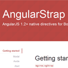
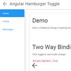
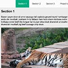
Demo
zurfyx.github.io/angular-contents
Install
npm install angular-contents Getting started
If you are using Angular Material, you are most likely going to have to use Scrolling View.
import { ContentsModule } from 'angular-contents'; @NgModule({ imports: [ ... ContentsModule, ... ], ∅
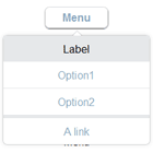
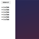
<div class="columnify" contents> <!-- Body --> <div> <div [contentsSection]="'section-one'"> <h1>Section One</h1> ... </div> <div [contentsSection]="'section-two'"> <h1>Section Two</h1> ... </div> <!-- Table of Contents --> <div class="table-column"> <ul class="contents-table" contentsTable> <li><a href="#section-one" contentsLink>Section One</a></li> <li><a href="#section-two" contentsLink>Section Two</a></li> </ul> </div> </div> * class names can be freely renamed. Just make sure to adjust the CSS classes later accordingly.
Below are the styles that the Angular Contents demo page uses. Only the <-- must have fields are required. Feel free to adjust the rest to your website style.
The snippet above displays the Angular Contents specific styles, you can find the full page styles here.
.contents-table { // Do not use margin here. It will be overwritten. position: absolute; // <-- must have. padding: 2rem; } .contents-table.sticky { position: fixed; // <-- must have. top: 0; // <-- must have. } .contents-table { list-style: none; margin: 0; } .contents-table a { border-radius: 4px; display: block; padding: 0.3rem 0.6rem; color: #444; text-decoration: none; } .contents-table a.active { background-color: #000; color: #fff; } .columnify > .table-column { flex: 0 1 auto; width: 220px; } // Columnify https://stackoverflow.com/a/47220287 .columnify { display: flex; } .columnify > * { flex: 1; } .columnify > *:not(:first-child) { margin-left: 2rem; } Scroll animation
By default, Angular Contents carries no animation. Feel free to choose a scrolling library of your choice.
The demo page uses ngx-page-scroll. Attaching it to Angular Contents is as simple as it follows.
Install the library
npm install ngx-page-scroll Import the library into your Module
import { ContentsModule } from 'angular-contents'; import { NgxPageScrollModule } from 'ngx-page-scroll'; imports: [ ... ContentsModule, NgxPageScrollModule, ... ], Add functionality to your Component HTML
<ul class="contents-table" contentsTable> <li><a href="#section-one" contentsLink pageScroll>Section One</a></li> <li><a href="#section-two" contentsLink pageScroll>Section Two</a></li> <li><a href="#section-three" contentsLink pageScroll>Section Three</a></li> <li><a href="#section-four" contentsLink pageScroll>Section Four</a></li> <li><a href="#section-five" contentsLink pageScroll>Section Five</a></li> </ul> Notice pageScroll addition.
For further ngx-page-scroll configuration, such as scroll speed, you should check their own repository.
[Advanced] Scrolling view
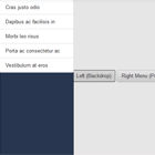
By default, Angular Contents will use the window or document as the scrolling view. That means that the inner content will update according to the changes in such elements.
More technically, the scrolling view is the one that triggers scrolling events and from which the relative offset is measured. If the scrolling view is set to a div instead, only once the div gets scrolled the Table of Contents will trigger an update.
By using the special binding [scrollingView], you can set the scrolling container of your choice instead of the default one.
Partial scrolling view
Below we present the source code of the one that is working in the first scrolling view demo, once you switch to the "Scroll View". Partial scrolling view source code features only the text content under the scrolling view. You can check the full source code by clicking on the file names.
Same as default.
import { Component, ViewEncapsulation, ViewChild, ElementRef, Inject } from '@angular/core'; import { DOCUMENT } from '@angular/common'; import { PageScrollService, PageScrollInstance } from 'ngx-page-scroll'; @Component({ selector: 'app-scrolling-view', templateUrl: 'scrolling-view.component.html', styleUrls: ['scrolling-view.component.scss'], }) export class ScrollingViewComponent { @ViewChild('container') private container: ElementRef; constructor(private pageScrollService: PageScrollService, @Inject(DOCUMENT) private document: any) {} public animateScroll(sectionTarget: string): void { // https://github.com/Nolanus/ngx-page-scroll#service const pageScrollInstance: PageScrollInstance = PageScrollInstance.newInstance({ document: this.document, scrollTarget: sectionTarget, scrollingViews: [this.container.nativeElement] }); this.pageScrollService.start(pageScrollInstance); } } The scrolling animation, just like by default can also be done with ngx-page-scroll. In fact, that's why it was initially requested and the reason why we try to stick to their names.
To set scrolling transition effects with ngx-page-scroll, you have to do something like above, where we wrote our own animateScroll to handle each of the Table of Contents links click. You can find more details about the PageScrollInstance and their service in their own repository.
Angular Contents as such does only require the declaration of the container that you are going to be using as the scrolling view: @ViewChild('container') private container: ElementRef;
<div class="columnify" contents [scrollingView]="container"> <!-- We use the container referenced below --> <!-- Body --> <div class="framed" #container> <!-- Notice the #container --> <div [contentsSection]="'section-one'"> <h1>Section One</h1> ... </div> <div [contentsSection]="'section-two'"> <h1>Section Two</h1> ... </div> <!-- Table of Contents --> <div class="table-column"> <ul class="contents-table" contentsTable> <li><a href="#section-one" contentsLink (click)="animateScroll('#section-one')">Section One</a></li> <li><a href="#section-two" contentsLink (click)="animateScroll('#section-two')">Section Two</a></li> </ul> </div> </div> ... // .framed makes the text scrollable. // If you already have a scrollable container, that is not a requirement. .framed { position: relative; height: 400px; overflow-y: auto; border: 1px solid #e2e2e2; border-radius: 2px; padding: 25px; } The rest of the styles are the same as default.
Full scrolling view
A note to Angular Material users: Angular Material carries its own content container, mat-sidenav-content. Thus, the default example will not work for you since it targets window or document. In this case, you are going to have to make use of the full scrolling view to make it work on your site, and target [scrollingView]=document.querySelector('mat-sidenav-content').
In the previous section, only the text content was part of the scrolling view. In the full scrolling view example below, the Table of Contents is also part of the scrolling view. Since the changes are minimal and accumulative, and for the sake of not rewriting it all, you should check Partial scrolling view before.
All and all, you can check the full source code here: my-module.module.ts my-module.component.ts my-module.component.html my-module.component.scss
<div class="columnify" contents [scrollingView]="container" #container> <!-- Body --> <div class="framed"> <div [contentsSection]="'section-one'"> <h1>Section One</h1> ... </div> <div [contentsSection]="'section-two'"> <h1>Section Two</h1> ... </div> <!-- Table of Contents --> <div class="table-column"> <ul class="contents-table" contentsTable [scrollingView]="container"> <li><a href="#section-one" contentsLink (click)="animateScroll('#section-one')">Section One</a></li> <li><a href="#section-two" contentsLink (click)="animateScroll('#section-two')">Section Two</a></li> </ul> </div> </div> License
MIT © Gerard Rovira Sánchez