NG Bootstrap - Angular Datetime picker component specific to Bootstrap 4
Welcome to the Angular version of the Datetimepicker Bootstrap library. It's using TypeScript and targeting the Bootstrap 4 CSS framework. As with Bootstrap 4, this library is a work in progress. The plugin is based on Angular Datepicker and Timepicker.
Demo
To test the component locally run ng serve: git clone https://github.com/zhaber/datetimepicker.git ng serve
Install
Run npm install npm install @zhaber/ng-bootstrap-datetimepicker to install. Use the --save option to add it to your package.json's dependencies.
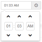
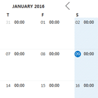
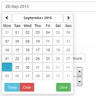
Datetimepicker Settings
-
datePlaceholderDate input placeholder. (Type: String) -
displayMonthsNumber of months to display. (Type: number) -
firstDayOfWeekFirst day of the week. With default calendar we use ISO 8601: 'weekday' is 1=Mon ... 7=Sun. (Type: number) -
hourStepNumber of hours to increase or decrease when using a button. (Type: number) -
meridianWhether to display 12H or 24H mode. (Type: boolean) -
minuteStepNumber of minutes to increase or decrease when using a button. (Type: number) -
navigationNavigation type:select(default with select boxes for month and year),arrows(without select boxes, only navigation arrows) ornone(no navigation at all). (Type: 'select' | 'arrows' | 'none'`) -
showWeekdays: boolean;Whether to display days of the week. (Type: boolean) -
outsideDaysWhether to display week numbers. (Type: 'visible' | 'collapsed' | 'hidden') -
secondsWhether to display seconds input. (Type: boolean) -
secondStepNumber of seconds to increase or decrease when using a button. (Type: number) -
showWeekNumbersWhether to display week numbers. (Type: boolean) -
spinnersWhether to display the spinners above and below the inputs. (Type: boolean) -
timeReadonlyInputsTo make timepicker readonly. (Type: boolean)