NG Dynamic Forms
NG Dynamic Forms is a rapid form development library based on the official Angular dynamic forms guide.
It fully automates form UI creation by introducing a set of maintainable form control models and dynamic form control components
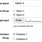
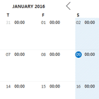
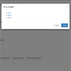
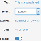
Out of the box support is provided for all popular UI libraries including Bootstrap, Foundation, Ionic, Kendo, Material, NG Bootstrap, ngx-bootstrap and PrimeNG.
Explore it live in action!
Table of Contents
- Getting Started
- Running the Sample
- Basic Usage
- UI Modules
- Form Groups
- Form Arrays
- Form Layouts
- Form Control Configuration
- Form Control Events
- Custom Templates
- Custom Validators
- Custom Form Controls
- Validation Messaging
- JSON Export & Import
- JSON Form Models
- Updating Form Models
- Disabling Form Controls
- Text Masks
- Related Form Controls
- Autocompletion
- AOT Compilation
- FAQ
- Appendix
Getting Started
1. Install the core package:
npm i @ng-dynamic-forms/core -S 2. Install a UI package and its peer dependencies:
npm i @ng-dynamic-forms/ui-material -S Running the Sample
1. Clone the Git repository:
git clone https://github.com/udos86/ng-dynamic-forms.git cd ng-dynamic-forms 2. Install the dependencies:
npm i 3. Build the library:
npm run build:lib 4. Run the application:
ng serve Basic Usage
1. Import DynamicFormsCoreModule and a UI module:
import { DynamicFormsCoreModule } from "@ng-dynamic-forms/core"; import { DynamicFormsMaterialUIModule } from "@ng-dynamic-forms/ui-material"; @NgModule({ imports: [ ReactiveFormsModule, DynamicFormsCoreModule, DynamicFormsMaterialUIModule ] }) export class AppModule {}2. Define your form model:
import { DynamicFormModel, DynamicCheckboxModel, DynamicInputModel, DynamicRadioGroupModel } from "@ng-dynamic-forms/core"; export const MY_FORM_MODEL: DynamicFormModel = [ new DynamicInputModel({ id: "sampleInput", label: "Sample Input", maxLength: 42, placeholder: "Sample input" }), new DynamicRadioGroupModel<string>({ id: "sampleRadioGroup", label: "Sample Radio Group", options: [ { label: "Option 1", value: "option-1", }, { label: "Option 2", value: "option-2" }, { label: "Option 3", value: "option-3" } ], value: "option-3" }), new DynamicCheckboxModel({ id: "sampleCheckbox", label: "I do agree" }) ];3. Create a FormGroup via DynamicFormService:
import { MY_FORM_MODEL } from "./my-dynamic-form.model"; import { DynamicFormModel, DynamicFormService } from "@ng-dynamic-forms/core"; export class MyDynamicFormComponent implements OnInit { formModel: DynamicFormModel = MY_FORM_MODEL; formGroup: FormGroup; constructor(private formService: DynamicFormService) {} ngOnInit() { this.formGroup = this.formService.createFormGroup(this.formModel); } }4. Add a DynamicFormComponent to your template and bind its [group] and [model] property:
<form [formGroup]="formGroup"> <dynamic-material-form [group]="formGroup" [model]="formModel"></dynamic-material-form> </form>UI Modules
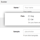
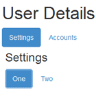
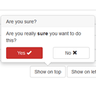
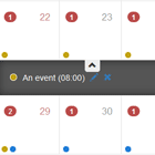
NG Dynamic Forms is built to provide solid yet unobtrusive support for a variety of common UI libraries:
You can instantly plug in your favorite form controls by installing the appropriate package and its peer dependencies:
npm i @ng-dynamic-forms/ui-<library-name> -S Now just import the UI module:
@NgModule({ imports: [ ReactiveFormsModule, DynamicFormsCoreModule, DynamicFormsMaterialUIModule ] }) export class AppModule {}For creating the form markup all UI modules come with a DynamicFormComponent that can easily be added to your component template:
<form [formGroup]="formGroup"> <dynamic-material-form [group]="formGroup" [model]="formModel"></dynamic-material-form> </form>Alternatively you can directly make use of a specific DynamicFormControlComponent to gain more control over rendering:
<form [formGroup]="formGroup"> <dynamic-material-form-control *ngFor="let controlModel of formModel" [group]="formGroup" [model]="controlModel"></dynamic-material-form-control> </form>Due to technical restrictions or external dependencies still being in development the support of major form controls varies among UI packages. See the following compatibility table:
| ui-basic | ui-bootstrap | ui-foundation | ui-ionic | ui-kendo | ui-material | ui-ng-bootstrap | ui-primeng | |
|---|---|---|---|---|---|---|---|---|
| Checkbox | ✓ | ✓ | ✓ | ✓ | ✓ | ✓ | ✓ | ✓ |
| Checkbox Group | ✓ | ✓ | ✓ | ✓ | ✓ | ✓ | ✓ | ✓ |
| Colorpicker | **** | **** | **** | **** | **** | **** | **** | ✓ |
| Datepicker | * | ✓ | * | ✓ | ✓ | * | ✓ | ✓ |
| Editor | ✗ | ✗ | ✗ | ✗ | ✗ | ✗ | ✗ | ✓ |
| File Upload | ** | ** | ** | ✗ | ✓ | ** | ** | ** |
| Input | ✓ | ✓ | ✓ | ✓ | ✓ | ✓ | ✓ | ✓ |
| Radio Group | ✓ | ✓ | ✓ | ✓ | ✓ | ✓ | ✓ | ✓ |
| Rating | ✗ | ✗ | ✗ | ✗ | ✗ | ✗ | ✗ | ✓ |
| Select | ✓ | ✓ | ✓ | ✓ | ✓ | ✓ | ✓ | ✓ |
| Slider | *** | *** | *** | ✓ | ✓ | ✓ | *** | ✓ |
| Switch | ✗ | ✗ | ✓ | ✓ | ✓ | ✓ | ✗ | ✓ |
| Textarea | ✓ | ✓ | ✓ | ✓ | ✓ | ✓ | ✓ | ✓ |
| Timepicker | * | ✓ | * | ✓ | ✓ | * | ✓ | ✓ |
*) datetime controls can be achieved using a DynamicInputModel with inputType: "date" or inputType: "time"
**) file upload controls can be achieved using a DynamicInputModel with inputType: "file"
***) slider controls can be achieved using a DynamicInputModel with inputType: "range"
****) color picker controls can be achieved using a DynamicInputModel with inputType: "color"
Form Groups
In order to improve clarity it's often considered good practice to group forms into several logical fieldset sections.
Thus NG Dynamic Forms supports nesting of form groups out of the box!
1. Declare a DynamicFormGroupModel within your form model and add it's models to the group array:
export const MY_FORM_MODEL: DynamicFormModel = [ new DynamicFormGroupModel({ id: "fullName", legend: "Name", group: [ new DynamicInputModel({ id: "firstName", label: "First Name" }), new DynamicInputModel({ id: "lastName", label: "Last Name" }) ] }), new DynamicFormGroupModel({ id: "address", legend: "Address", group: [ new DynamicInputModel({ id: "street", label: "street" }), new DynamicInputModel({ id: "zipCode", label: "Zip Code" }) ] }) ]; 2. Create a FormGroup and add a DynamicFormComponent:
ngOnInit() { this.formGroup = this.formService.createFormGroup(this.formModel); }<form [formGroup]="formGroup"> <dynamic-material-form [group]="formGroup" [model]="formModel"></dynamic-material-form> </form>3. To manipulate an existing DynamicFormGroupModel you can simply use DynamicFormService:
addFormGroupControl(...)insertFormGroupControl(...)moveFormGroupControl(...)removeFormGroupControl(...)
Form Arrays
Sometimes forms need to allow the user to dynamically add multiple items of the same kind to it, e.g. addresses, products and so on.
Particularly for this reason Angular provides so called Form Arrays.
Fortunately, NG Dynamic Forms is capable of managing such nested form structures!
1. Add a DynamicFormArrayModel to your form model:
export const MY_FORM_MODEL: DynamicFormModel = [ new DynamicFormArrayModel({ id: "myFormArray" }) ];2. Add the groupFactory property to the DynamicFormArrayModel and assign a function to it which returns the structure of a single form array item:
new DynamicFormArrayModel({ id: "myFormArray", initialCount: 5, groupFactory: () => { return [ new DynamicInputModel({ id: "myInput", label: "My Input" }) ]; } })3. Create a FormGroup via DynamicFormService and bind it to your component template:
this.formGroup = this.formService.createFormGroup(this.formModel);<form [formGroup]="formGroup"> <dynamic-material-form [group]="formGroup" [model]="formModel"></dynamic-material-form> <button type="button" (click)="addItem()">Add item</button> <button type="button" (click)="clear()">Remove all items</button> </form>4. You can now easily modify your form array with DynamicFormService:
ngOnInit() { this.formArrayControl = this.formGroup.get("myFormArray") as FormArray; this.formArrayModel = this.formService.findById("myFormArray", this.formModel) as DynamicFormArrayModel; } addItem() { this.formService.addFormArrayGroup(this.formArrayControl, this.formArrayModel); } clear() { this.formService.clearFormArray(this.formArrayControl, this.formArrayModel); }Alright, works like a charm!
But what if we want to append an additional remove <button> for each array group?
Particularly for this case you can add a <ng-template> and declare some custom content that is rendered equally for all form array groups:
<form [formGroup]="formGroup"> <dynamic-material-form [group]="formGroup" [model]="formModel"> <ng-template modelId="myFormArray"> <button type="button" (click)="onClick()">Label</button> </ng-template> </dynamic-material-form> </form> Whenever a <ng-template> is applied to a DynamicFormArrayModel, NgTemplateOutletContext is internally bound to the associated DynamicFormArrayGroupModel.
That means you can access the group object and it's properties by either declaring a local default template variable or individual local template variables.
see chapter on Custom Templates
<form [formGroup]="formGroup"> <dynamic-material-form [group]="formGroup" [model]="formModel"> <ng-template modelId="myFormArray" let-group let-index="index" let-context="context"> <button type="button" (click)="removeItem(context, index)">Remove Item</button> <button type="button" (click)="insertItem(group.context, group.index + 1)">Add Item</button> </ng-template> </dynamic-material-form> </form> This is extremely useful when you'd like to implement a remove or insert function:
removeItem(context: DynamicFormArrayModel, index: number) { this.formService.removeFormArrayGroup(index, this.formArrayControl, context); } insertItem(context: DynamicFormArrayModel, index: number) { this.formService.insertFormArrayGroup(index, this.formArrayControl, context); }Using DynamicFormService again, you can even change the order of the groups in a form array dynamically:
this.formService.moveFormArrayGroup(index, -1, this.formArrayControl, context);Form Layouts
When using a NG Dynamic Forms UI package, e.g. ui-bootstrap, all essential form classes of the underlying CSS library (like form-group or form-control) are automatically put in place for you in the template of the corresponding DynamicFormControlComponent.
Apart from that, NG Dynamic Forms does not make any further presumptions about optional CSS classes and leaves advanced layouting all up to you. That's solid yet unobtrusive.
So let's say we want to implement a beautifully aligned Bootstrap horizonal form...
At first we have to append the mandatory Bootstrap CSS class form-horizontal to the <form> element in our template:
<form class="form-horizontal" [formGroup]="formGroup"> <dynamic-bootstrap-form [group]="formGroup" [model]="formModel"></dynamic-bootstrap-form> </form>Now we need to position the <label> and the form-control using the Bootstrap grid system.
But since all the template logic for the form controls is capsuled in the component scope we cannot directly attach those necessary CSS classes to markup.
Don't worry!
Arbitrary CSS classes can be provided for any form control by binding a DynamicFormLayout to a DynamicFormControlComponent.
A DynamicFormLayout is a simple object literal that associates a CSS class configuration object with a model id.
By differentiating between element and grid context NG Dynamic Forms can automatically apply the CSS class strings in the component template based on position identifiers:
export const MY_FORM_LAYOUT = { "myFormControlModelId": { element: { label: "control-label" }, grid: { control: "col-sm-9", label: "col-sm-3" } }, "myOtherFormControlModelId": { element: { label: "control-label" }, grid: { control: "col-sm-9", label: "col-sm-3" } } };To reference this DynamicFormLayout we now just create another component class member:
import { MY_FORM_LAYOUT } from "./my-dynamic-form.layout"; export class MyDynamicFormComponent implements OnInit { formModel: DynamicFormModel = MY_FORM_MODEL; formGroup: FormGroup; formLayout: DynamicFormLayout = MY_FORM_LAYOUT; constructor(private formService: DynamicFormService) {} ngOnInit() { this.formGroup = this.formService.createFormGroup(this.formModel); } }Finally we pass the form layout to our DynamicFormComponent via input binding:
<form [formGroup]="formGroup"> <dynamic-bootstrap-form [group]="formGroup" [layout]="formLayout" [model]="formModel"></dynamic-bootstrap-form> </form>Using this approach we are able to strictly decouple layout information from pure form models.
Form Control Configuration
No matter which UI library you're using, usually there is a set of basic properties that apply universally to a certain type of form control.
So, when picking e.g. a slider component, you'll always find an @Input() to control its minimum / maximum value and its orientation.
Whenever that's the case NG Dynamic Forms directly provides an abstract configuration property on the corresponding DynamicFormControlModel:
new DynamicSliderModel({ id: "mySlider", min: 0, max: 10, vertical: true })Furthermore, very often there are additional component features that are totally library-specific.
So, when using e.g. Material there is a unique @Input() for inverting a slider component.
NG Dynamic Forms gives you the freedom to utilize such an individual parameter, as well.
All you need to do is to put it in the additional configuration object of your DynamicFormValueControlModel:
new DynamicSliderModel({ id: "mySlider", min: 0, max: 10, vertical: true additional: { invert: true } })Form Control Events
When developing forms it's often useful to keep track of certain events that occur on a specific form control.
With NG Dynamic Forms you can directly listen to the three most common events, blur, change and focus, both on DynamicFormControlComponent and DynamicFormComponent:
<dynamic-material-form [group]="formGroup" [model]="formModel" (blur)="onBlur($event)" (change)="onChange($event)" (focus)="onFocus($event)"></dynamic-material-form><form [formGroup]="myFormGroup"> <dynamic-material-form-control *ngFor="let controlModel of myFormModel" [group]="myFormGroup" [model]="controlModel" (blur)="onBlur($event)" (change)="onChange($event)" (focus)="onFocus($event)"></dynamic-material-form-control> </form>The object passed to your handler function gives you any control and model information needed for further processing.
The $event property even grants access to the original event:
interface DynamicFormControlEvent { $event: Event | FocusEvent | DynamicFormControlEvent | any; context: DynamicFormArrayGroupModel | null; control: FormControl; group: FormGroup; model: DynamicFormControlModel; type: string; }But when using a UI library usually there are a bunch of additional events provided for certain form control components.
Of course, NG Dynamic Forms won't let you down here.
All custom UI events are pooled by an individual @Output() utilizing the respective library prefix.
<dynamic-material-form [group]="formGroup" [model]="formModel" (matEvent)="onMatEvent($event)"></dynamic-material-form>Custom Templates
As already mentioned, NG Dynamic Forms gives you a lot of freedom in adjusting your form layout via CSS classes.
However there are situations where you would like to add custom markup for some of your form controls, as well.
In order to do so, just put a <ng-template> inside your dynamic form control element and set a modelId property to assign it to a certain control.
<form [formGroup]="formGroup"> <dynamic-material-form [group]="formGroup" [model]="formModel"> <ng-template modelId="myInput"> <p>Some custom markup</p> </ng-template> </dynamic-material-form> </form>Alternatively you can also apply modelType instead of modelId to reuse a template for several form controls of the same type:
<form [formGroup]="formGroup"> <dynamic-material-form [group]="formGroup" [model]="formModel"> <ng-template modelType="ARRAY"> <p>Just some custom markup</p> </ng-template> </dynamic-material-form> </form>And it's getting better!
Since for every template NgTemplateOutletContext is internally bound to the corresponding DynamicFormControlModel you can use local template variables to reference your models' properties:
<form [formGroup]="formGroup"> <dynamic-material-form [group]="formGroup" [model]="formModel"> <ng-template modelId="myInput" let-id="id"> <p>Some custom markup for {{ id }}</p> </ng-template> </dynamic-material-form> </form>Still not convinced?
Some UI libraries, e.g. Kendo UI, allow detailed customizing of form controls via template directives.
And you surely don't want to miss out on such a feature, do you?
That's why NG Dynamic Forms can even master this!
All you have to do is to add a as attribute to your template and specifiy the use of it:
<form [formGroup]="formGroup"> <dynamic-kendo-form [group]="formGroup" [model]="formModel"> <ng-template modelId="myDropDownList" as="kendoDropDownListHeaderTemplate"> <p>My Kendo DropDown Header Template</p> </ng-template> </dynamic-kendo-form> </form>Finally you can determine whether the template is rendered before or after the actual form control by using the align property:
<form [formGroup]="formGroup"> <dynamic-material-form [group]="formGroup" [model]="formModel"> <ng-template modelId="myInput" align="START"> <p>Some custom markup</p> </ng-template> </dynamic-material-form> </form>Custom Validators
Adding built-in Angular validators to any DynamicFormControlModel is plain and simple!
Just reference a function from Validators class by it's name in the validators or asyncValidators configuration object:
new DynamicInputModel({ id: "myInput", label: "My Input", validators: { required: null, minLength: 3 } })So far so good!
But what if you'd like to introduce some custom validator as well?
export function myCustomValidator(control: AbstractControl): ValidationErrors | null { let hasError = control.value ? (control.value as string).startsWith("abc") : false; return hasError ? {myCustomValidator: true} : null; }Just provide your validator functions via default NG_VALIDATORS or NG_ASYNC_VALIDATORS token:
@NgModule({ // ... providers: [ {provide: NG_VALIDATORS, useValue: myCustomValidator, multi: true} ] })Note: thoughtram.io - Custom Validators in Angular 2
You're now ready to apply your custom validator to your model:
new DynamicInputModel({ id: "myInput", label: "My Input", validators: { myCustomValidator: null } })But beware! There's a catch!
Internally NG Dynamic Forms resolves a provided validator by it's function name.
Though when uglifying code for production this information is irretrievably lost.
To save you from this issue NG Dynamic Forms comes up with a special InjectionToken<Map<string, Validator | ValidatorFactory>> named DYNAMIC_VALIDATORS to which you should additionally provide any custom validator function:
providers: [ { provide: NG_VALIDATORS, useValue: myCustomValidator, multi: true }, { provide: DYNAMIC_VALIDATORS, useValue: new Map<string, Validator | ValidatorFactory>([ ["myCustomValidator", myCustomValidator] ]) } ]Another suitable solution for most situations would be to make use of the alternate validator notation:
new DynamicInputModel({ id: "myInput", label: "My Input", validators: { myCustomValidator: { name: myCustomValidator.name, args: null } } })Custom Form Controls
Starting with version 6 NG Dynamic Forms allows you to easily plugin in your own custom form controls.
Beforehand follow the standard procedure to build your custom Angular form control:
import { Component, forwardRef } from '@angular/core'; import { ControlValueAccessor, NG_VALUE_ACCESSOR } from "@angular/forms"; @Component({ selector: 'my-custom-form-control', templateUrl: './my-custom-form-control.component.html', providers: [ { provide: NG_VALUE_ACCESSOR, useExisting: forwardRef(() => MyCustomFormControlComponent), multi: true } ] }) export class MyCustomFormControlComponent implements ControlValueAccessor { //... }Now create a new DynamicFormControlComponent:
import { ChangeDetectionStrategy, Component, EventEmitter, Input, Output, ViewChild } from "@angular/core"; import { FormGroup } from "@angular/forms"; import { DynamicFormControlComponent, DynamicFormControlCustomEvent, DynamicFormLayout, DynamicFormLayoutService, DynamicFormValidationService, } from "@ng-dynamic-forms/core"; import { MyCustomFormControlComponent } from "..."; @Component({ selector: "my-dynamic-custom-form-control", templateUrl: "./my-dynamic-custom-form-control.component.html", changeDetection: ChangeDetectionStrategy.OnPush }) export class MyDynamicCustomFormControlComponent extends DynamicFormControlComponent { @Input() group: FormGroup; @Input() layout: DynamicFormLayout; @Input() model: /* corresponding DynamicFormControlModel */; @Output() blur: EventEmitter<any> = new EventEmitter(); @Output() change: EventEmitter<any> = new EventEmitter(); @Output() customEvent: EventEmitter<DynamicFormControlCustomEvent> = new EventEmitter(); @Output() focus: EventEmitter<any> = new EventEmitter(); @ViewChild(MyCustomFormControlComponent) myCustomFormControlComponent: MyCustomFormControlComponent; constructor(protected layoutService: DynamicFormLayoutService, protected validationService: DynamicFormValidationService) { super(layoutService, validationService); } }Next embed your custom form control into the component template:
<ng-container [formGroup]="group"> <my-custom-form-control [formControlName]="model.id" [name]="model.name" [ngClass]="[getClass('element', 'control'), getClass('grid', 'control')]" (blur)="onBlur($event)" (change)="onChange($event)" (focus)="onFocus($event)"></my-custom-form-control> </ng-container>Then add your newly implemented DynamicFormControl to entryComponents in your app module:
entryComponents: [MyDynamicCustomFormControlComponent]Finally provide DYNAMIC_FORM_CONTROL_MAP_FN to overwrite the default mapping of a concrete DynamicFormControlModel to its corresponding DynamicFormControlComponent;
providers: [ { provide: DYNAMIC_FORM_CONTROL_MAP_FN, useValue: (model: DynamicFormControlModel): Type<DynamicFormControl> | null => { switch (model.type) { case /* corresponding DynamicFormControlModel */: return MyDynamicCustomFormControlComponent; } } } ]Validation Messaging
Delivering meaningful validation information to the user is an essential part of good form design.
Yet HTML5 already comes up with some native functionality you very likely want to use Angular mechanisms to gain much more control over validation logic and it's corresponding message output.
Avoiding a library too opinionated in the beginning, NG Dynamic Forms has originally been developed without any kind of obtrusive validation message system in mind.
However, due to its very common use case and several developer requests, model-based error messaging has eventually become an optional built-in feature:
Just add an errorMessages object to any DynamicFormValueControlModel and assign error message templates based on Validators names:
new DynamicInputModel({ id: "myInput", label: "My Input", validators: { required: null }, errorMessages: { required: "{{ label }} is required." } })Note: Error message templates allow the following placeholders:
{{ propertyName }}wherepropertyNameis a property of the model, for example{{ label }}.{{ validator.propertyName }}wherepropertyNameis a property of the object returned by validation function, for example{{ validator.requiredPattern }}in case of pattern validator.
Error messaging is automatically enabled whenever errorMessages are declared on a DynamicFormControlModel.
Still you are completely free to implement your own validation messaging.
Follow the recommended approach below:
1. Create your own custom validation message component and make it accept a FormControl input:
import { Component, Input } from "@angular/core"; import { FormControl } from "@angular/forms"; @Component({ selector: "validation-message", templateUrl: "./my-validation-message.component.html" }) export class MyValidationMessageComponent { @Input() control: FormControl; constructor () {} }2. Create a template file for your custom validation component and implement it's logic based on the control property:
<span *ngIf="control && control.hasError('required') && control.touched">Field is required</span>3. Define some validators for your DynamicFormControlModel:
new DynamicInputModel({ id: "myInput", label: "My Input", validators: { required: null } })4. Add your validation component aside from the DynamicFormControlComponent in your form component template and bind the FormControl reference via a local template variable:
<form [formGroup]="formGroup"> <ng-container *ngFor="let controlModel of formModel"> <dynamic-material-form-control [group]="formGroup" [model]="controlModel" #componentRef> <validation-message [control]="componentRef.control"></validation-message> </dynamic-material-form-control> </ng-container> </form>JSON Export & Import
Sooner or later you likely want to persist your dynamic form model in order to restore it at some point in the future.
That's why all DynamicFormControlModels have been prepared to properly export to JSON:
storeForm() { let json: string = JSON.stringify(this.formModel); // ...store JSON in localStorage or transfer to server }In order to recreate a form from JSON just make use of the corresponding function provided by DynamicFormService:
restoreForm() { let json: string; // ...load JSON from localStorage or server this.formModel = this.formService.fromJSON(json); }JSON Form Models
By default NG Dynamic Forms embraces prototypical inheritance and forces you to use constructor functions when modelling a form.
Depending on your general set-up or individual preferences sometimes it's more suitable to provide a form model in plain JSON, though.
Fortunately, this is perfectly fine and supported, as well.
To specify a single JSON form control model just assign the mandatory type property:
[ { "type": "INPUT", "id": "sampleInput", "label": "Sample Input", "maxLength": 42, "placeholder": "Sample input" }, { "type": "RADIO_GROUP", "id": "sampleRadioGroup", "label": "Sample Radio Group", "options": [ { "label": "Option 1", "value": "option-1", }, { "label": "Option 2", "value": "option-2" }, { "label": "Option 3", "value": "option-3" } ], "value": "option-3" }, { "type": "CHECKBOX", "id": "sampleCheckbox", "label": "I do agree" } ]After having asynchronously loaded the JSON form model into your application don't forget to transform it via fromJSON() before creating a FormGroup.
ngOnInit() { this.http.get<object[]>('./app/my-dynamic-form.model.json').subscribe(formModelJson => { this.formModel = this.formService.fromJSON(formModelJson); this.formGroup = this.formService.createFormGroup(this.formModel); }); }Updating Form Models
One of the benefits of using NG Dynamic Forms is that programmatically interacting with your form becomes pretty easy.
Since a DynamicFormControlModel is bound directly to a DOM element via Angular core mechanisms, changing one of it's properties will immediately trigger an update of the user interface.
But there's one major exception!
NG Dynamic Forms relies on the Angular ReactiveFormsModule. Therefore the value property is not two-way-bound via [(ngModel)] under the hood.
So what if we actually want to update the value of an arbitrary form control at runtime?
At first we need to get a reference to it's DynamicFormControlModel representation.
This can easily be achieved either by a simple index-based array lookup or through the findById method of DynamicFormService:
this.inputModel = this.formModel[2];this.inputModel = this.formService.findById("myInput", this.formModel) as DynamicInputModel;We now have access to a Rx.Subject named valueUpdates to push new values via next() as well as to listen to new user input via subscribe():
this.inputModel.valueUpdates.next("my new value"); this.inputModel.valueUpdates.subscribe(value => console.log("new value: ", value);At any time we can also safely read the most recent user input from the value property:
let currentValue = this.inputModel.value;Disabling Form Controls
Dating back to RC.6, Angular does not allow property bindings of the disabled attribute in reactive forms.
That means changing the corresponding disabled property of a DynamicFormControlModel at runtime won't have any effect.
But similar to updating values NG Dynamic Forms helps you out here by providing a Rx.Subject named disabledUpdates.
It can be used to programmatically switch the activation state of a form control through a DynamicFormControlModel:
this.inputModel.disabledUpdates.next(true);Text Masks
Whenever an <input> element needs to be filled in a predefined value format, text masks make a nice form enhancement to guide the user.
Since Angular does not deliver an appropriate feature by default, NG Dynamic Forms integrates an external Text Mask directive.
That's why most UI packages demand one additional peer dependency to be installed:
npm install angular2-text-mask --save You're now capable of adding a mask property to any DynamicInputModel according to Text Mask docs:
new DynamicInputModel({ id: "maskedInput", label: "Masked Input", mask: ['(', /[1-9]/, /\d/, /\d/, ')', ' ', /\d/, /\d/, /\d/, '-', /\d/, /\d/, /\d/, /\d/], }),You can also pass a function as the mask. The function will receive the user input at every change. The function is expected to return a mask array as described above.Text Mask Addons
new DynamicInputModel({ id: "maskedInput", label: "Masked Input", mask: createNumberMask({ prefix: "", suffix: " $" }), }),Please note that some UI libraries like Kendo UI come with their own text mask implementation that may rely on a different text mask string / regex representation.
Related Form Controls
In many forms the state of a certain form control directly depends on the value or status of some other form control.
Implementing such a connection manually would be time-consuming and only lead to undesired boilerplate code.
NG Dynamic Forms enables you to declaratively add form control relations by using so called DynamicFormControlMatchers.
A matcher defines the action that should take place for a predefined match when a value or state change has occured on the related form control.
export interface DynamicFormControlMatcher { match: string; opposingMatch: string | null; onChange(hasMatch: boolean, model: DynamicFormControlModel, control: FormControl, injector: Injector): void; }At the moment there are the following default matchers available:
DisabledMatcherHiddenMatcherRequiredMatcher
NOTE: Always make sure that you're providing every DynamicFormControlMatcher in your app.module:
providers: [ // ... DISABLED_MATCHER, REQUIRED_MATCHER ]That way you're also totally free to implement your own custom matcher:
export const MyCustomMatcher: DynamicFormControlMatcher = { match: MATCH_CUSTOM, opposingMatch: MATCH_CUSTOM_OPPOSITE, onChange(hasMatch: boolean, model: DynamicFormControlModel): void { if (hasMatch) { console.log("It's a match"); } } };export const MY_CUSTOM_MATCHER: ValueProvider = { provide: DYNAMIC_MATCHERS, useValue: MyCustomMatcher, multi: true };So let's pretend we need to have our textarea myTextArea disabled as soon as the third option of our select menu mySelect is chosen.
Just add a relations property to your DynamicFormControlModel, then declare a DynamicFormControlRelation by setting a match for a certain DynamicFormControlCondition:
new DynamicTextAreaModel( { id: "myTextArea", label: "My Textarea", relations: [ { match: MATCH_DISABLED, when: [ { id: "mySelect", value: "option-3" } ] } ] }That's it - the library will automatically add all the pieces together under the hood.
But what if myTextArea should depend on another control myRadioGroup as well?
Luckily there's support for multi-related form controls, too.
Just add a second DynamicFormControlCondition entry and (optionally) define how all conditions should logically be connected via operator:
new DynamicTextAreaModel( { id: "myTextArea", label: "My Textarea", relations: [ { match: MATCH_DISABLED, operator: AND_OPERATOR, when: [ { id: "mySelect", value: "option-3" }, { id: "myRadioGroup", value: "option-4" } ] } ] } )Autocompletion
Adding automatic input completion can be key factor to good user experience (especially on mobile devices) and should always be considered when designing forms.
That's why NG Dynamic Forms keeps you covered here, as well!
Following HTML5 standard behavior, the autocomplete attribute is always bound to on for any DynamicFormTextInputControl form element by default. Nevertheless you can completely disable this feature by explicitly setting the corresponding model property to off:
import { AUTOCOMPLETE_OFF } from "@ng-dynamic-forms/core"; let model = new DynamicInputModel({ id: "myInput", label: "My Input", autoComplete: AUTOCOMPLETE_OFF });Further on NG Dynamic Forms embraces the brand new HTML5 autofill detail tokens by providing AUTOFILL_<TOKEN_NAME|FIELD_NAME> string constants and AutoFillUtils to help you putting together a valid expression:
Note: Jason Grigsby - Autofill: What web devs should know, but don’t
import { AutoFillUtils, AUTOFILL_TOKEN_BILLING, AUTOFILL_FIELD_NAME, AUTOCOMPLETE_ON } from "@ng-dynamic-forms/core"; export class MySample { constructor() { let expression = `${AUTOFILL_TOKEN_BILLING} ${AUTOFILL_FIELD_NAME}`; let model = new DynamicInputModel({ id: "myInput", label: "My Input", autoComplete: AutoFillUtils.validate(expression) ? expression : AUTOCOMPLETE_ON }); } }Besides you can make user input more comfortable, providing HTML5 datalists by setting the list property of DynamicInputControlModel:
new DynamicInputModel({ id: "myInput", label: "My Input", list: ["Alabama", "Alaska", "Arizona", "Arkansas"] })AOT Compilation
Ahead-of-Time (AOT) Compilation significantly improves the overall performance of any Angular application.
Since NG Dynamic Forms bundle files fully match Angular Package Format all packages fit in seamlessly with your AoT build - whether your'e using the Angular CLI --aot flag , @ngtools/webpack plugin or directly @angular/compiler-cli.
Yet, no guarantee can be given for any peer dependency to properly integrate with AOT.
FAQ
Why should I use NG Dynamic Forms?
Your Angular forms will become highly maintainable as you don't have to care about keeping template markup and program code in sync ever again.
When should I use NG Dynamic Forms?
Whenever your Angular application is driven by multiple complex forms.
When should I not use NG Dynamic Forms?
Whenever your Angular application has to display very simple forms only or extremely individual form UI.
Are there any downsides to using NG Dynamic Forms?
Certain limitations exist regarding extremely individual form layouts.
Does NG Dynamic Forms support custom form controls?
Yes, it does.
Are there any other dynamic forms libraries for Angular?
Yes, namely ng-formly, ngx-forms and angular-formio.
How can I support this project besides contributing issues or code?
Star the repository.
Appendix
- Logo design made by oscarana
