ui.bootstrap.materialPicker
Material Design Color Picker directive for AngularJS.

Latest codepen.io example.
Reference the ui.bootstrap.materialPicker module
To use include the ui.bootstrap.materialPicker.js file and add a reference to the ui.bootstrap.materialPicker module.
Tag
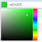
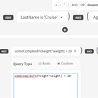
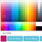
<material-picker ng-model="color"></material-picker> <material-picker ng-model="color" format="'hex'" size="10" hover-model="hoverColor" size="15"></material-picker>| Attribute | Default | values | Required |
|---|---|---|---|
| ng-model | n/a | string, object | true |
| hover-model | n/a | object | false |
| format | 'object' | 'object', 'hex' | false |
| size | 15 | 5 to n | false |
CSS
The required CSS is below.
.materialpicker-colors { -webkit-user-select: none; user-select: none; position: relative; border: 1px solid #FFF; border-radius: 2px; display: inline-block; box-shadow: 0 1px 5px rgba(0,0,0,0.5); cursor: default; } .materialpicker-colors div.selected { position: relative; z-index: 2; box-shadow: 0 0 4px #000; border: 2px solid #FFF; } div.materialpicker-white.selected { border-color: #78909C; } .materialpicker.ng-invalid .materialpicker-colors { border-color: #a94442; box-shadow: 0 1px 5px #a94442; }Format Object
$scope.color = { hex: '#990000', Hex or RGB must be populated. r: 153, Red 0-255 g: 0, Green 0-255 b: 0, Blue 0-255 name: '' Material Design Color Name or empty string };