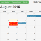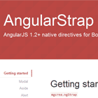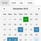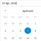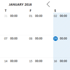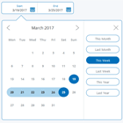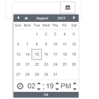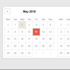
Angular Datepicker


Angular datepicker is an angularjs directive that generates a datepicker calendar on your input element.
The Angularjs Datepicker is developed by 720kb.
Requirements
AngularJS v1.3+
Browser support
| Chrome | Firefox | IE | Opera | Safari |
|---|---|---|---|---|
| ✔ | ✔ | IE9 + | ✔ | ✔ |
Load
To use the directive, include the Angular Datepicker's javascript and css files in your web page:
<!DOCTYPE HTML> <html> <head> <link href="src/css/angular-datepicker.css" rel="stylesheet" type="text/css" /> </head> <body ng-app="app"> //..... <script src="src/js/angular-datepicker.js"></script> </body> </html>Installation
Bower
$ bower install angularjs-datepicker --save Npm
$ npm install angularjs-datepicker --save then load the js files in your html
Add module dependency
Add the 720kb.datepicker module dependency
angular.module('app', [ '720kb.datepicker' ]);Call the directive wherever you want in your html page
<datepicker> <input ng-model="date" type="text"/> </datepicker>By default the ng-model will show a Javascript Date() Object inside your input, you can use the options below to set your preferred date format to.
DOC
| Option | Type | Default | Description |
|---|---|---|---|
| date-set="" | String | false | Set a default date to show and init datepicker |
| tip: Do not use same scope for ng-model="date" and date-set="{{date}}", this example is wrong. | |||
| tip: If you want to pass a Date Object inside do like this date-set="{{newDateObject.toString()}}" | |||
tip: Consider that date-set="{{myDate}}" equals to new Date(attr.dateSet), be sure the date you pass inside date-set="" is always in a correct ISO format, or adjust it based on the browser locale to avoid problems with that.". | |||
| date-format="" | String | String(new Date()) | Set the date format you want to use, see the list here |
| tip: Be always sure to use a recognized format, maybe try first of all to pass it through new Date('...') and see if it's recognized | |||
| date-min-limit="" | String | false | Set a minimum date limit - you can use all the accepted date formats by the javascript new Date() |
| date-max-limit="" | String | false | Set a maximum date limit - you can use all the accepted date formats by the javascript new Date() |
| date-set-hidden="" | String(Boolean) | false | Set the default date to be shown only in calendar and not in the input field |
| date-disabled-dates="" | String([Date(), Date(), ...]) | false | Disable specific dates using an Array of dates. |
| date-enabled-dates="" | String([Date(), Date(), ...]) | false | Enable only the specific dates using an Array of dates. |
| date-disabled-weekdays="" | String(1, 5, ...]) | false | Disable specific weekdays using an Array of weeks number |
| date-refocus="" | String(Boolean) | false | Set the datepicker to re-focus the input after selecting a date |
| date-typer="" | String(Boolean) | false | Set the datepicker to update calendar date when user is typing a date, see validation tips |
| date-week-start-day="" | String(Number) | 0 | Set the first day of the week. Must be an integer between 0 (Sunday) and 6 (Saturday). (e.g. 1 for Monday) |
| datepicker-class="" | String('class1 class2 class3') | false | Set custom class/es for the datepicker calendar |
| datepicker-append-to="" | String('#id','.classname', 'body') | false | Append the datepicker to #id or .class element or to body |
| datepicker-toggle="" | String(Boolean) | true | Set the datepicker to toggle its visibility on focus and blur |
tip: Best is to use pointer-events: none; on your input if you don't want the user to toggle the calendar visibility. | |||
| datepicker-show="" | String | false | Trigger the datepicker visibility, if true datepicker is shown if false it is hidden |
| tip: Do not mix it with datepicker-toggle for a more stable behavior | |||
| datepicker-mobile="" | String | true | Set to false to force override of mobile styles. Especially useful for using desktop-style pagination control in mobile apps. |
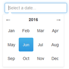
Options
Angular datepicker allows you to use some options via attribute data
Custom titles
You can set the titles for the month and year selectors with the date-year-title="" and date-month-title="" data attributes (default to is "select month" and "select year")
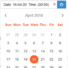
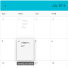
<datepicker date-month-title="selected year"> <input ng-model="date"/> </datepicker> <datepicker date-year-title="selected title"> <input ng-model="date"/> </datepicker>Highlight today day in calendar
To highlight or style the today day in the calendar just use its own CSS class (._720kb-datepicker-today) like this:
._720kb-datepicker-calendar-day._720kb-datepicker-today { background:red; color:white; }Custom buttons
You can customize the calendar navigation buttons content, let's make an example while using FontAwesome
<datepicker button-prev="<i class='fa fa-arrow-left'></i>" button-next="<i class='fa fa-arrow-right'></i>"> <input ng-model="date" type="text"/> </datepicker>Custom buttons titles for arrows
You can also set the titles for the left and right arrows with button-next-title="" for the right and button-prev-title="" for the left. By default they are labeled "next" and "prev".
<datepicker button-prev-title="previous month"> <input ng-model="date"/> </datepicker> <datepicker button-next-title="next month"> <input ng-model="date" type="text"/> </datepicker>Input as grandchild
Sometimes you cannot put date input as a first child of datepicker. In this case you may use selector="" to point to the CSS class of the input. Below example with using Twitter Bootstrap and FontAwesome
<datepicker date-format="yyyy-MM-dd" selector="form-control"> <div class="input-group"> <input class="form-control" placeholder="Choose a date"/> <span class="input-group-addon" style="cursor: pointer"> <i class="fa fa-lg fa-calendar"></i> </span> </div> </datepicker>Manually show and hide datepicker
Sometimes you want to (manually/programmatically) show or hide the datepicker, this can be achieved using datepicker-show attribute, if false, datepicker is hidden, if true, datepicker is shown
.controller('TestController', ['$scope', '$interval', function TestController($scope, $interval) { $scope.visibility = true; $interval(function setInterval() { //toggling manually everytime $scope.visibility = !$scope.visibility; }, 3500); }]); <datepicker ng-controller="TestController" datepicker-show="{{visibility}}"> <input ng-model="date3" type="text" class="angular-datepicker-input"/> </datepicker>tip: you should use this attribute together with `datepicker-toggle="false" , for a better stable behavior of the datepicker
Input as grandchild
Sometimes you cannot put date input as a first child of datepicker. In this case you may use selector="" to point to the CSS class of the input. Below example with using Twitter Bootstrap and FontAwesome
<datepicker date-format="yyyy-MM-dd" selector="form-control"> <div class="input-group"> <input class="form-control" placeholder="Choose a date"/> <span class="input-group-addon" style="cursor: pointer"> <i class="fa fa-lg fa-calendar"></i> </span> </div> </datepicker>Tips
Date validation
If you want to validate the input, while user is typing for example, you just have to refer to the ngModel. As long as you use something like:
<div ng-controller="MyCtrl as ctrl"> <input datepicker type="text" ng-model="myDate"/> </div>You can show validation errors simply validating the ngModel, as you would do for any other type of input, for example:
.controller('Ctrl', ['$scope', function ($scope) { var liveDate; $scope.$watch('myDate', function (value) { try { liveDate = new Date(value); } catch(e) {} if (!liveDate) { $scope.error = "This is not a valid date"; } else { $scope.error = false; } }); }]);Then your final html:
<div ng-controller="MyCtrl as ctrl"> <input type="text" ng-model="myDate" datepicker/> <div ng-show="ctrl.error">{{ctrl.error}}</div> </div>Example
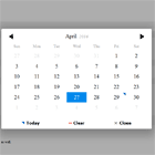
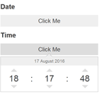
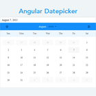
Themes 🎨
You can edit the default Css file angular-datepicker.css if you want to make a new theme for the datepicker, then just add it to the themes dir and PR!
More about it https://github.com/720kb/angular-datepicker/tree/master/themes.
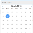
Here is an example of a Dark Theme made using custom Css.
***Please note that the example may not be uptodate with the latest angular and/or module version
Contributing
We will be much grateful if you help us making this project to grow up. Feel free to contribute by forking, opening issues, pull requests etc.
License
The MIT License (MIT)
Copyright (c) 2014 Filippo Oretti, Dario Andrei
Permission is hereby granted, free of charge, to any person obtaining a copy of this software and associated documentation files (the "Software"), to deal in the Software without restriction, including without limitation the rights to use, copy, modify, merge, publish, distribute, sublicense, and/or sell copies of the Software, and to permit persons to whom the Software is furnished to do so, subject to the following conditions:
The above copyright notice and this permission notice shall be included in all copies or substantial portions of the Software.
THE SOFTWARE IS PROVIDED "AS IS", WITHOUT WARRANTY OF ANY KIND, EXPRESS OR IMPLIED, INCLUDING BUT NOT LIMITED TO THE WARRANTIES OF MERCHANTABILITY, FITNESS FOR A PARTICULAR PURPOSE AND NONINFRINGEMENT. IN NO EVENT SHALL THE AUTHORS OR COPYRIGHT HOLDERS BE LIABLE FOR ANY CLAIM, DAMAGES OR OTHER LIABILITY, WHETHER IN AN ACTION OF CONTRACT, TORT OR OTHERWISE, ARISING FROM, OUT OF OR IN CONNECTION WITH THE SOFTWARE OR THE USE OR OTHER DEALINGS IN THE SOFTWARE.